Pro Employee
An Employee Assessment Platform
Industry
SaaS
What we did
User Research
UI UX Designing
UI Development
Platform
Web Application
Problem
PorEmployee is an employee assessment platform that wanted to simplify the assessment process for all age groups.
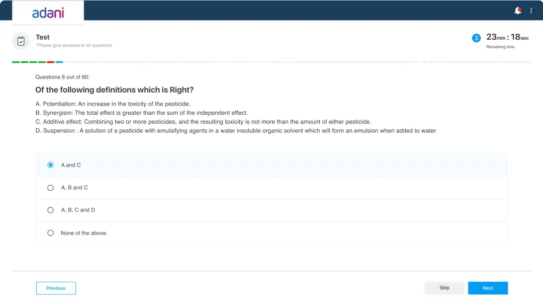
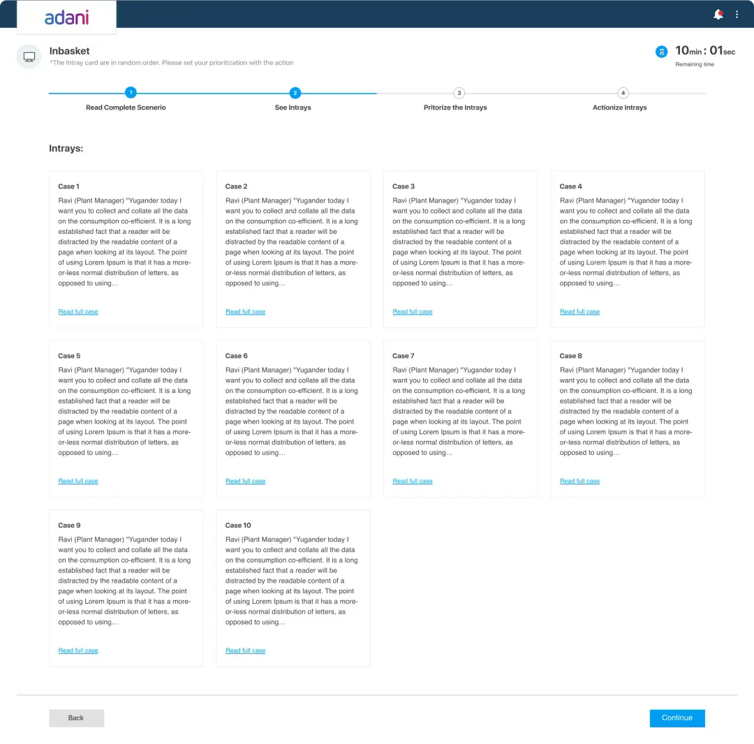
Our primary challenge was to make task management as user-friendly as possible and so we worked extensively on the bucket sorting module.
We were tasked to-
- Simplify task management
- Modernise assessment structure
- Rethink the bucket sorting module
- Explain scenarios before the assessment
Solution
Our main goal was to keep the UI intuitive and guide the user at every action. We ensured that all the information is adequately displayed in the viewport.
We prioritized simplicity and removed any unnecessary elements, allowing for a clean and uncluttered UI design that improves overall usability.
In order to enhance the user's understanding and navigation of the system we created guided flows and actions within the user interface.
We also Optimized the viewport to ensure a consistent user experience across devices and screen sizes.

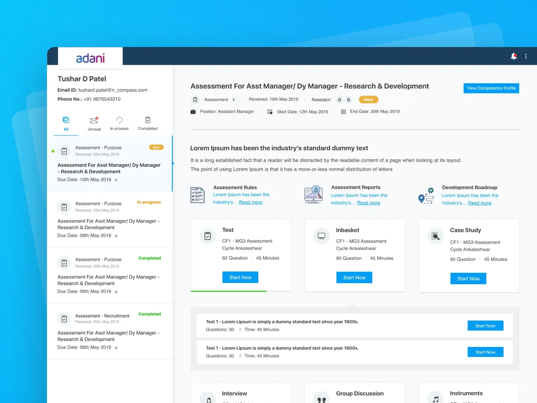
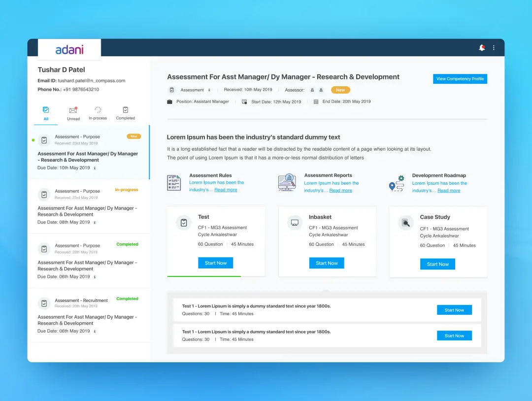
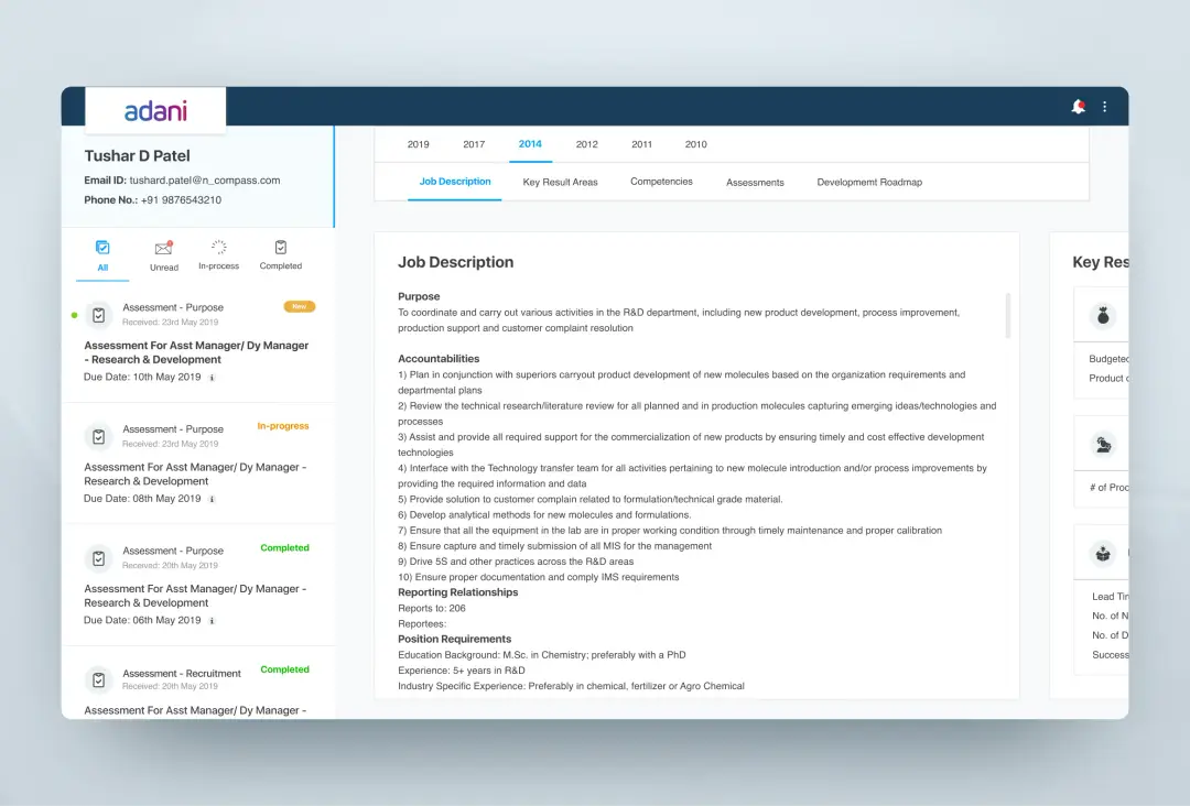
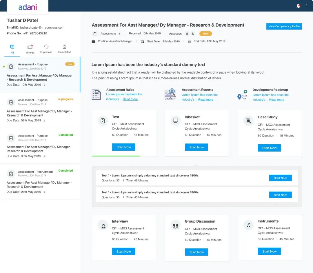
Employee Test Profile
This platform showcases the individual assessment profile of every employee with the tests that they have to attempt. We highlighted the status of the test along with different other stages of assessment for a better employee experience.
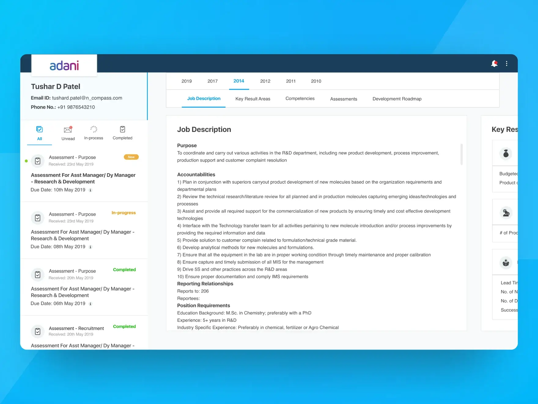
Job Description
It is important to understand the job profile for any position. Hence, keeping this perspective in mind we dedicatedly designed a screen to provide a complete job description with the percentage of skill sets required for an improved assessment process.
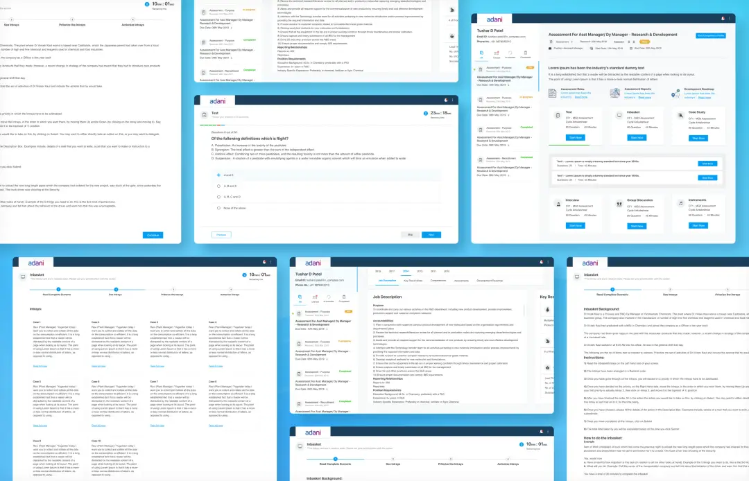
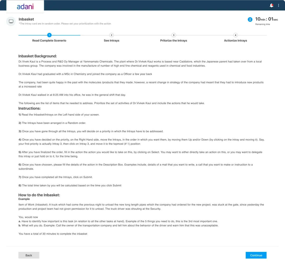
Inbasket
We created this platform to give a detailed view of the inbasket assessment and also added a step bar for better employee understanding.
Conclusion
We simplified the assessment process for all age groups by focusing on intuitive UI design, guided flows, and optimizing the viewport and have successfully created a user-friendly system that enhances the user's understanding and navigation for ProEmployee.
With a clean and uncluttered design, users can easily manage tasks, modernize assessment structures, and utilize the bucket sorting module effectively.
Overall, our solution prioritizes simplicity and improves overall usability, ensuring a consistent user experience across different devices and screen sizes.

Previous
Next

