Cielo
An Ecommerce platform for beauty and cosmetic products.
Industry
Ecommerce
What we did
UI Designing
Platform
Website Design
Problem
Beauty and cosmetics ecommerce platforms often struggle with generic user interfaces that look like standard WordPress templates. This basic design fails to showcase the brand's uniqueness, making it harder to engage customers and stand out in a competitive market.
Solution
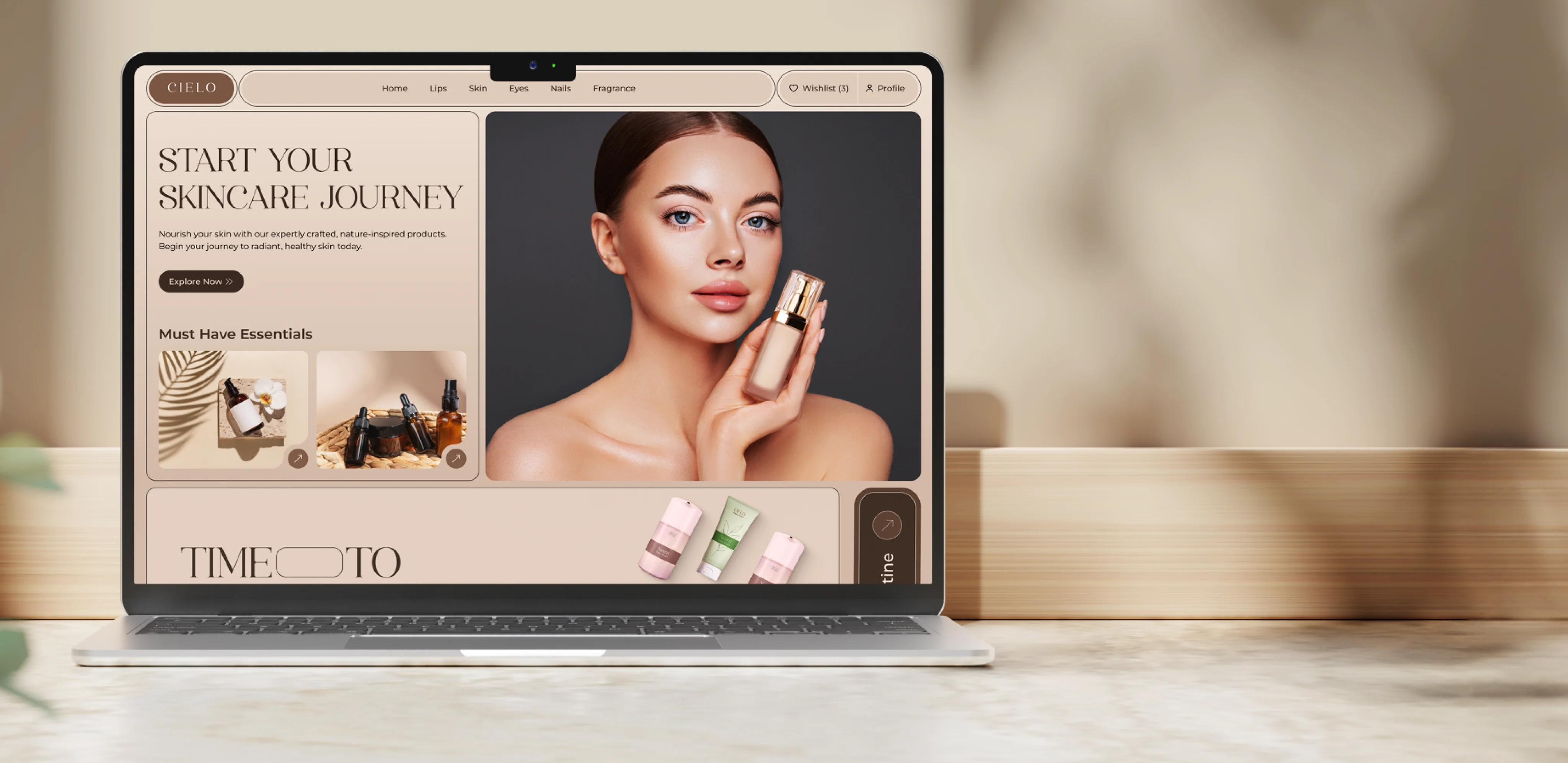
Since Cielo’s product targets premium customers, we positioned it as a premium offering to evoke emotions of luxury and exclusivity. We ditched the basic look and gave the platform a fresh, modern look that reflected the website’s unique identity. The new layout featuring a clean and sophisticated interface ensured a smooth and enjoyable experience across all devices.
1
Project Brief
What Is Cielo?
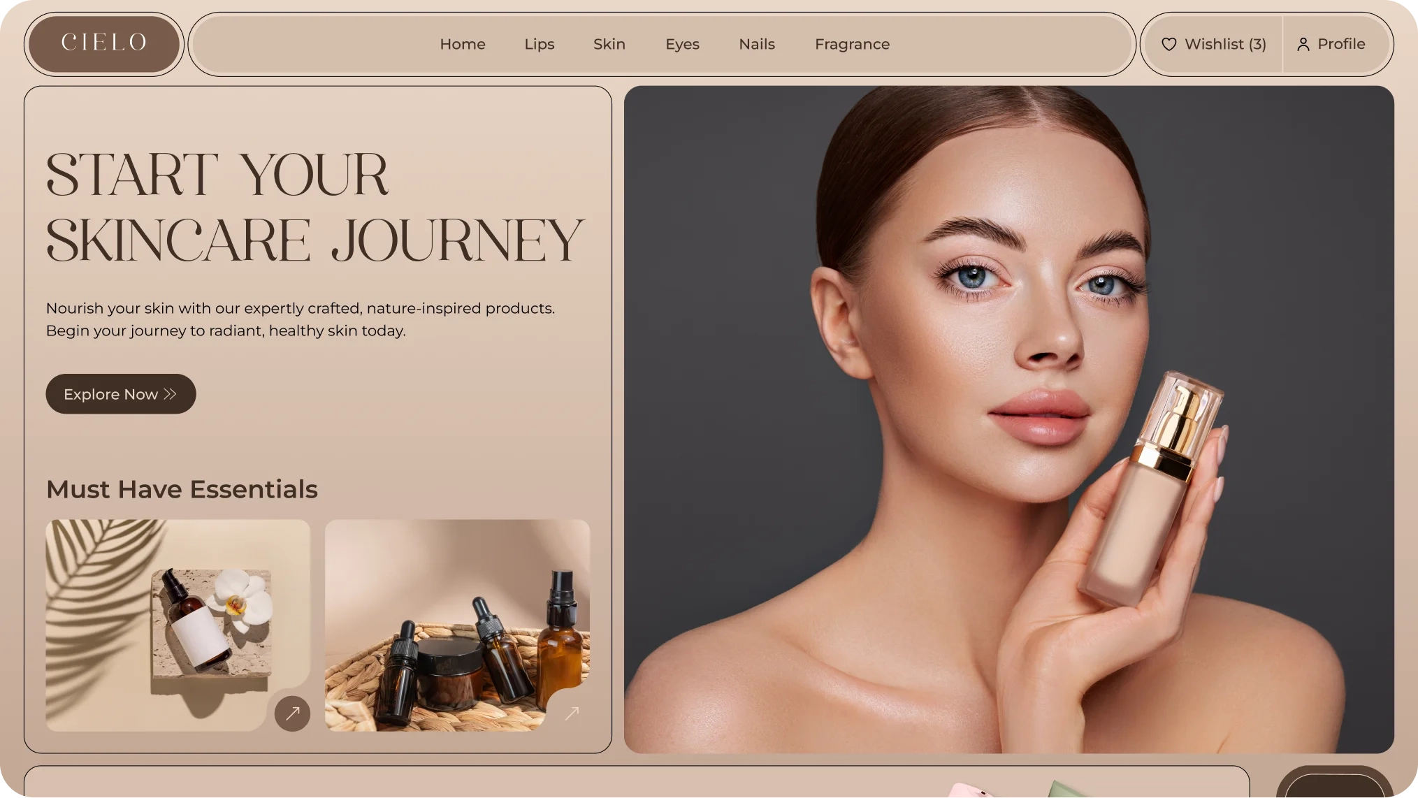
Cielo is an ecommerce platform that focuses on premium beauty and cosmetic products. We designed the platform to give it a premium feel, using carefully selected shapes and colors that reflect luxury and quality. The overall design creates a modern and elegant look, making the shopping experience attractive and user-friendly.
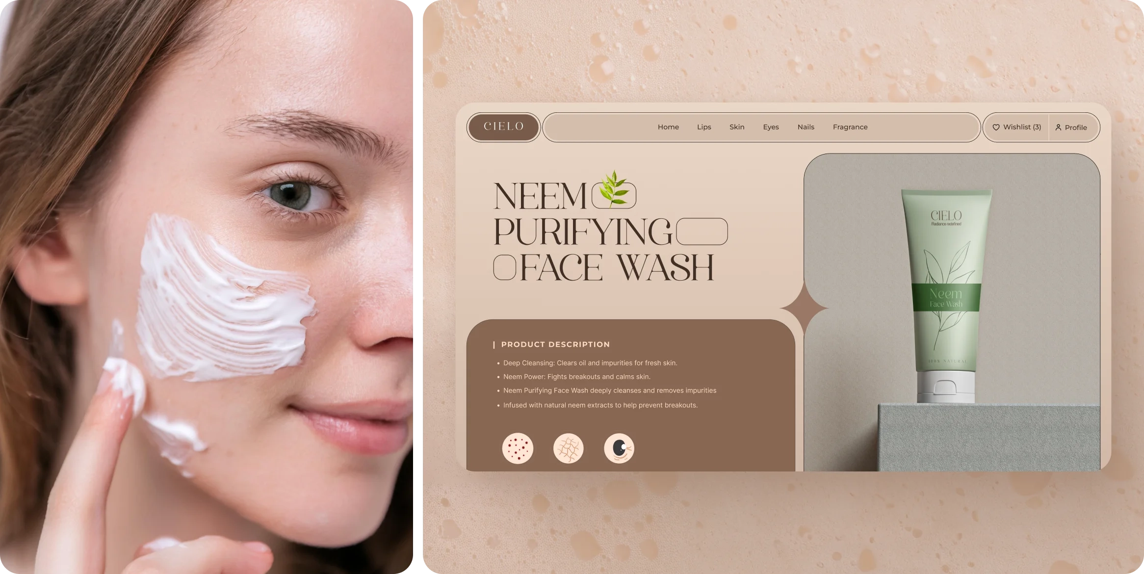
Showcasing the UI Layouts
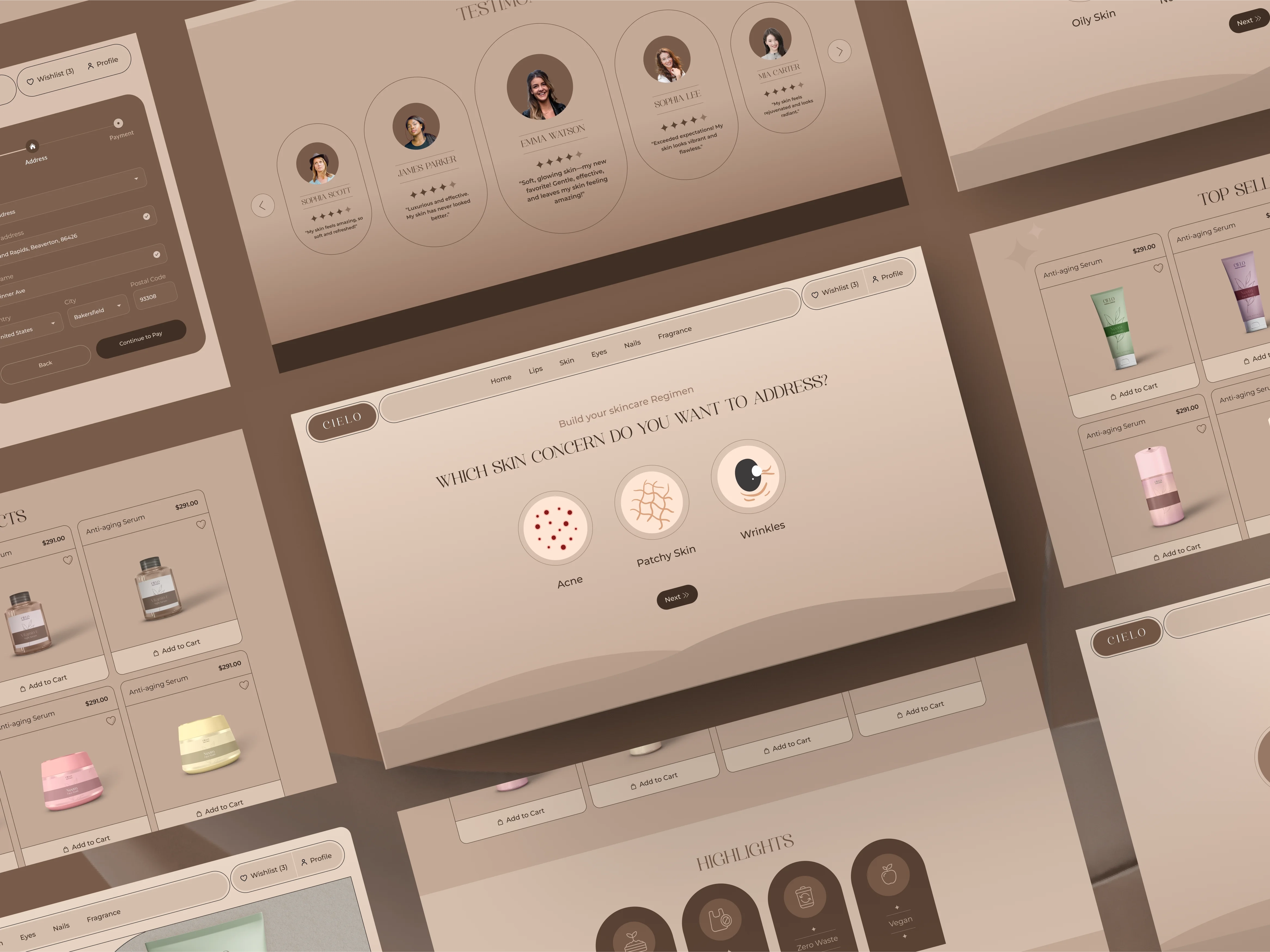
A closer look at the screens showcasing the vibrant and bold UI design. Each element is crafted to create an energetic experience reflecting extroverts' lively spirit.
2
Research
Survey
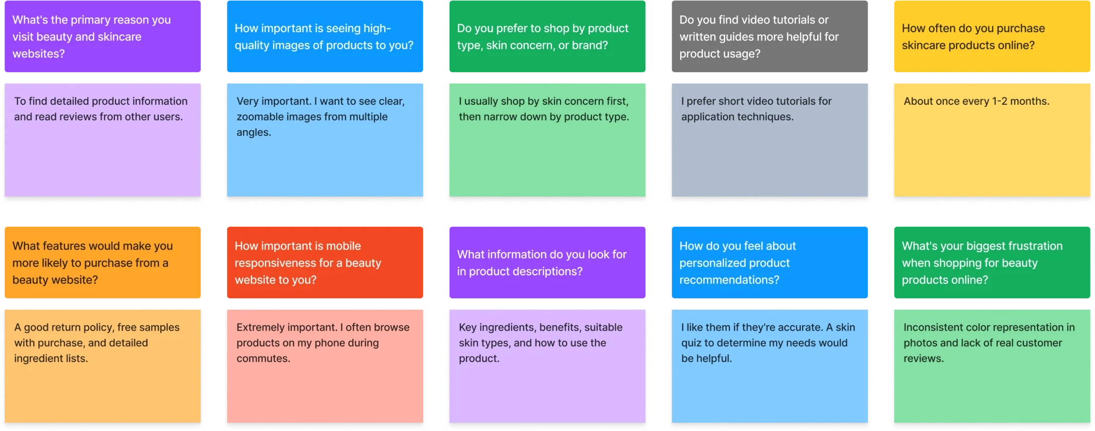
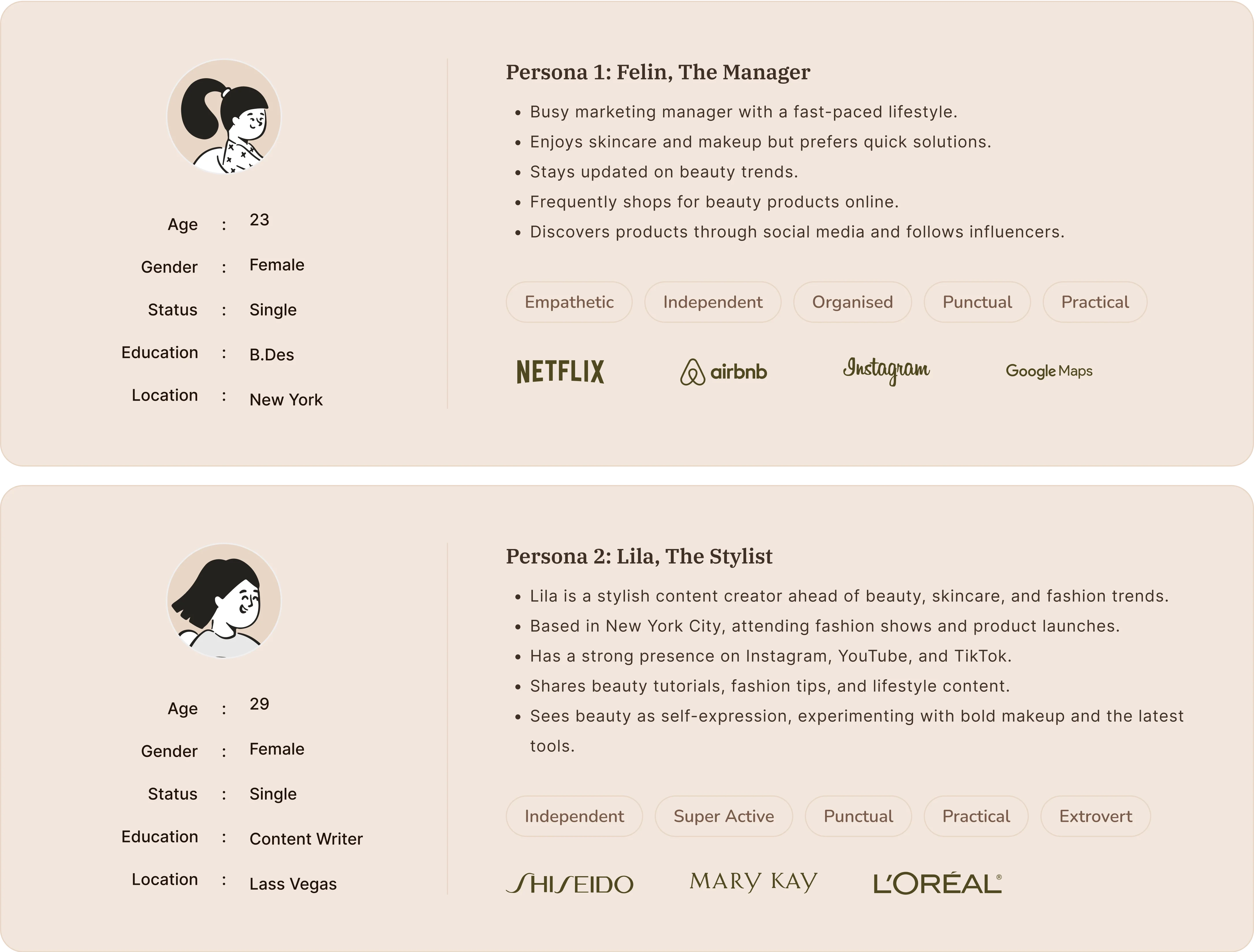
We conducted a survey, which laid the groundwork for our design process. We collected essential insights from our target audience, allowing us to create detailed user personas. This helped us understand their preferences, behaviors, and challenges, guiding our design decisions effectively.
User interviews
User Personas
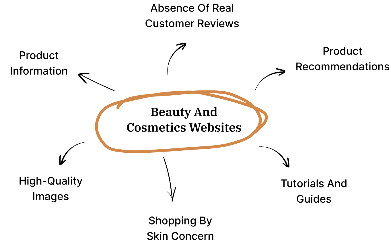
Mindmapping
3
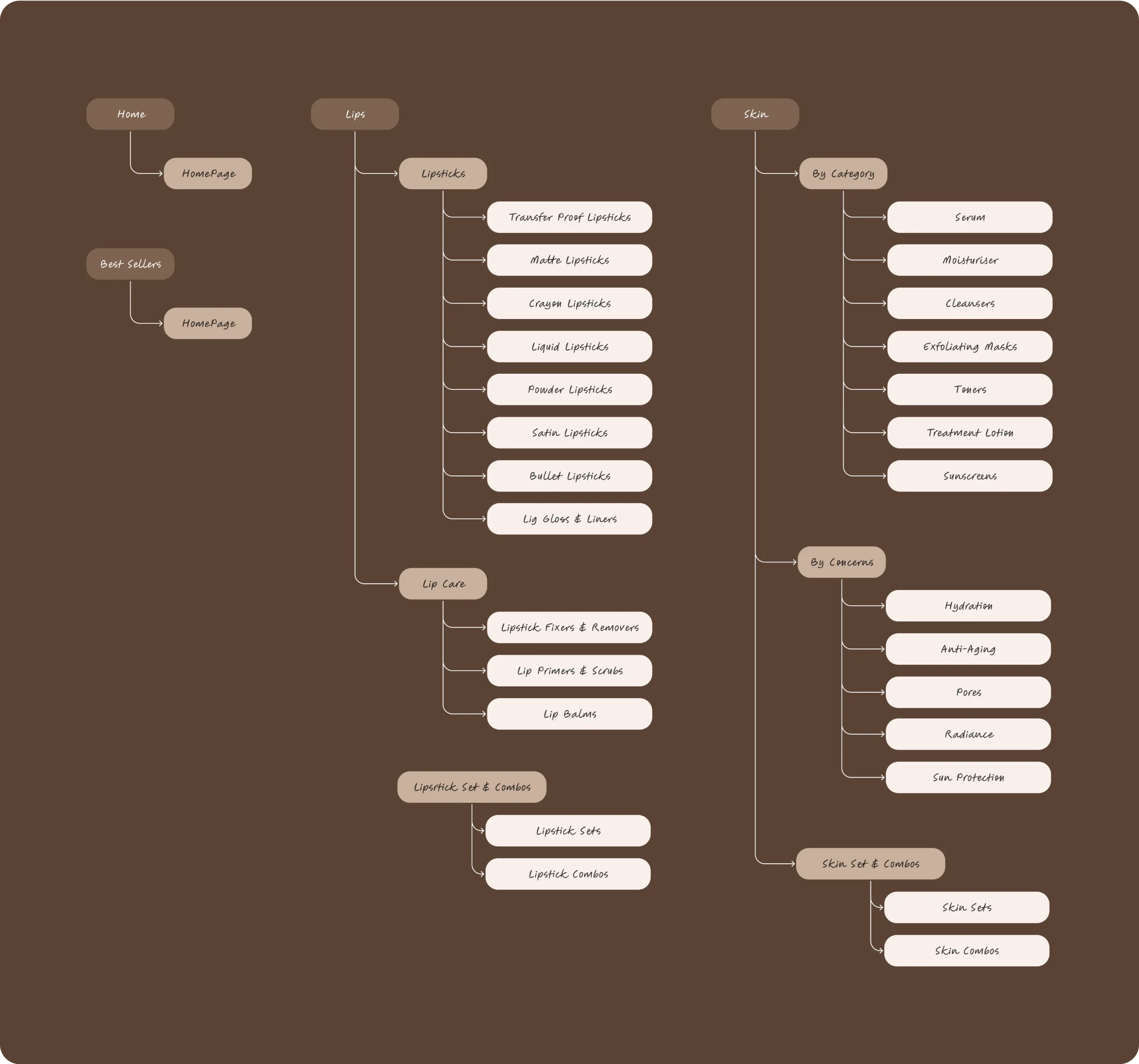
Sitemap
User Personas
We developed a sitemap to define the core UI elements and outline the site structure. This step ensured that all necessary features and pages were included, creating a clear roadmap for the design process.
4
Wireframe
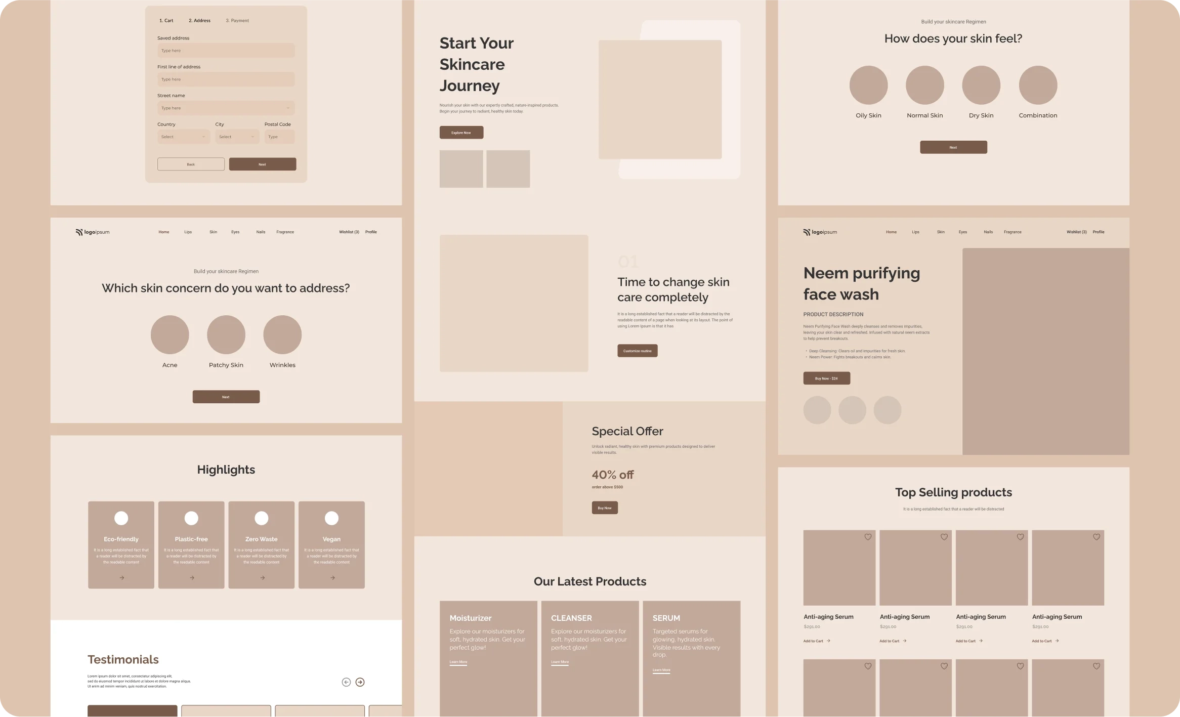
Sketching & Wireframing
Through wireframing, we created simple sketches to outline the layout and functions of each page on the platform. These blueprints helped us visualize how the user interface would look and work for this ecommerce platform.
5
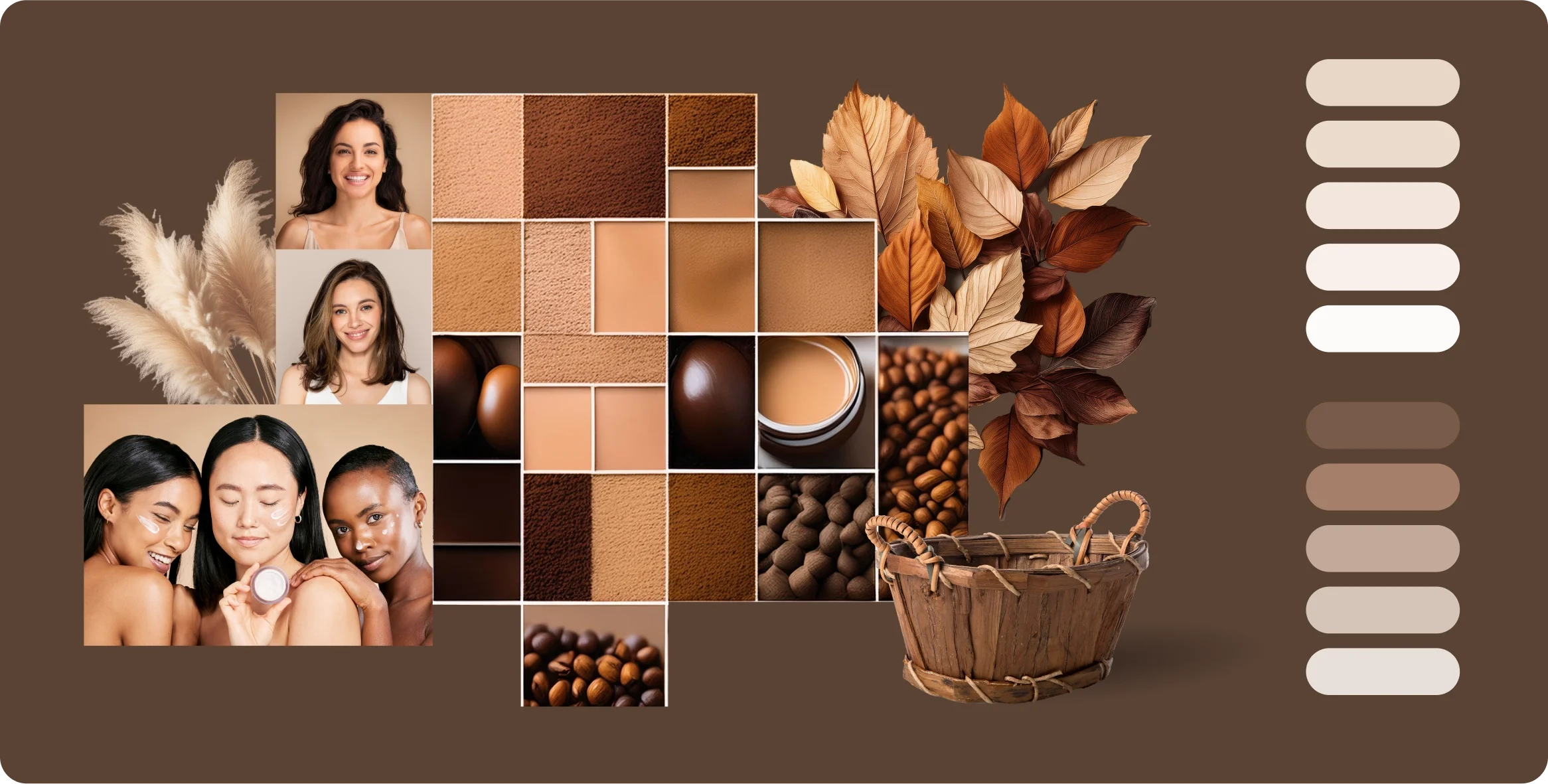
Mood Board
Colors
We picked a color palette that highlights luxury and sophistication, aligning with the premium feel of beauty and cosmetic products. These rich and elegant colors create a sense of luxury, enhancing the brand's upscale identity.
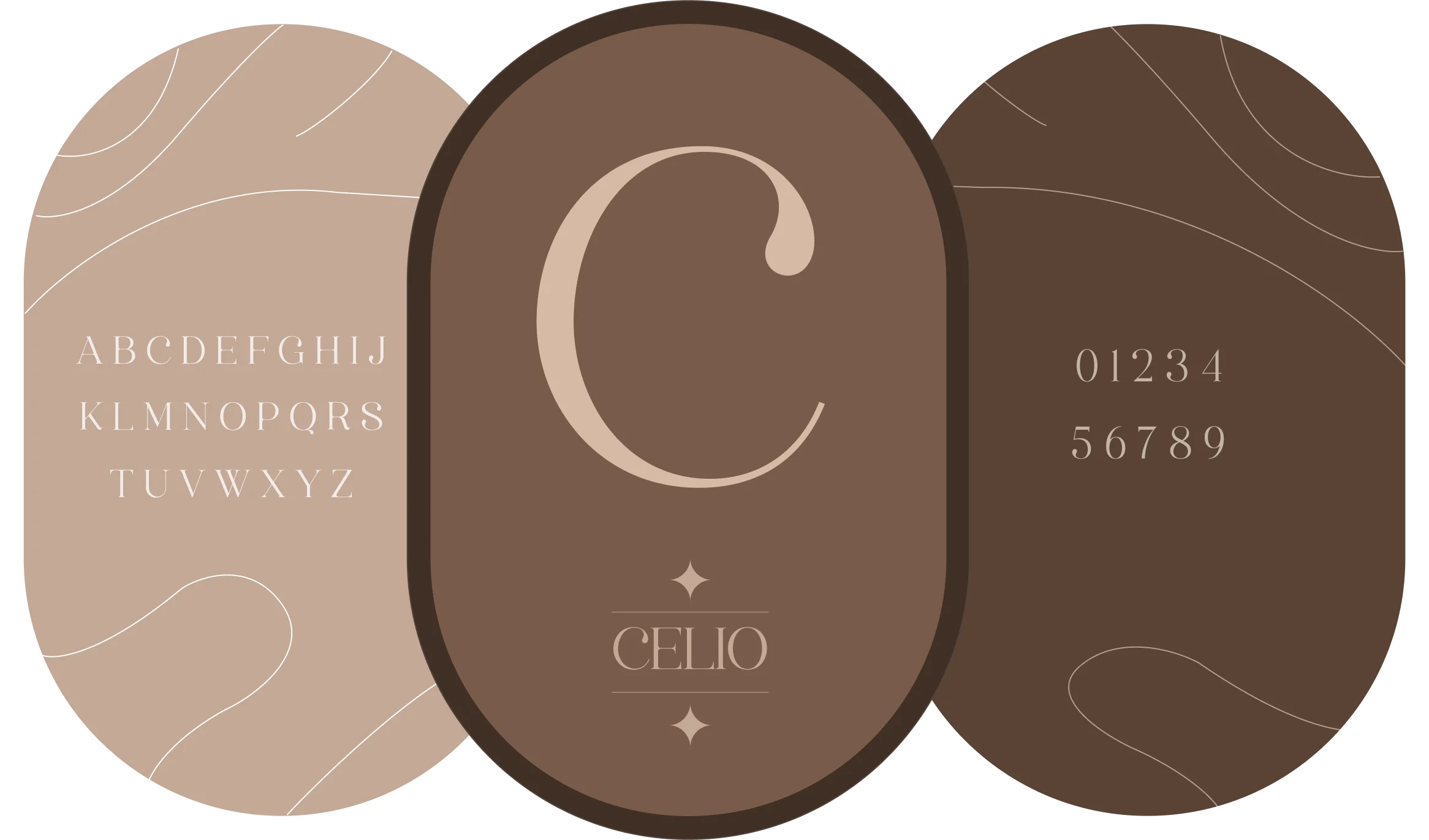
Typography
We chose a serif font that adds elegance and sophistication to create a luxurious feel. This font style enhances the platform's premium look.
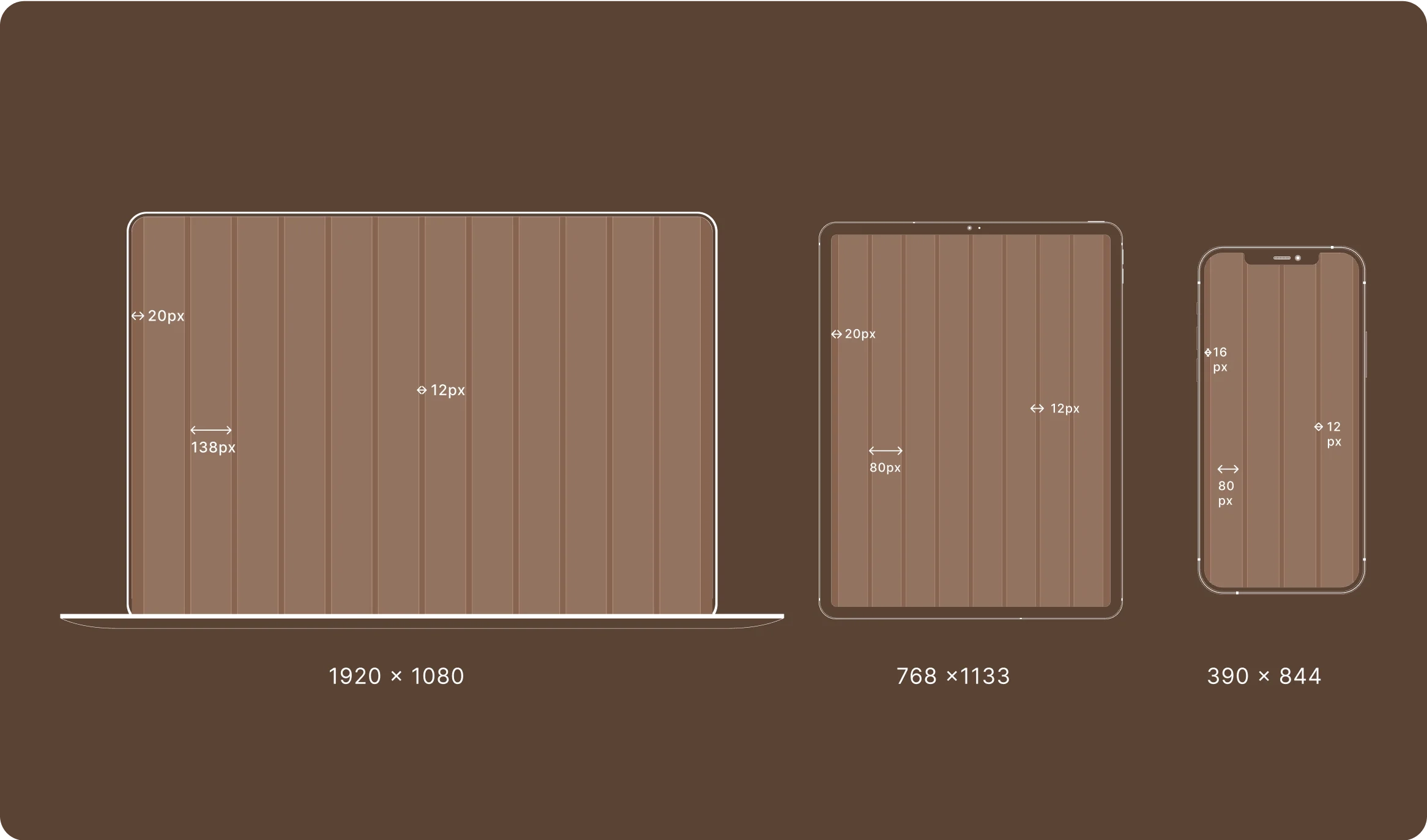
Responsive Grid
We used a responsive grid layout to ensure the platform looks great and works well on all screen sizes and devices. This allows users to have a smooth experience using a desktop, tablet, or mobile phone.
6
Interface
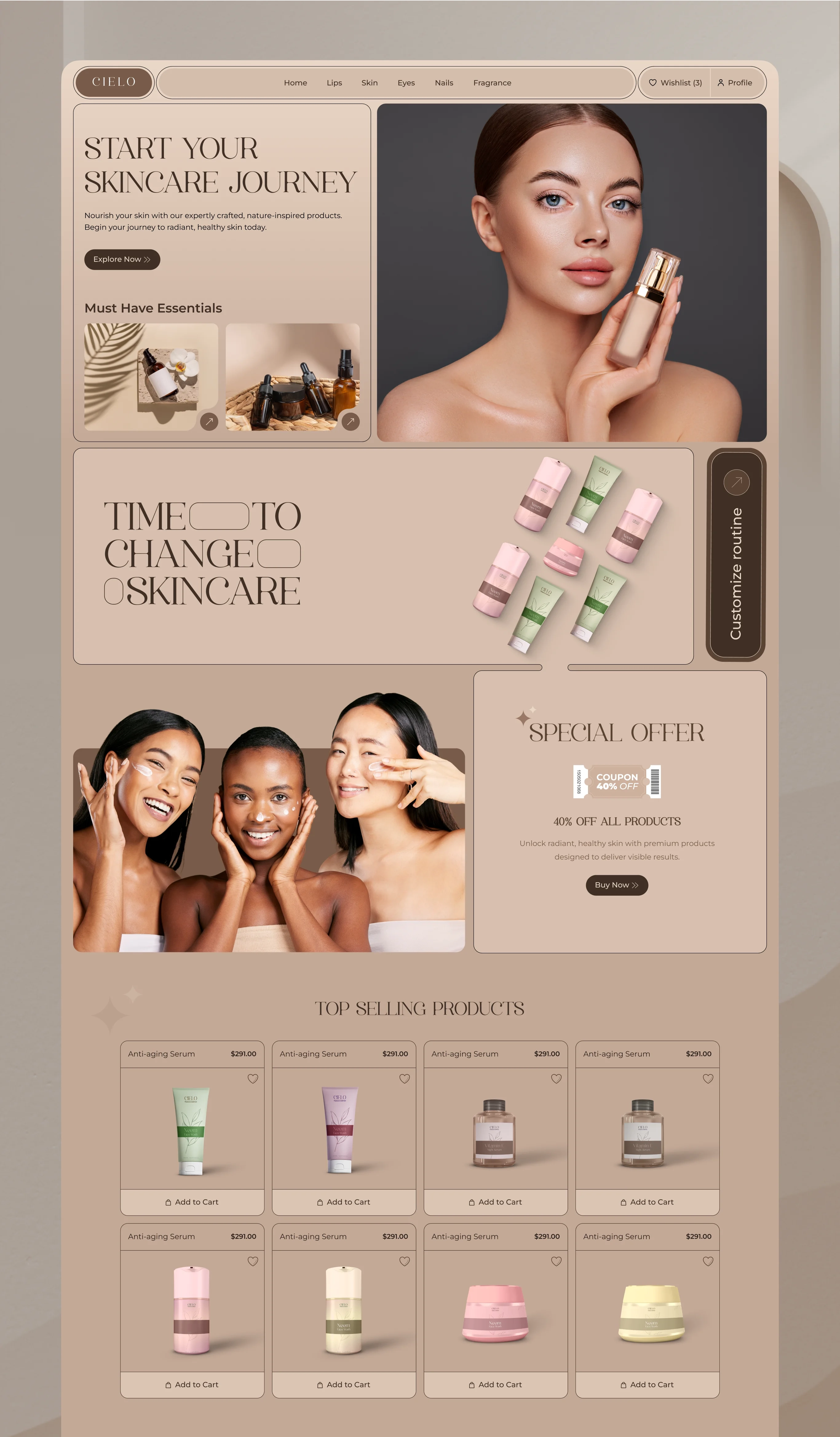
Home Page Design
The home page design showcases all the essential sections, like discounts, key features, and top products, to effectively attract users. This layout helps visitors quickly find what they're looking for and keeps them engaged.
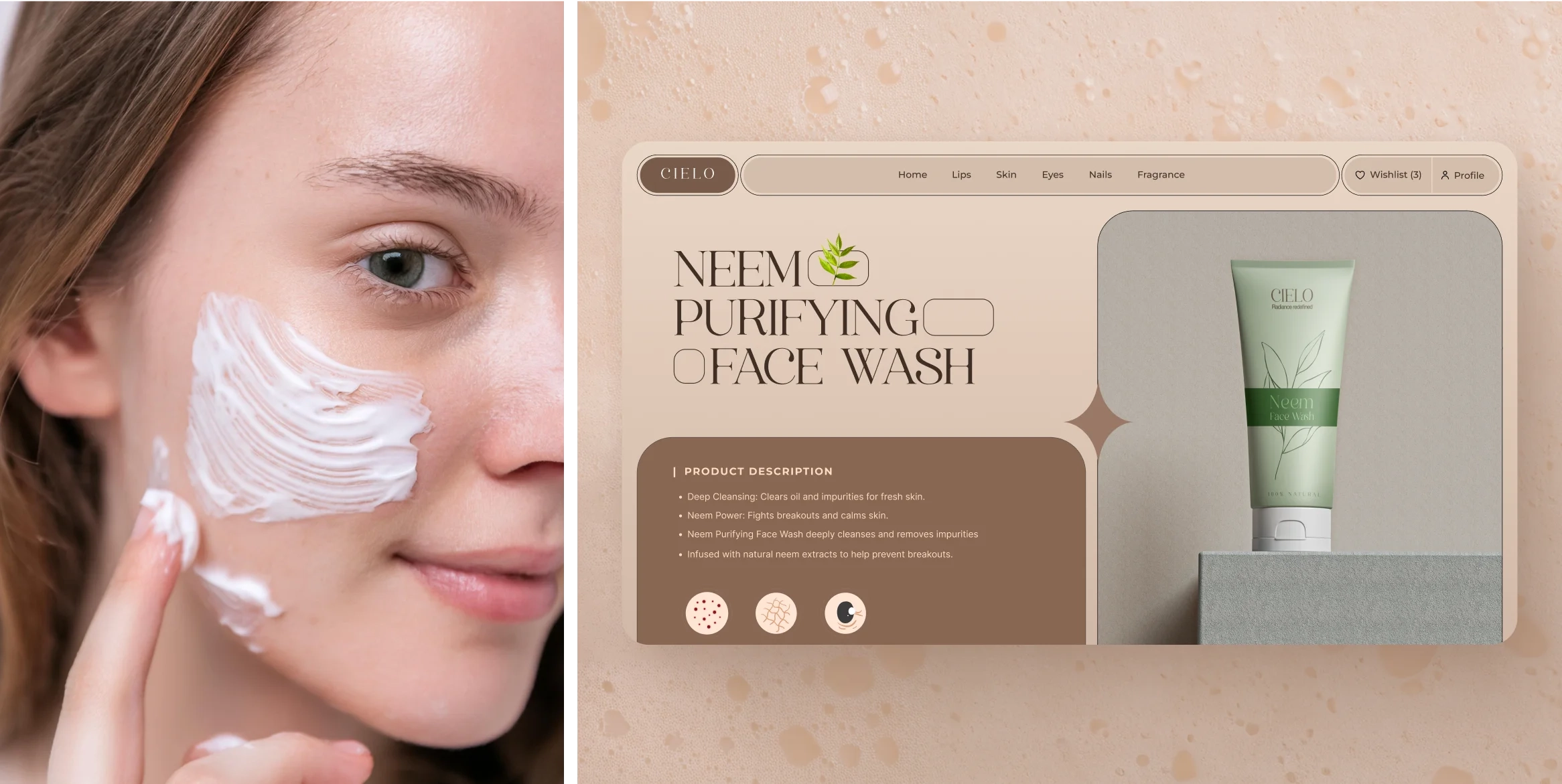
Product Single Page
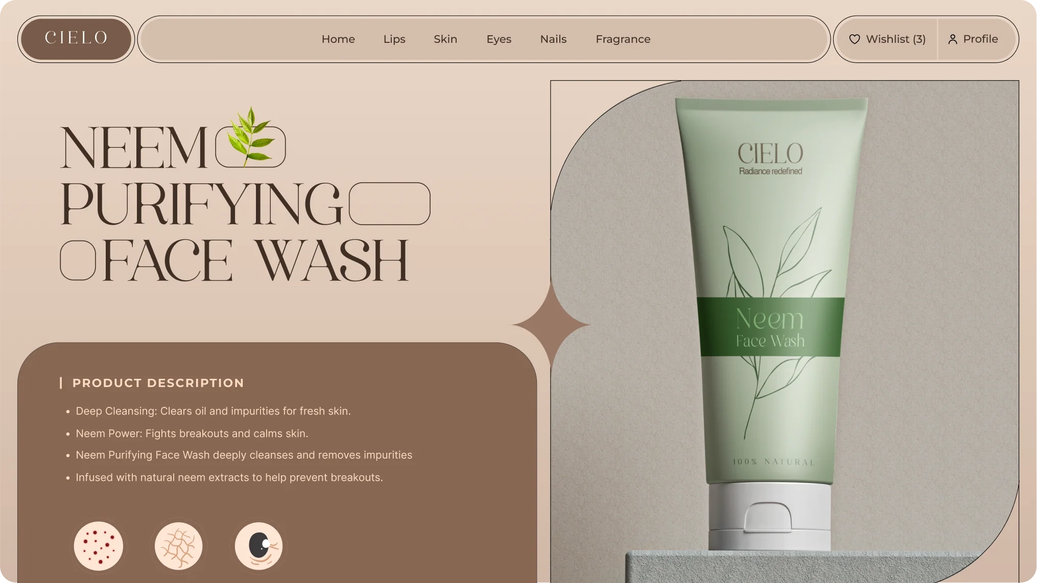
The product's single page features detailed information, high-quality images, and user reviews for each item. This design helps customers easily find the information they need to make informed purchasing decisions.
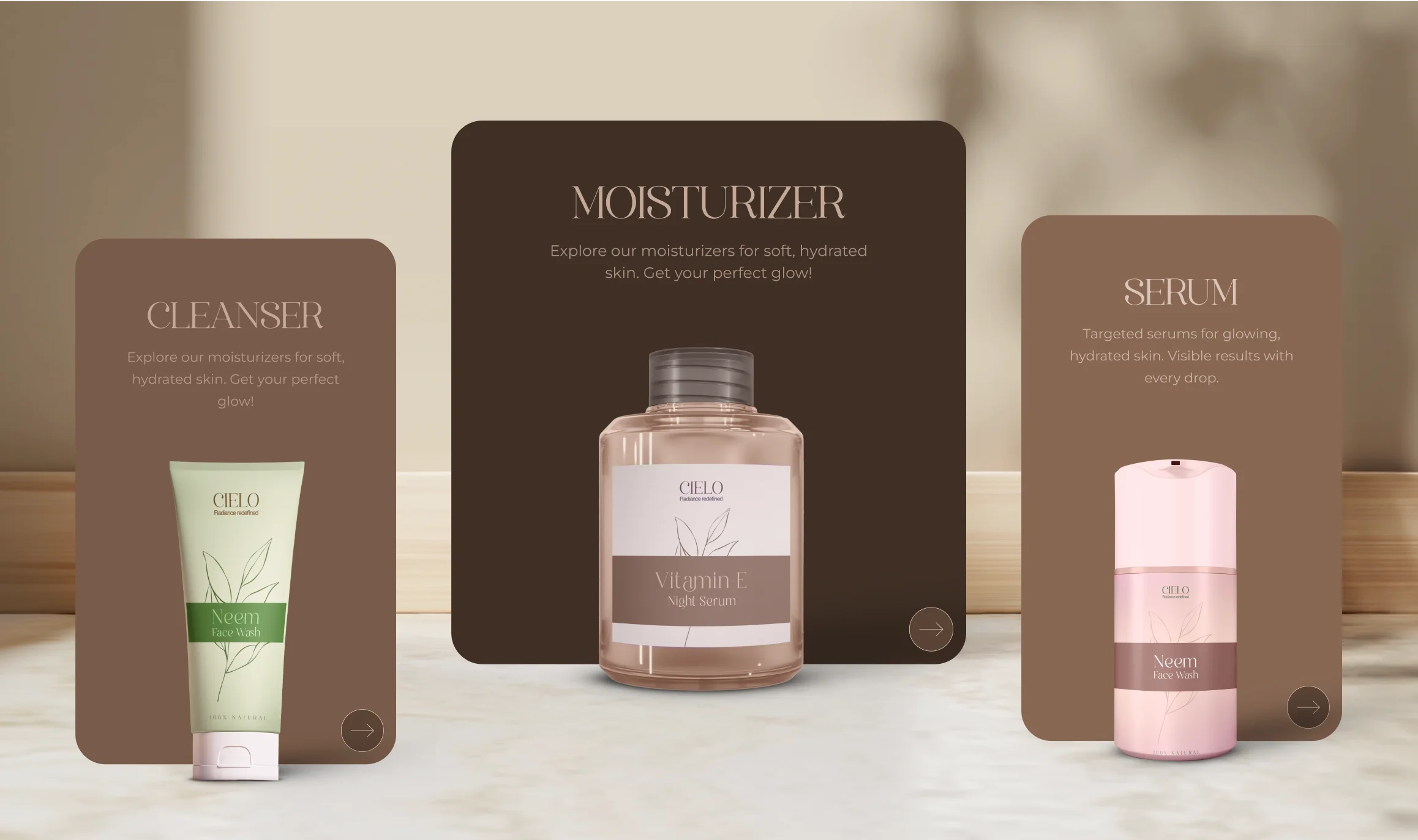
Product Card
The product card showcases key details like images, names, and prices in a clean layout. This design helps users quickly scan and compare options for easier shopping.
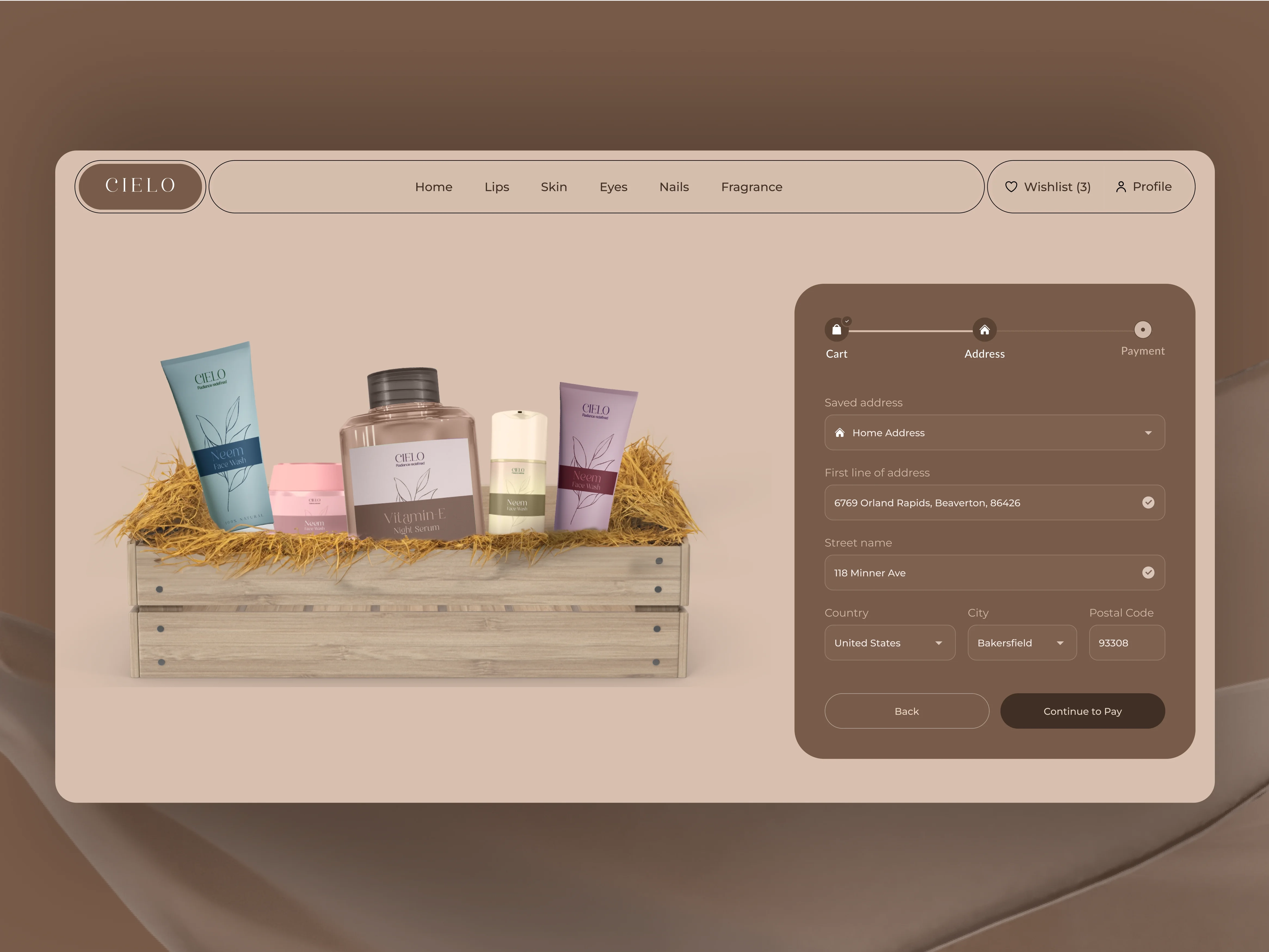
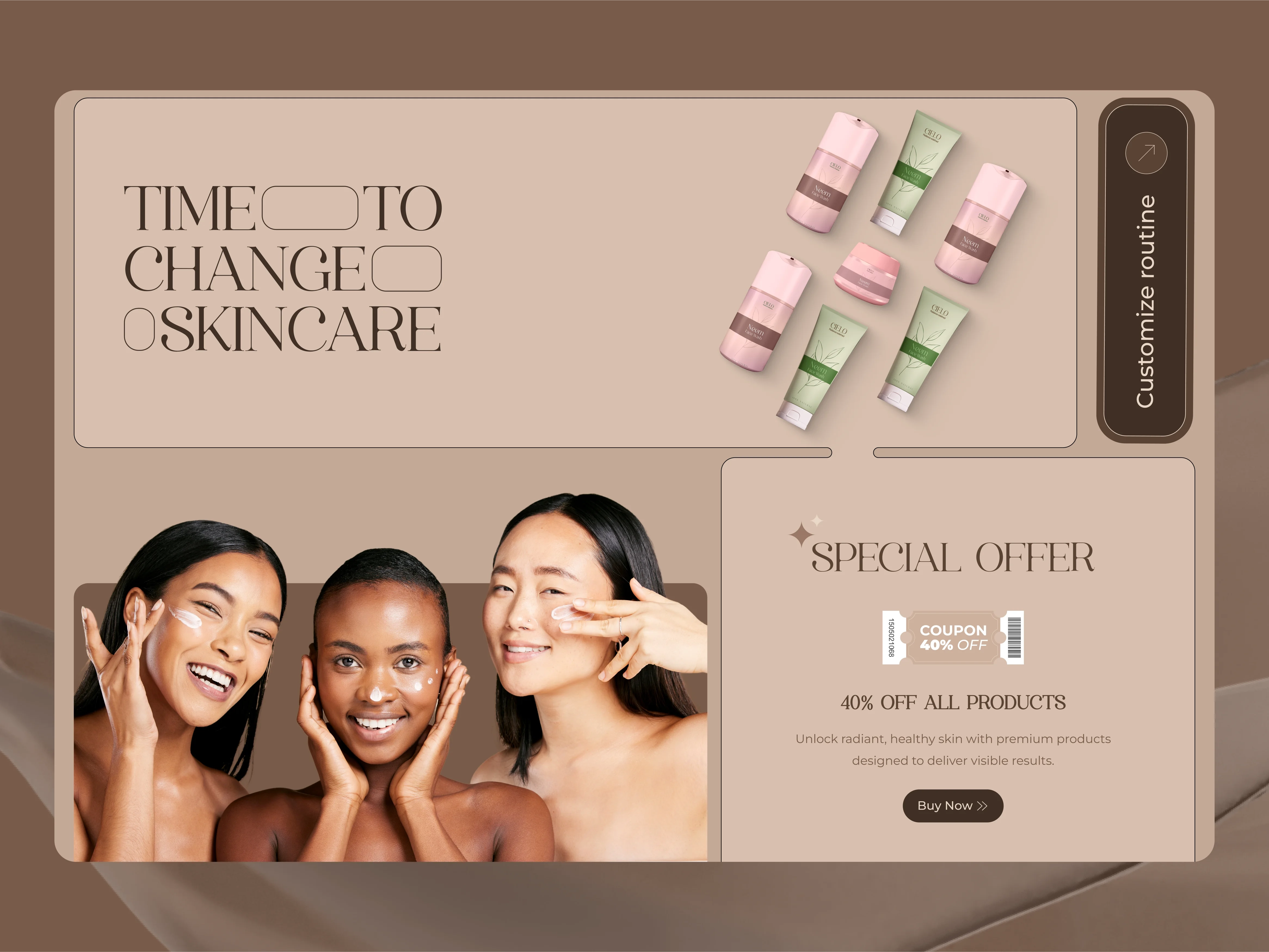
Other Pages
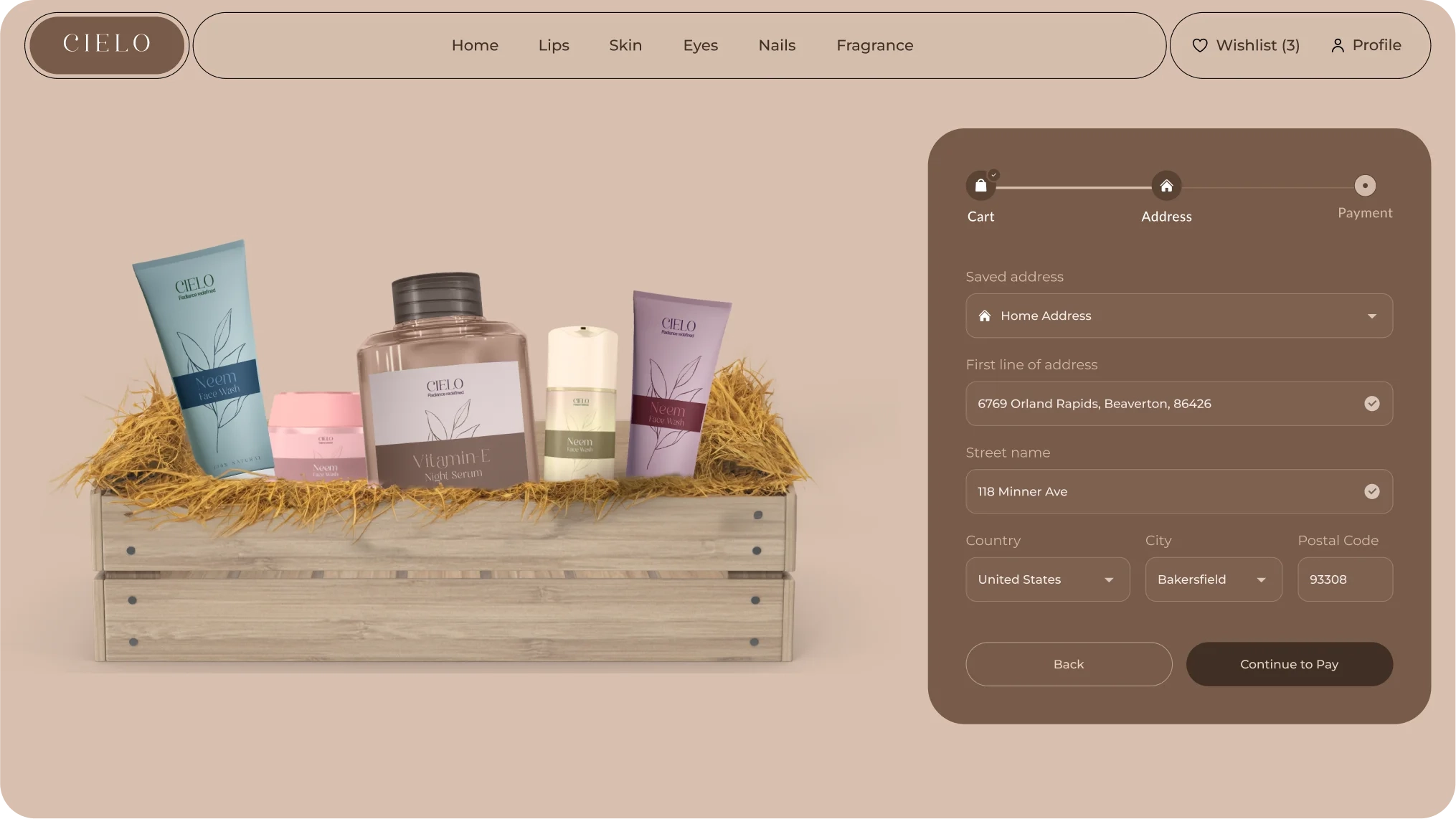
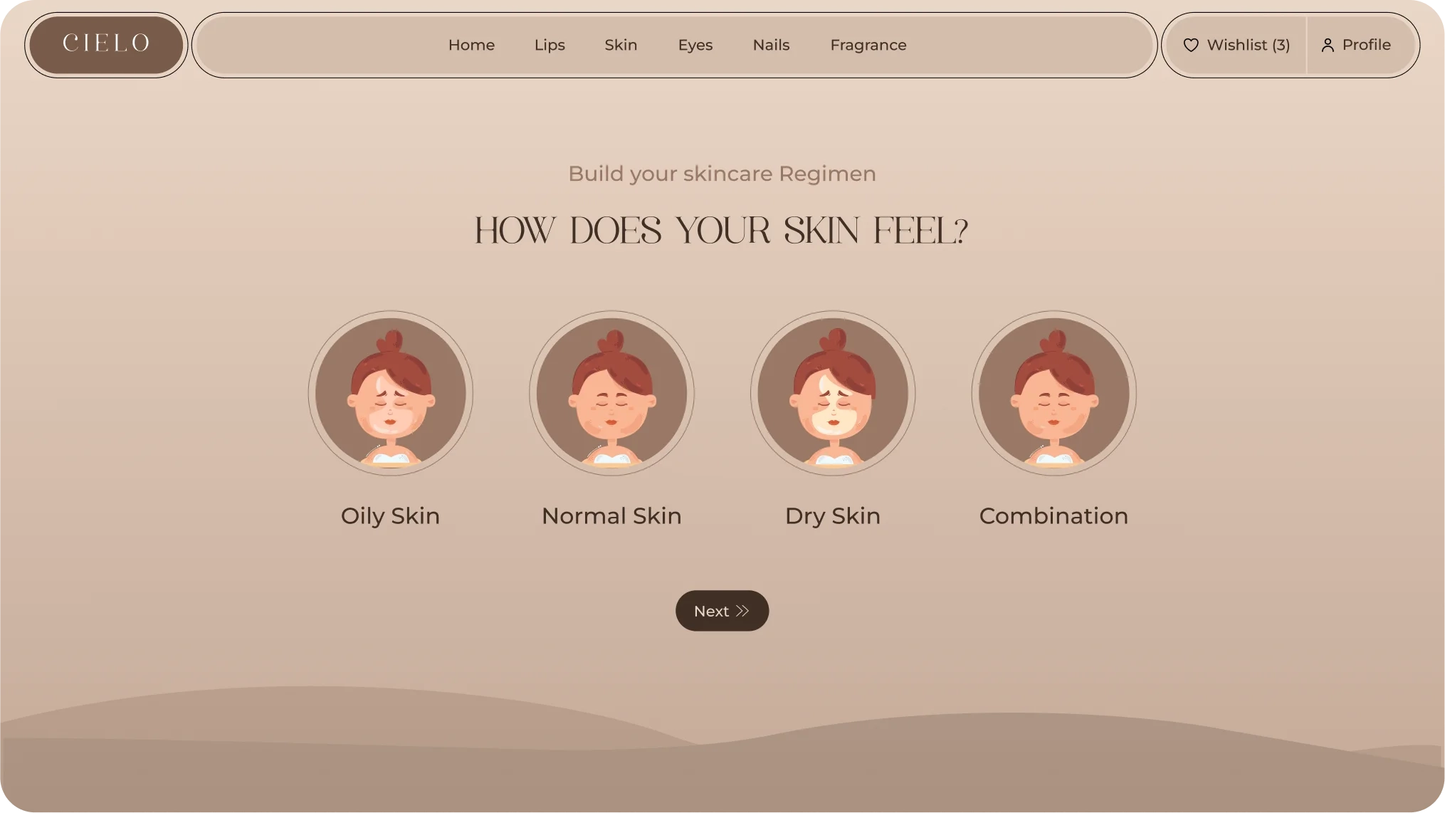
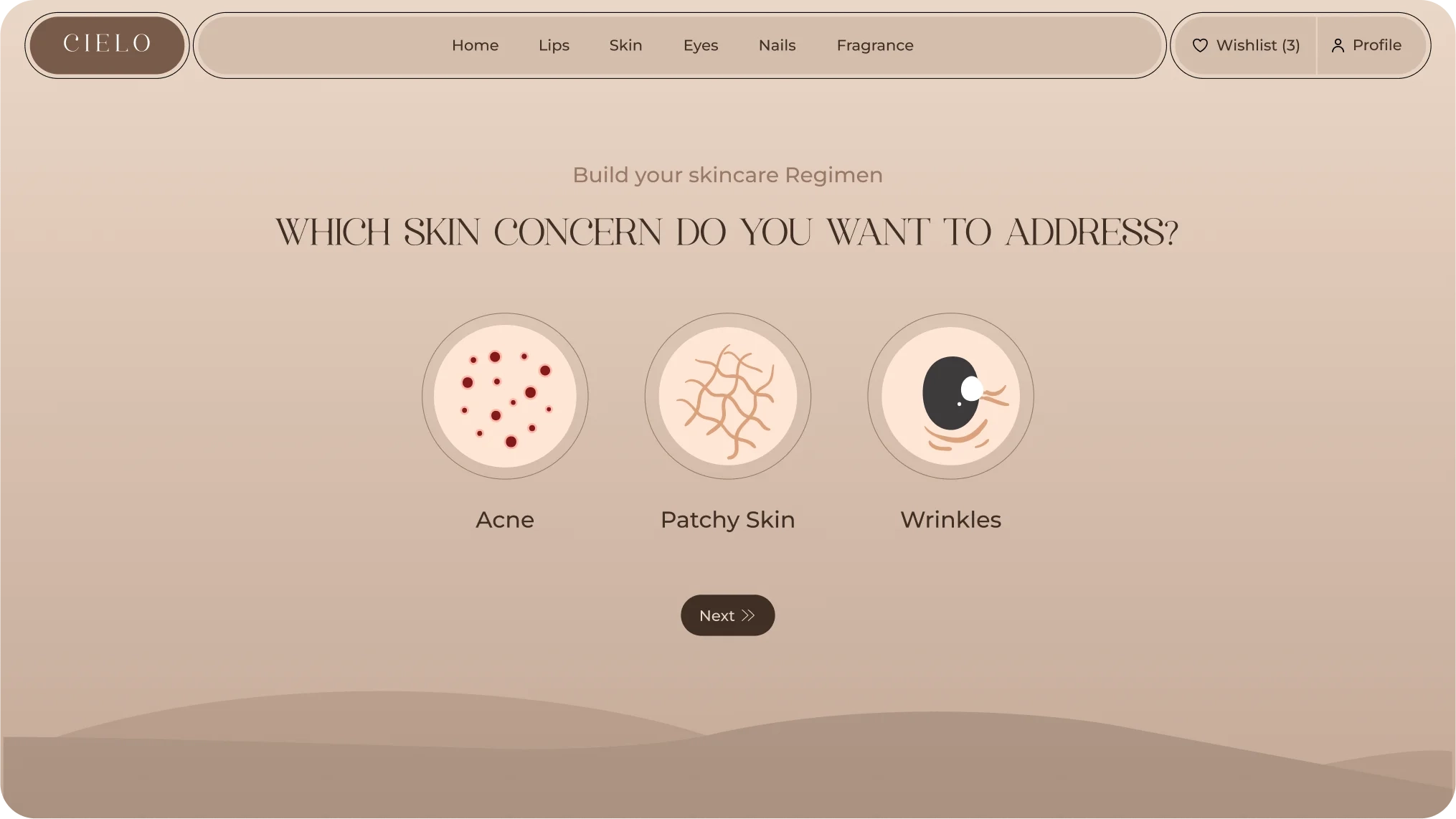
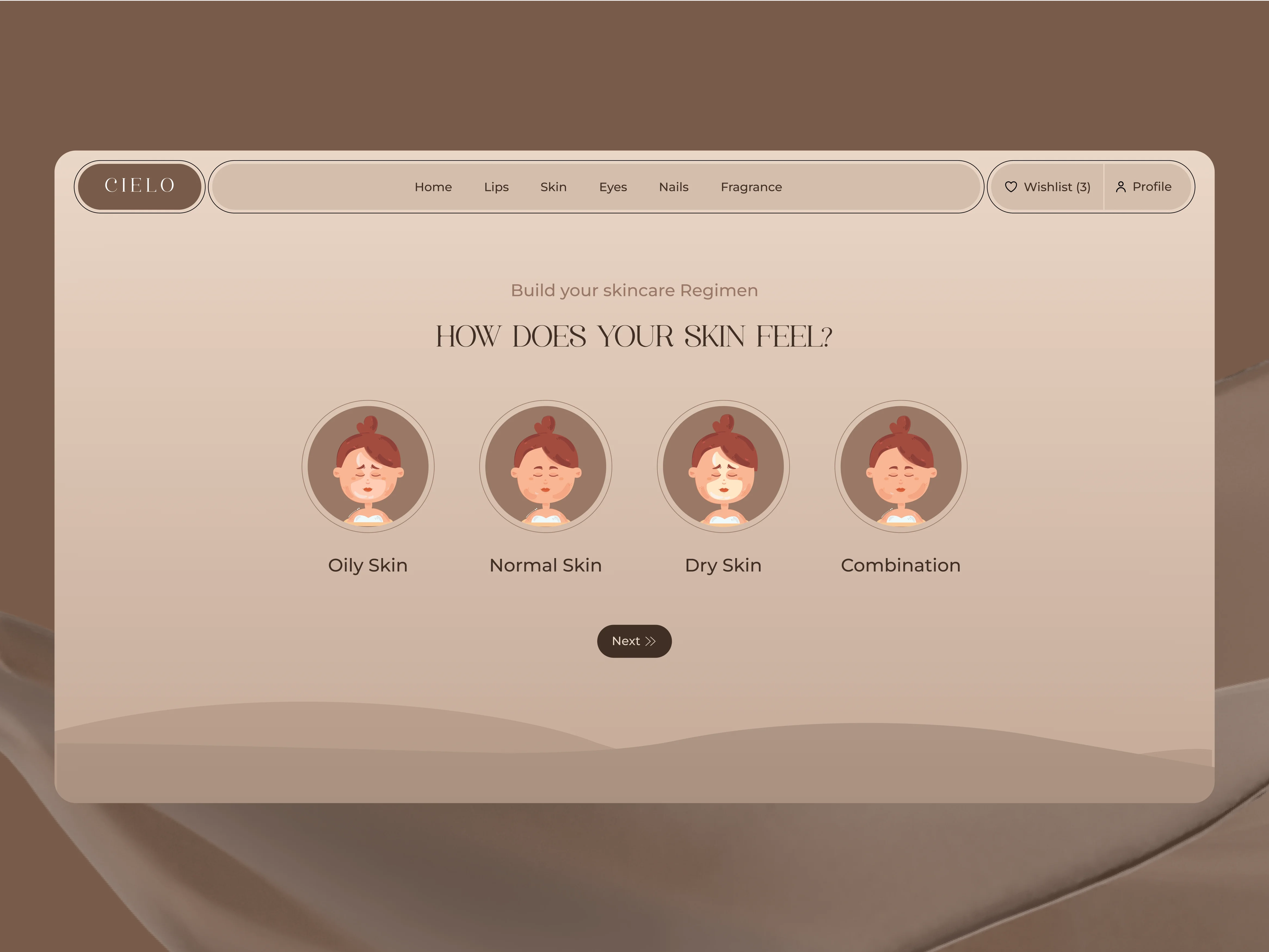
The other pages include checkout, discount, and skin preference sections, designed to enhance user experience. These pages provide essential functionality and personalized options for a smooth shopping process.
Conclusion
- Our goal was to create a luxurious website that appeals to premium customers, giving them an exceptional experience when choosing skincare and cosmetic products.
- We believe this approach will attract users and help them find the information and tools they need to make intelligent choices.
- We faced challenges in changing a basic UI into a more sophisticated design that connects with the target audience.
- By improving the overall user experience, we aim to build loyalty and satisfaction, making Cielo a top platform in the beauty and cosmetic industry.
- Our solution included a complete redesign, focusing on elegant visuals, easy navigation, and personalized features.

Previous
Next

