Sangti
Tech-first carbon management platform
Industry
Saas
What we did
UX Audit
UX Research
Information Architecture
UI Design
Platform
Web Application
Problem
The old software used to keep track of how much carbon pollution a company produces but had problems with the overall software look and usability.
Companies find it hard to use because it's confusing and not user-friendly.
The challenges lie in the complexity of aggregating emissions data from diverse sources, the lack of intuitiveness & transparency in partner reporting.
We had to make new, easy-to-use version of the software that can fix these problems and help people track the pollution and follow rules effectively.
Solution
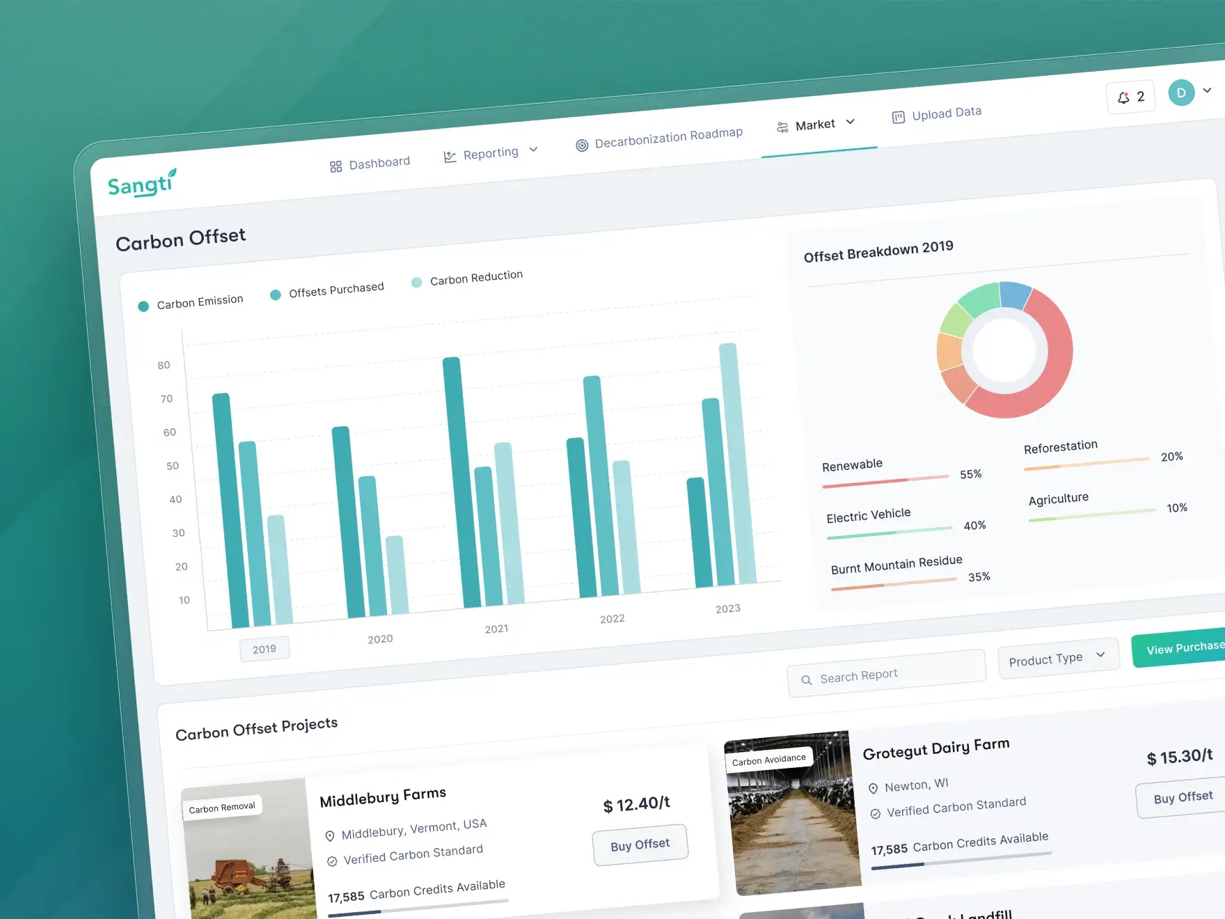
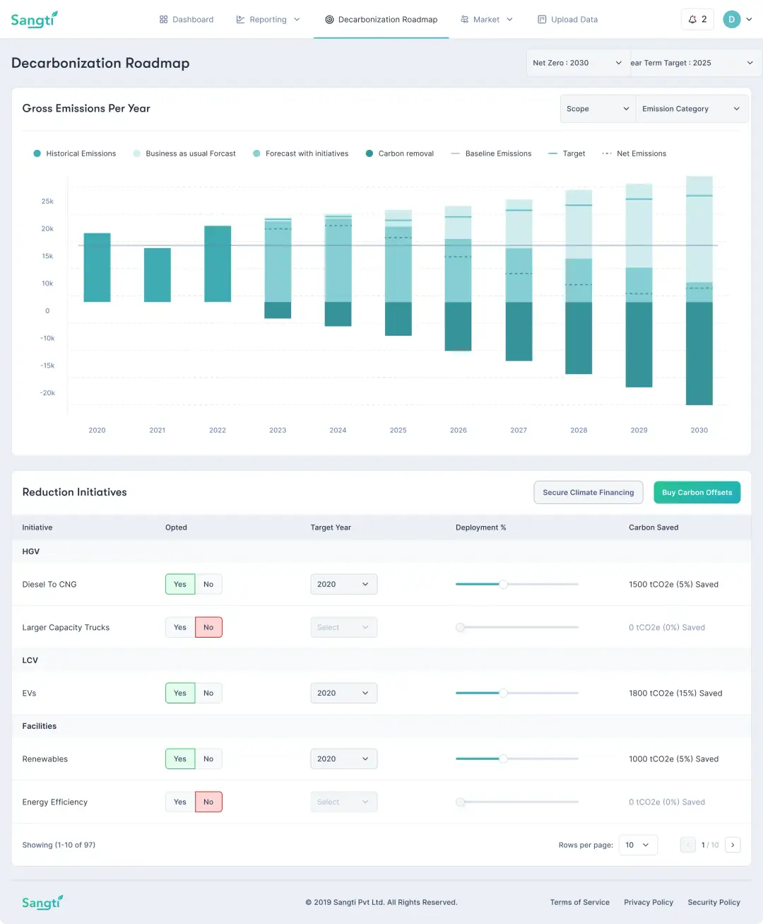
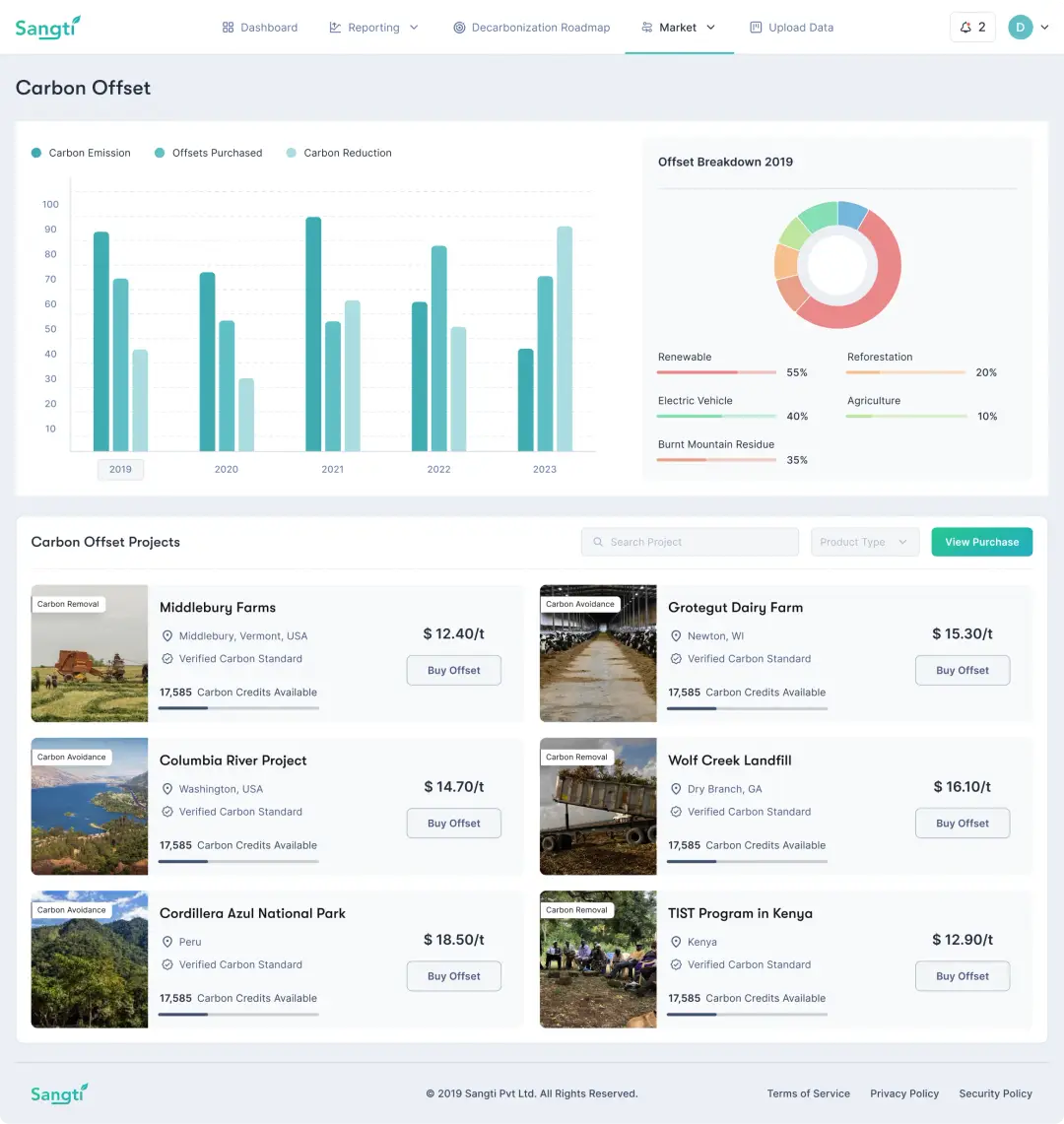
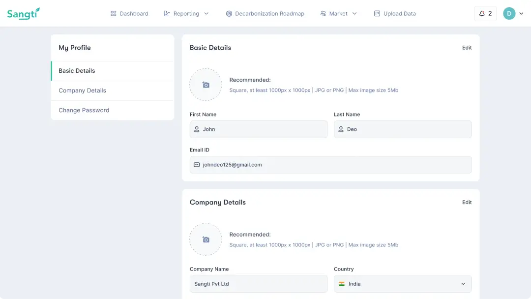
Our revamped solution introduced a streamlined and user-friendly interface, making it accessible to users of all backgrounds.
Key improvements includes simplified data entry and retrieval processes, ensuring that users can easily input and access critical emissions data.
We restructured the information architecture & simplified the user-flows by minimizing the friction for users.
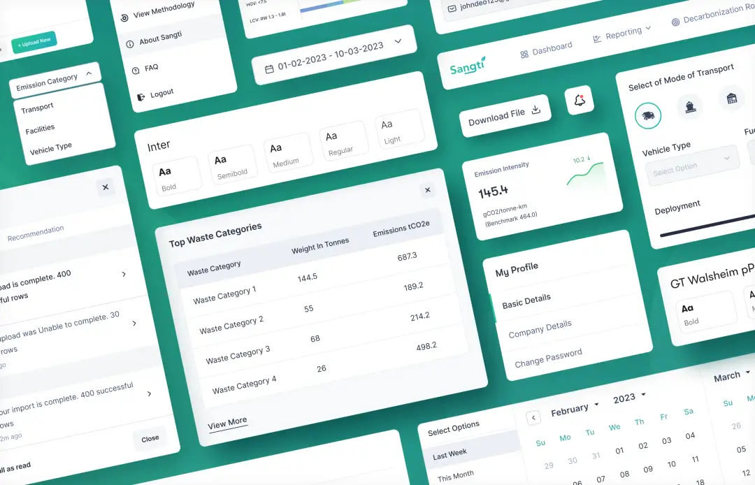
We also gave a modern look to the application with intuitive interface and redesigned the platform for user-friendly experience.
Our aim was to streamline emission tracking, enhance transparency & collaboration, ensure regulatory adherence and facilitate efficient logistics optimisation.

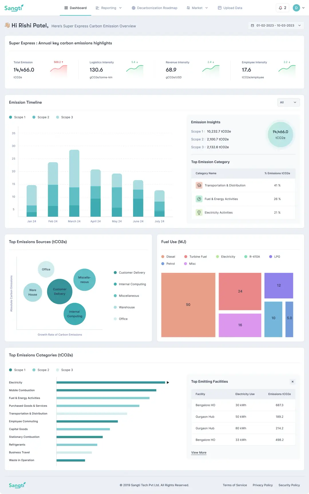
Dashboard
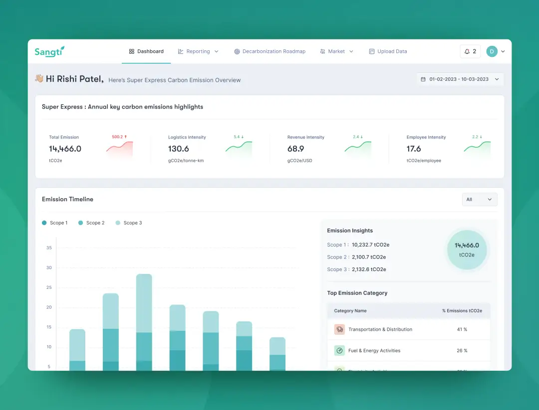
Our UX enhancement project involved a significant overhaul of a cluttered dashboard to achieve a cleaner, modern look.
Our primary goal was to simplify the visual complexity by decluttering, removing unnecessary elements, and reorganizing information for a more intuitive layout.
We introduced a harmonious color palette and optimized white space to improve readability and create a contemporary, inviting feel.
The result is a modern dashboard that offers a user-centric experience, allowing users to focus on their tasks without visual distractions.
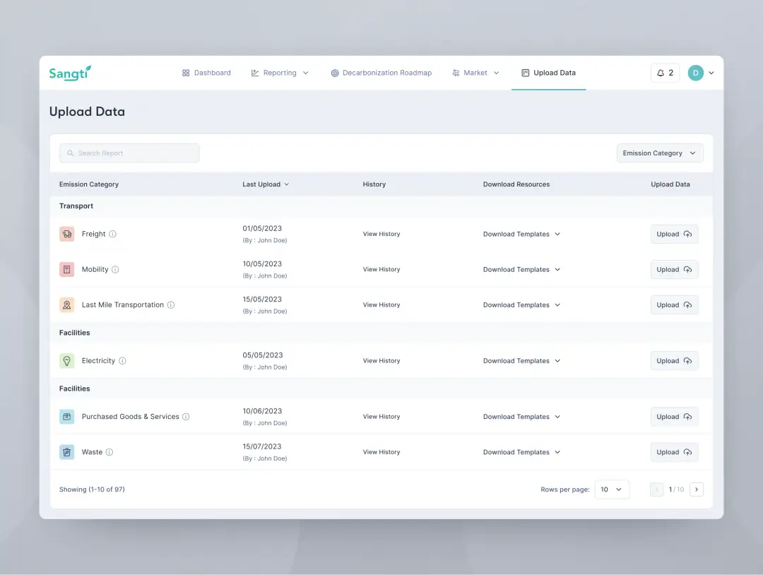
Data Upload
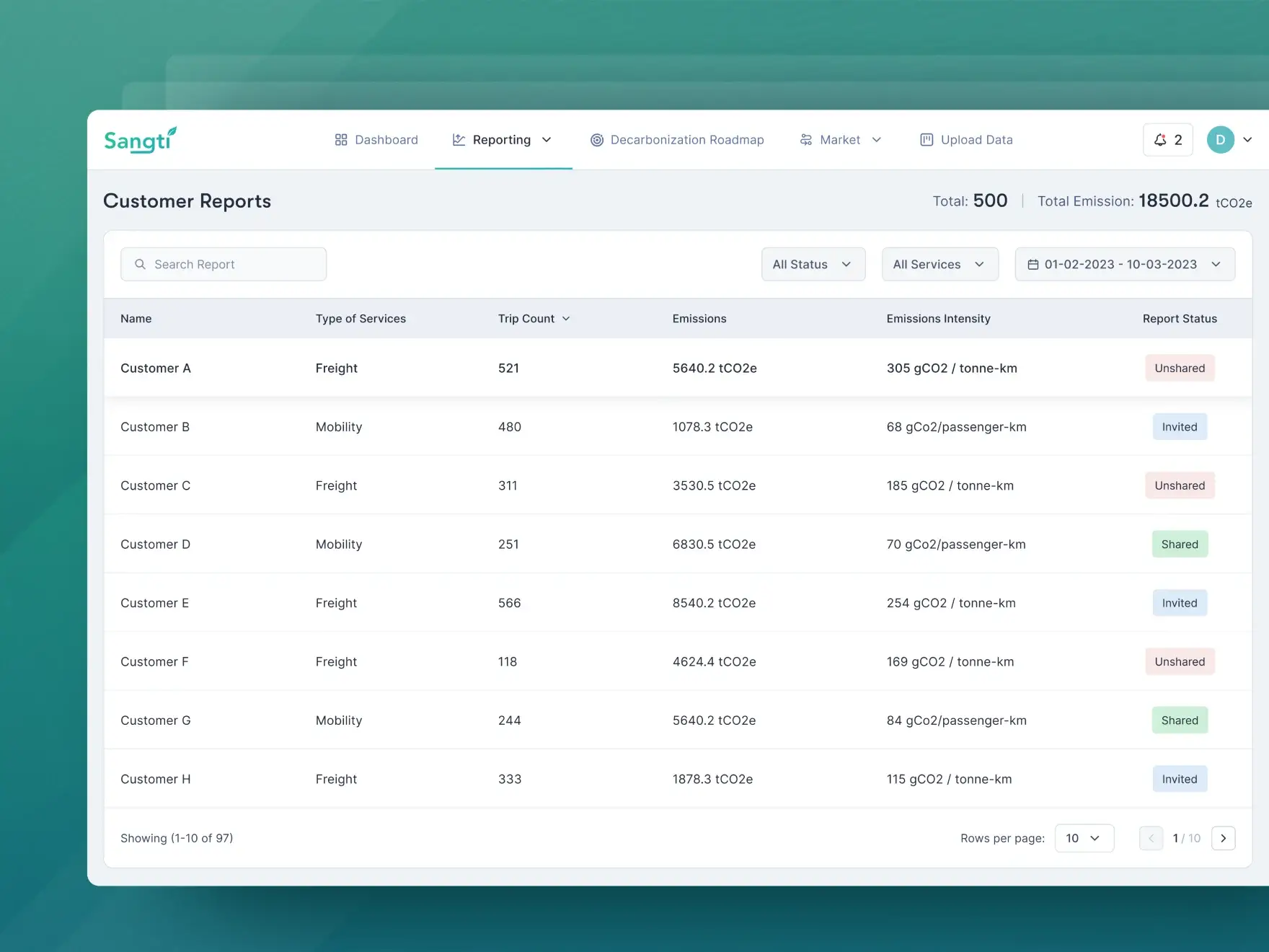
We conducted a substantial transformation of the customer carbon reports page. The initial design was cluttered and disorganized, hindering user accessibility and comprehension.
Our approach included layout restructuring for better organization. The introduction of a report sharing status feature streamlined communication and reduced errors.
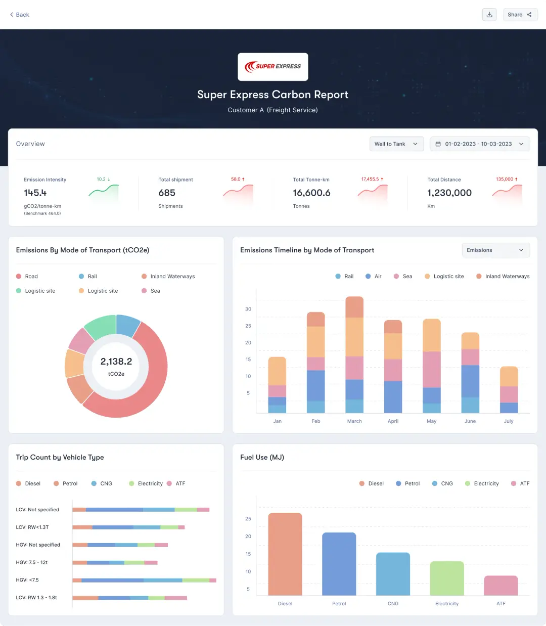
Emphasis on customer logos was enhanced, offering a visually appealing, consistent, and brand-boosting design.
The revamped interface is now highly organized, user-friendly, and aesthetically pleasing, improving both user experience and brand visibility.
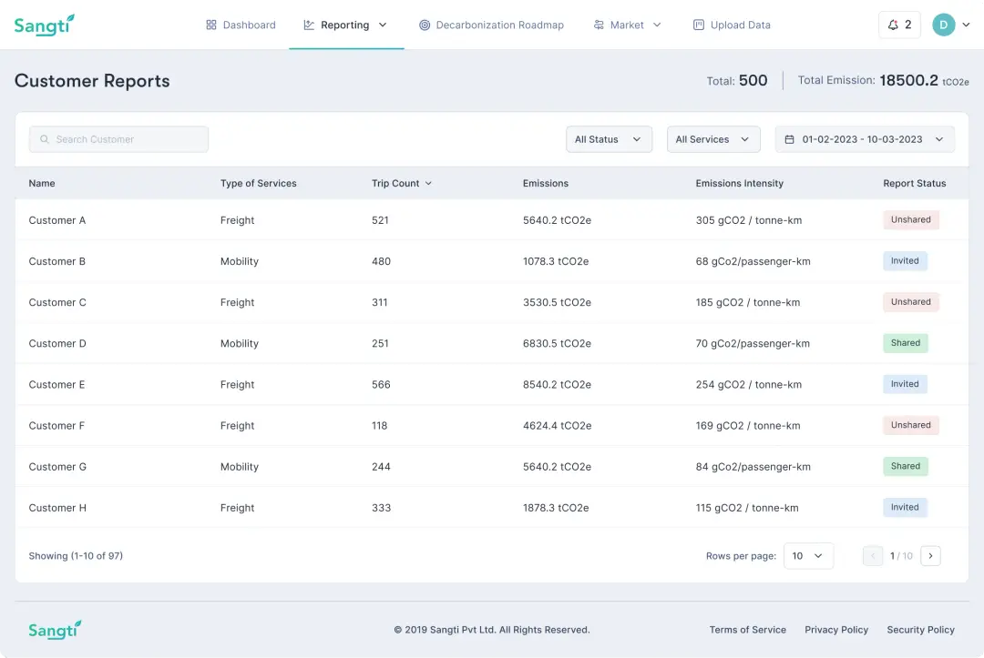
Customer Carbon reports
We conducted a substantial transformation of the customer carbon reports page. The initial design was cluttered and disorganized, hindering user accessibility and comprehension.
Our approach included layout restructuring for better organization. The introduction of a report sharing status feature streamlined communication and reduced errors.
Emphasis on customer logos was enhanced, offering a visually appealing, consistent, and brand-boosting design.
The revamped interface is now highly organized, user-friendly, and aesthetically pleasing, improving both user experience and brand visibility.
Conclusion
The comprehensive redesign of our web application has yielded significant benefits for both with company and user.
We have successfully addressed complex UX/UI challenges and data-related issues that hindered efficient carbon emissions tracking.
The simplified interface has streamlined data entry and retrieval, empowering users to make informed decisions effortlessly.
Efficient data integration ensures complete and accurate insights, enhancing overall data quality.
Transparency and collaboration tools have strengthened partnerships and facilitated faster & intuitive emissions data sharing.
The redesign has improved user satisfaction, productivity, and environmental responsibility, aligning with the shared sustainability goals and helped them do a better job of tracking pollution.

Previous
Next

