Heartsy
A Mobile Dating App
Industry
Mobile
What we did
User Research
UI UX Designing
Design Audit
Platform
Mobile Application
Problem
Many dating apps on the market cater to a broad audience and tend to have a neutral, minimalist interface. This approach often falls flat for extroverts who thrive in lively, energetic, and expressive environments. Other app designs feel basic and generic, creating a dull user experience that doesn't engage or excite extroverted users who crave vibrancy and confidence.
Solution
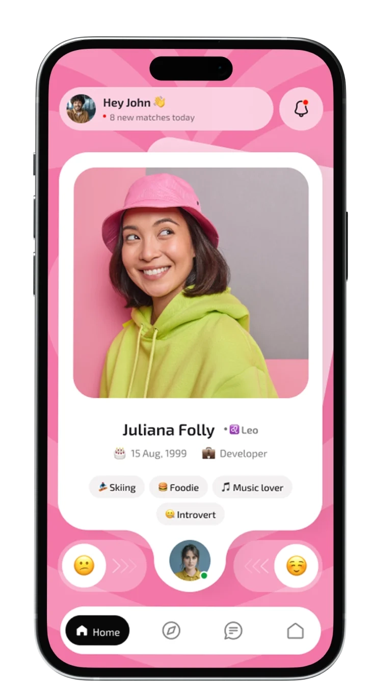
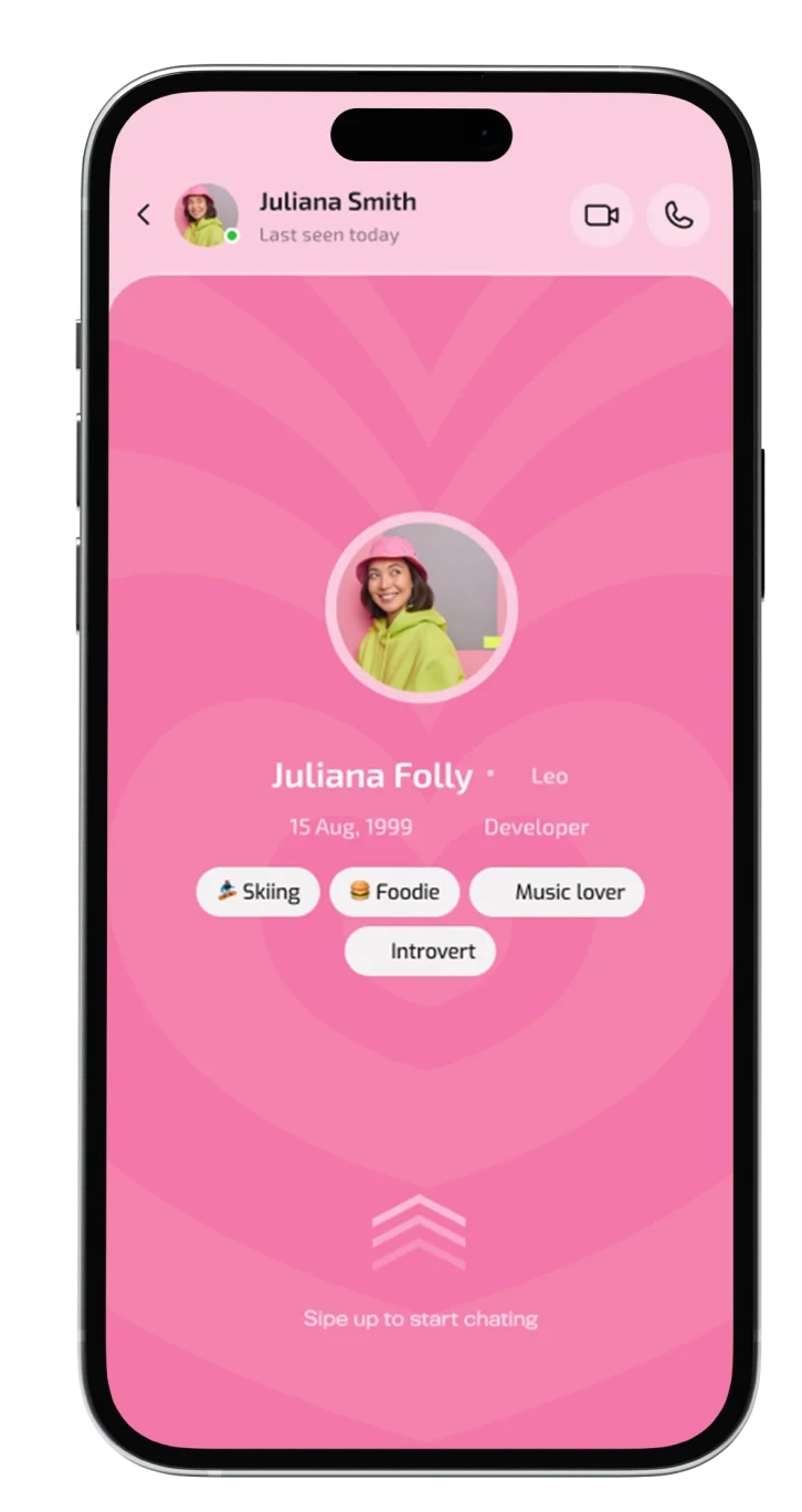
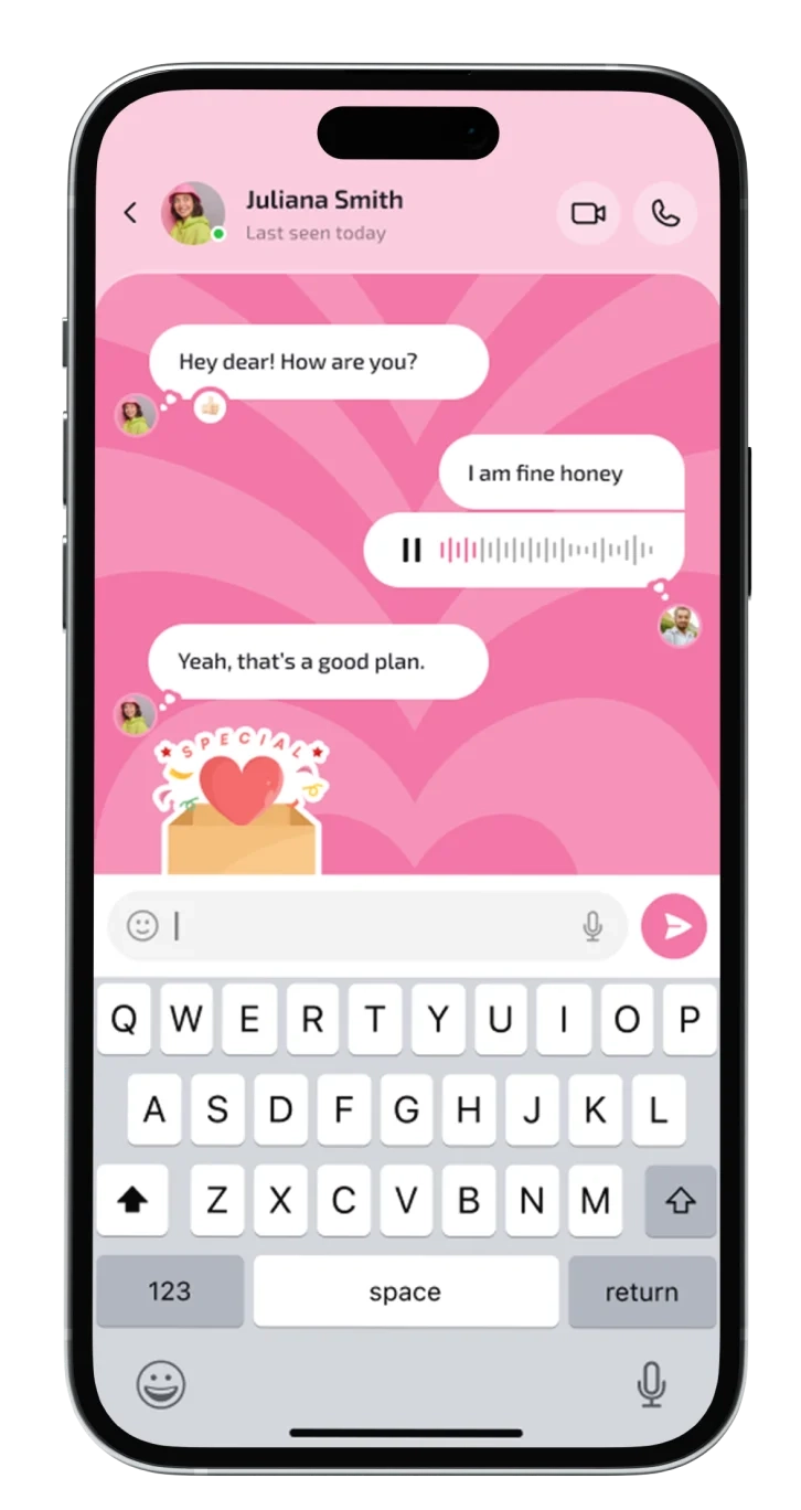
To solve this, we created a dating app with a bold, funky identity designed explicitly for extroverts. The interface is filled with vibrant colors, dynamic animations, and interactive features like flash meetups, group chats, and video introductions that emphasize real-time interactions.
1
Project Brief
What Is Heartsy?
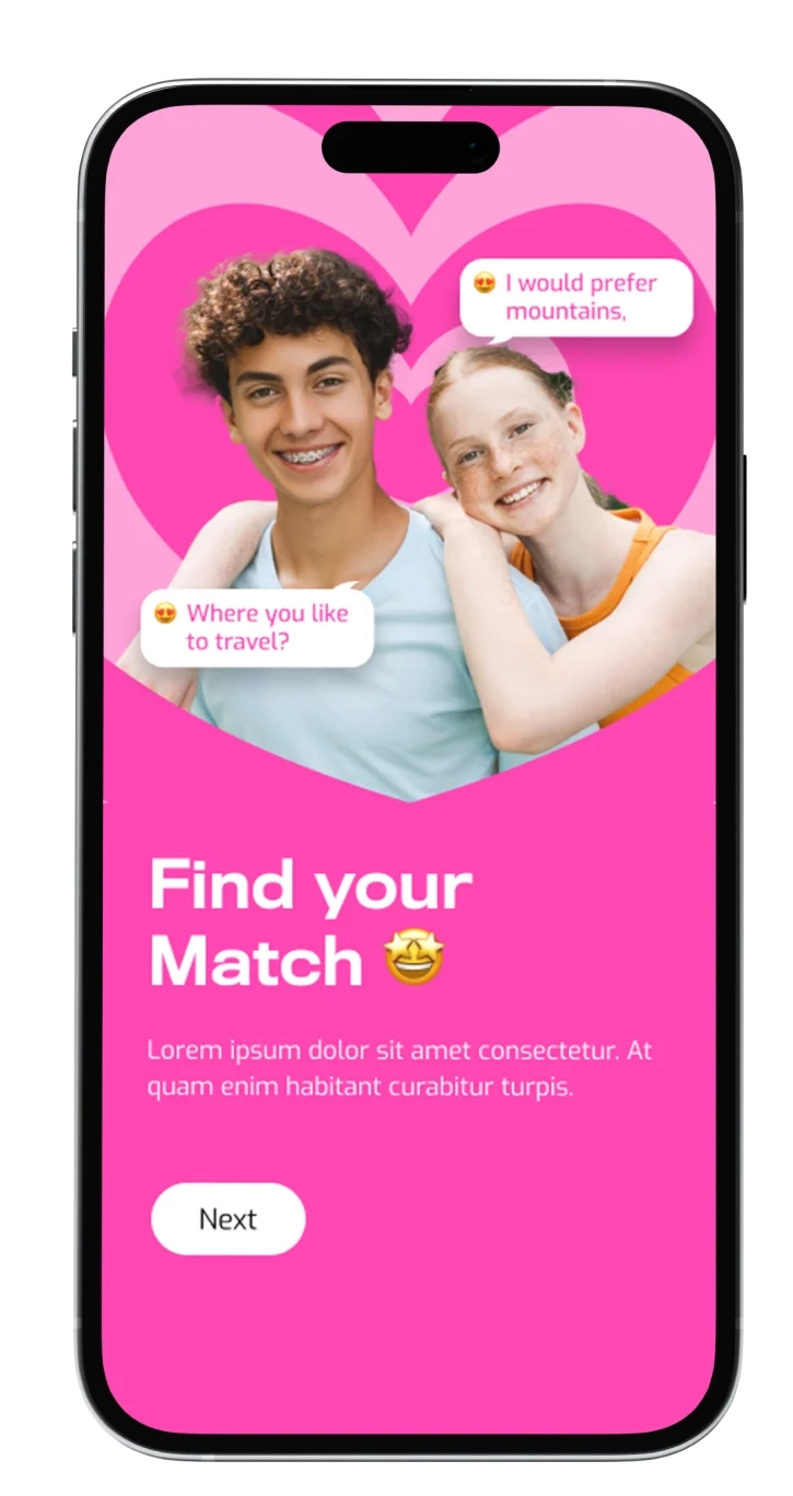
We have designed a bold, vibrant dating app tailored for extroverts, focusing on energetic and socially interactive experiences. The app’s design breaks from typical dating apps' neutral, minimalist style, offering a lively visual identity with bright colors, playful typography, and dynamic animations.
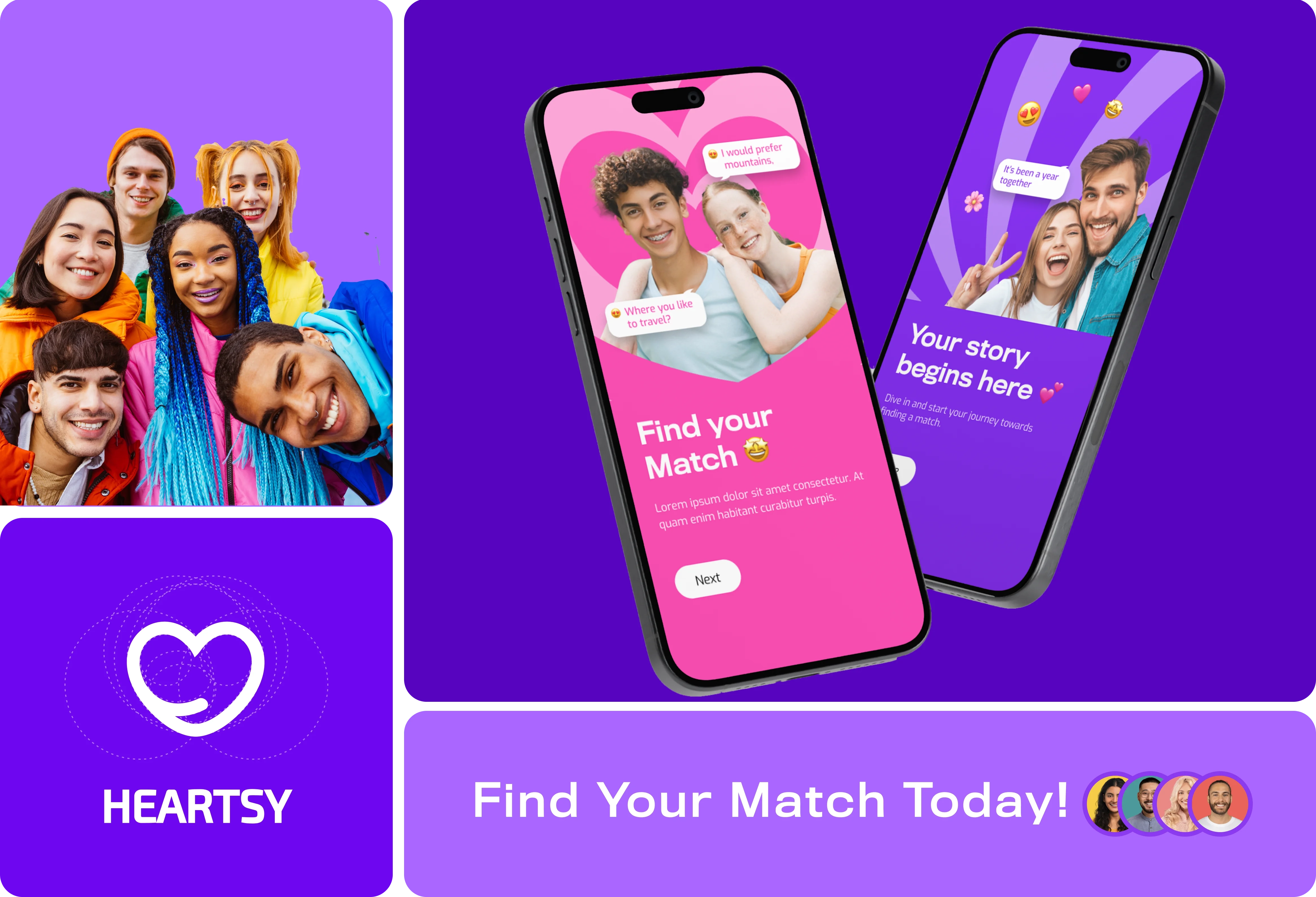
A Bold Identity Dating App
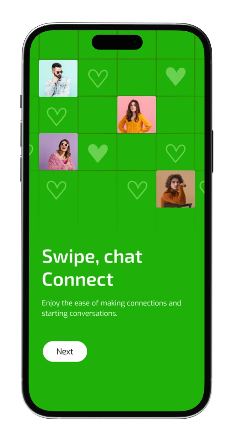
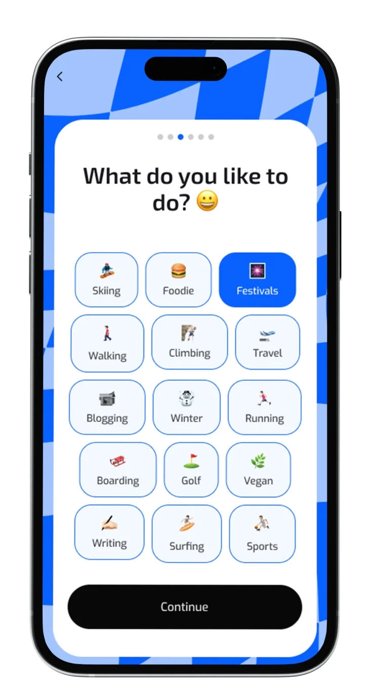
The app has features like matching users' profiles with accurate onboarding and connecting them with like-minded personalities. These features will encourage extroverts to be bold and social, differentiating the app from traditional platforms.
2
Project Research
Survey
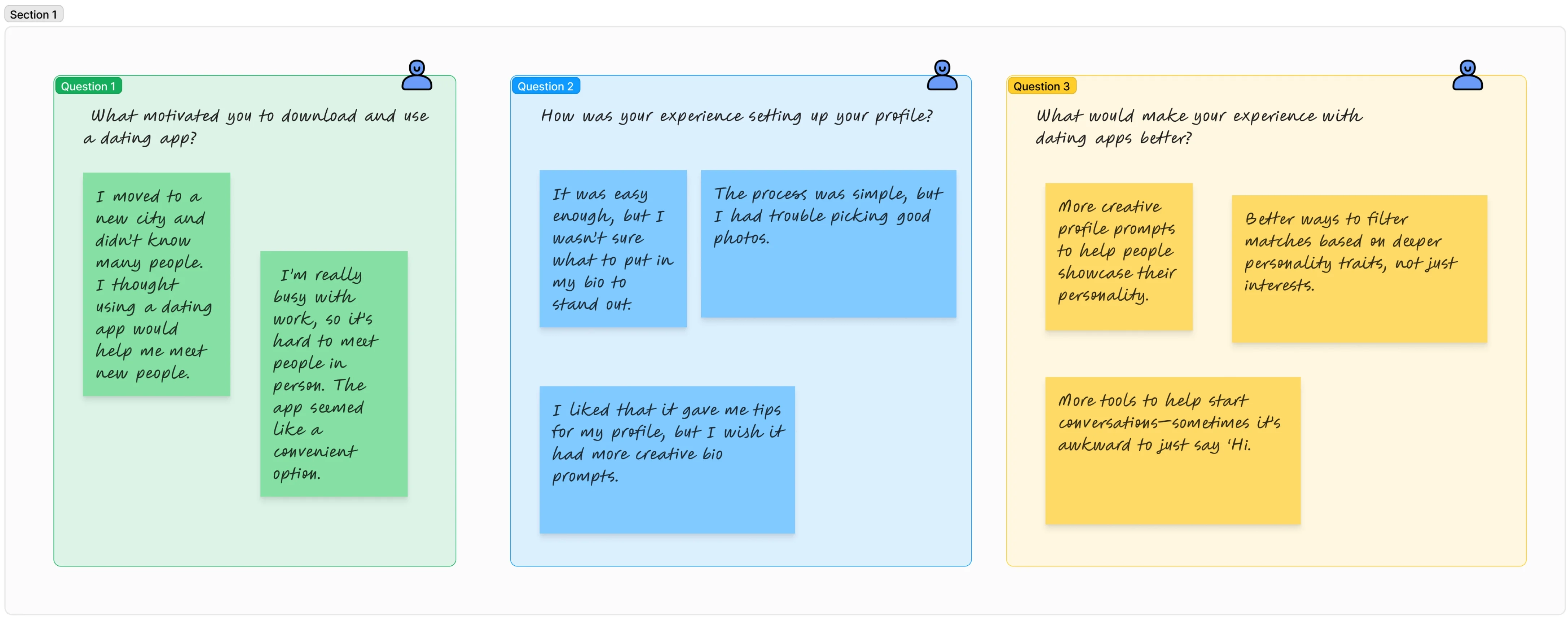
User interviews are essential for gathering valuable insights into user needs and preferences. This process allows us to identify specific requirements, ensuring the final product resonates with the target audience.
User interviews
Data analysis
3
Observations
User Personas
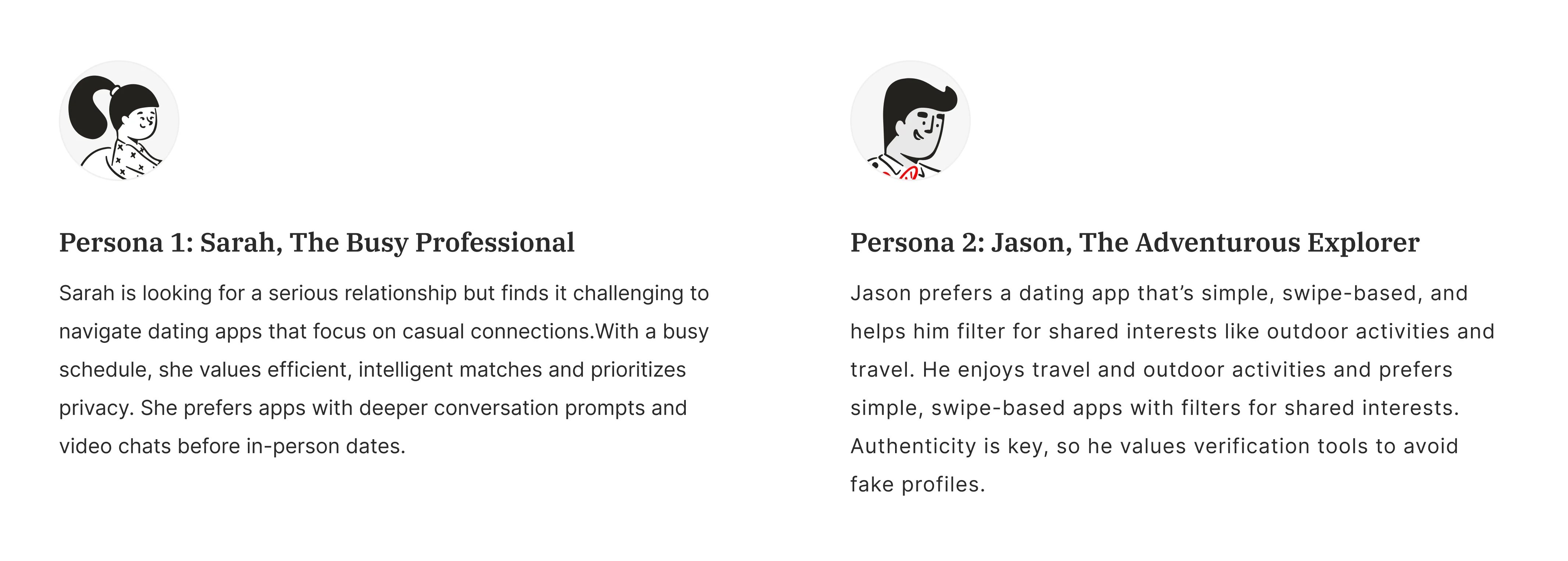
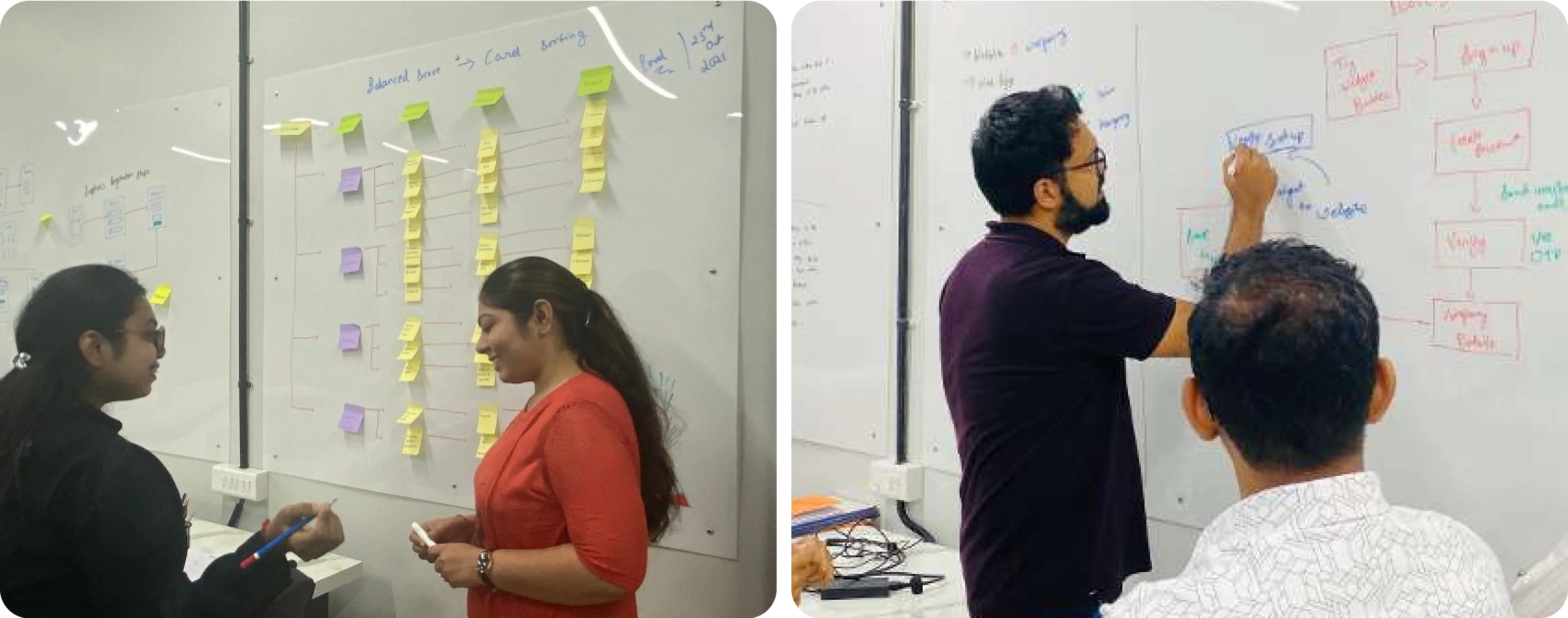
A user persona is a detailed representation of a target user based on research and observations about their behaviors, preferences, and needs. This prevents disconnection and enhances overall engagement with the final product.
User Personas
User Journey Mapping
Jobs-to-be-Done
4
Wireframes
Sketching & Wireframing
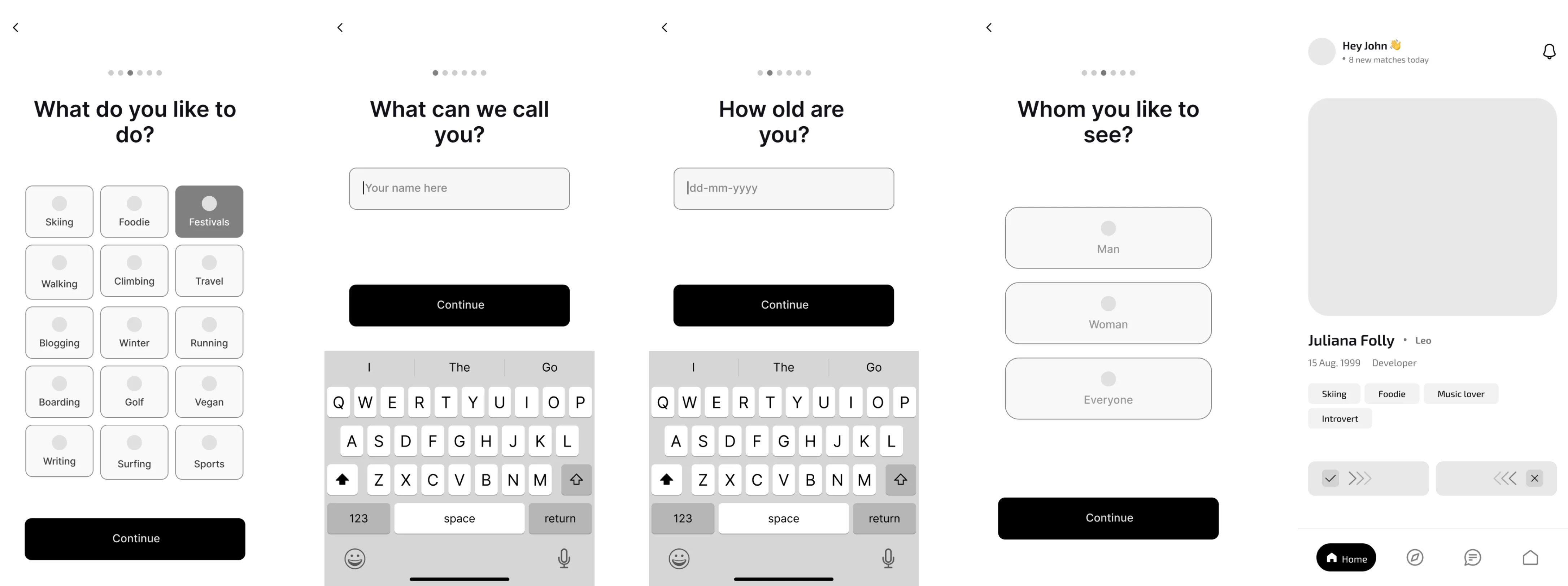
We created simple sketches to outline the layout and functions of each page on the platform. These blueprints helped us visualize how the user interface would look and work for this ecommerce platform, allowing us to make changes before moving on to the final design.
Wireframes
Prototyping
5
Moodboard
Colors
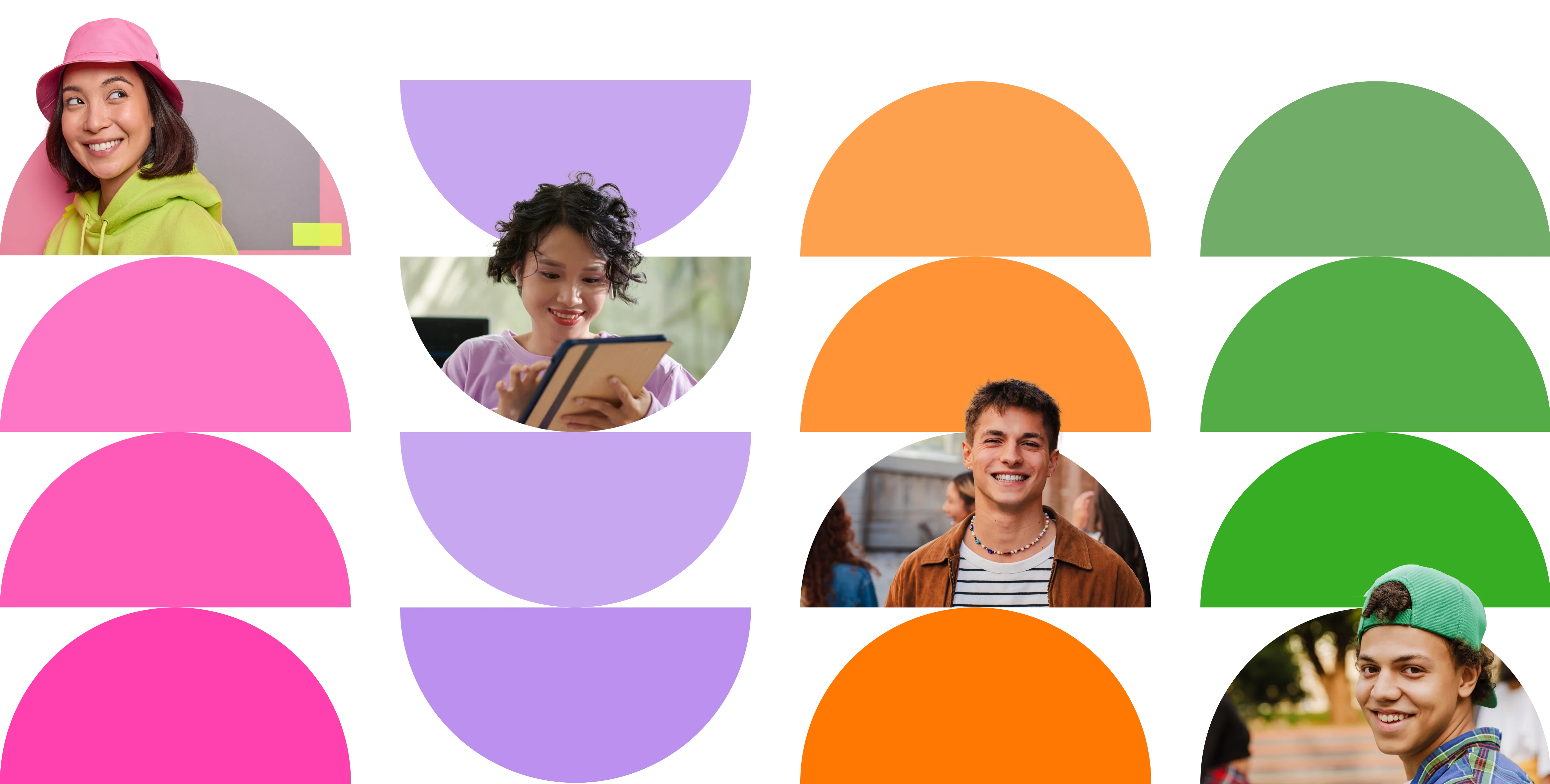
We chose a bold color palette with bright tones like electric blue, vibrant orange, and neon pink to evoke excitement and confidence. These colors reflect the lively nature of extroverts, ensuring the app is visually stimulating and engaging.
Patterns
We incorporated diverse patterns that change with each card, allowing users to personalize their experience and feel a sense of belonging across different genres. Users can easily modify their mood boards to reflect their current vibes and self-expression.

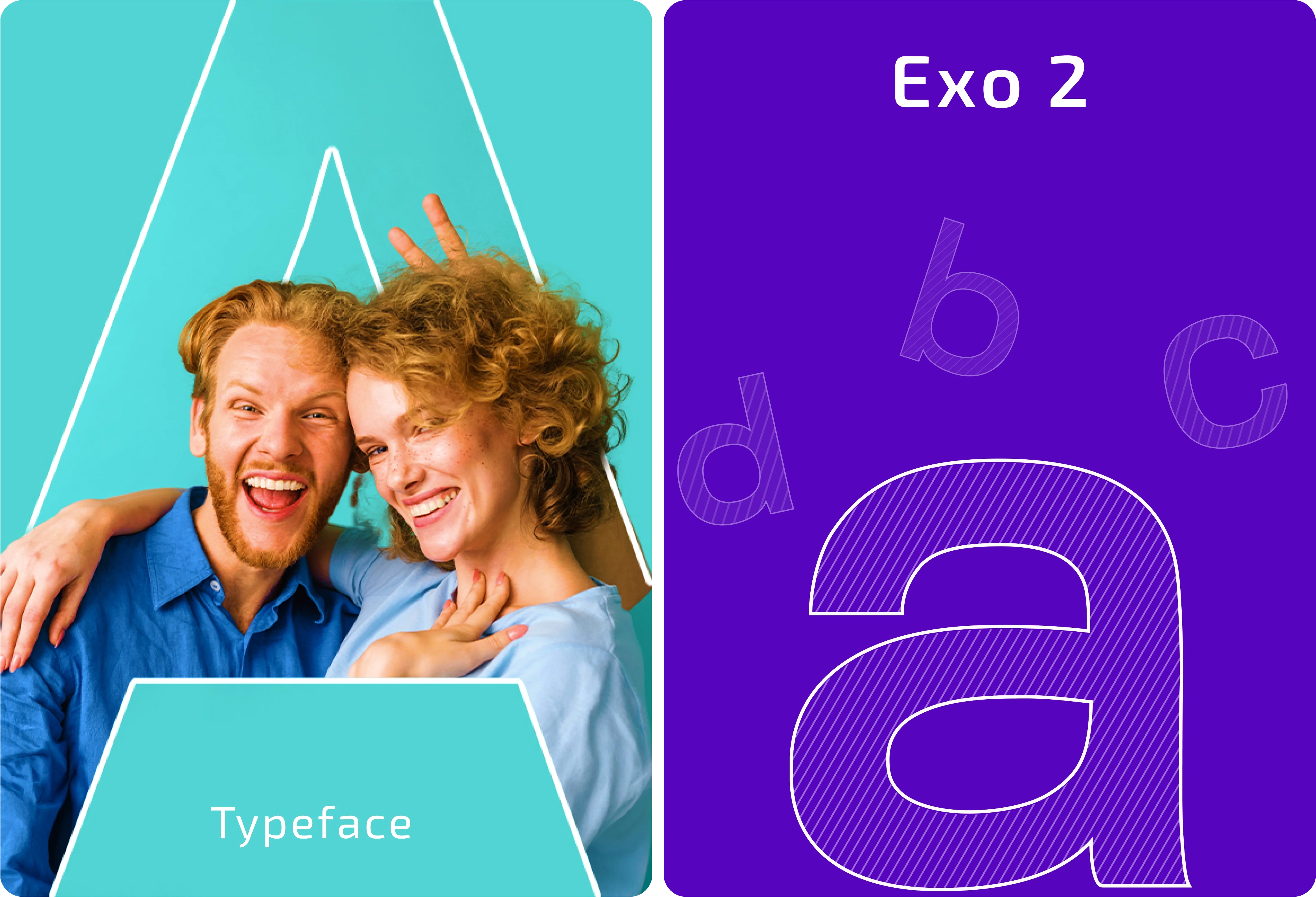
Typography
A bold sans serif typography conveys a modern and approachable feel. This clean, straightforward font enhances readability while reflecting extroverted users' confident, lively personalities.
6
Interface
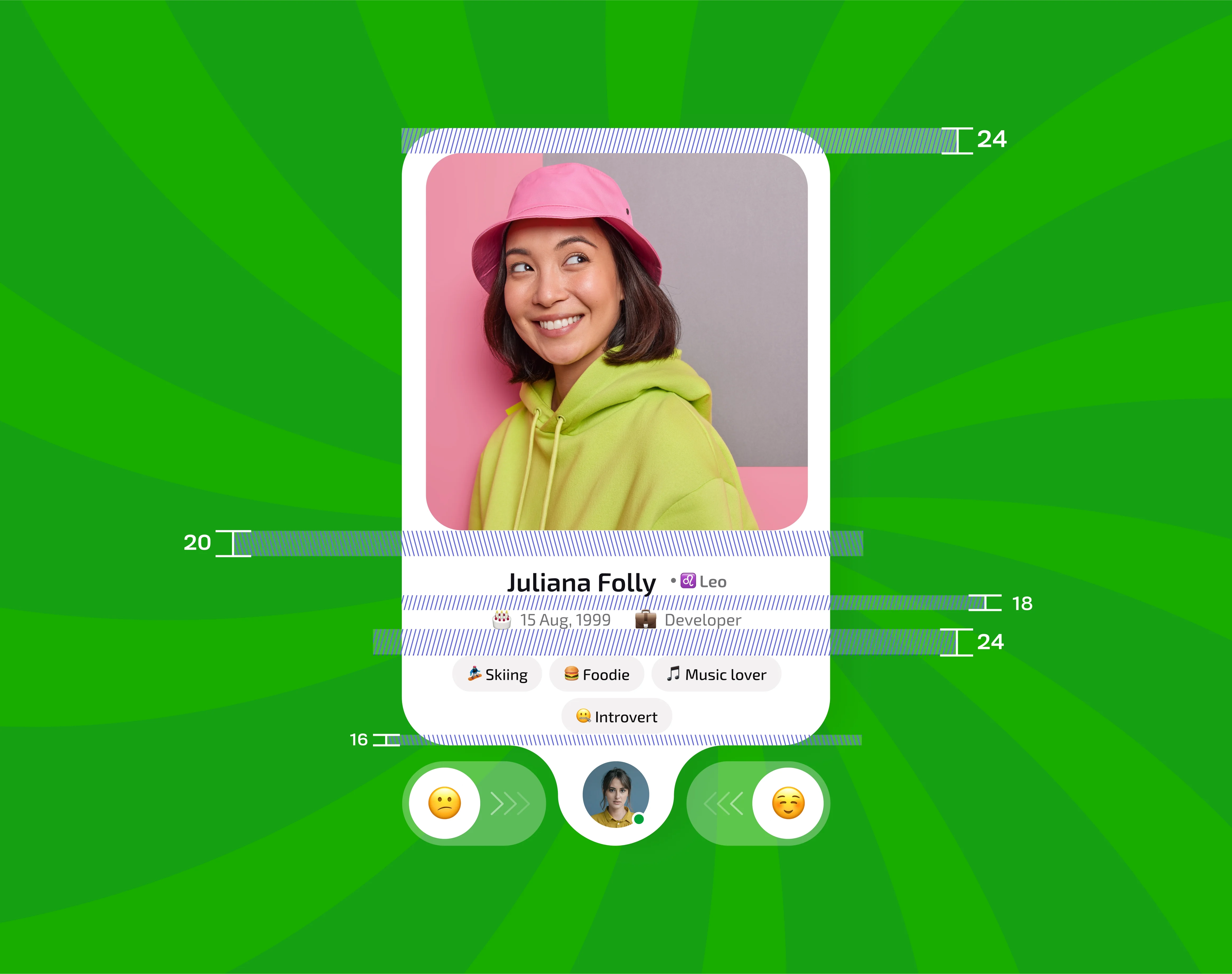
Grids & Proximity
Consistent spacing and margins are crucial to creating a balanced layout that enhances usability and visual appeal. This thoughtful use of grids and proximity ensures that elements are organized, allowing users to feel consistency across the application.
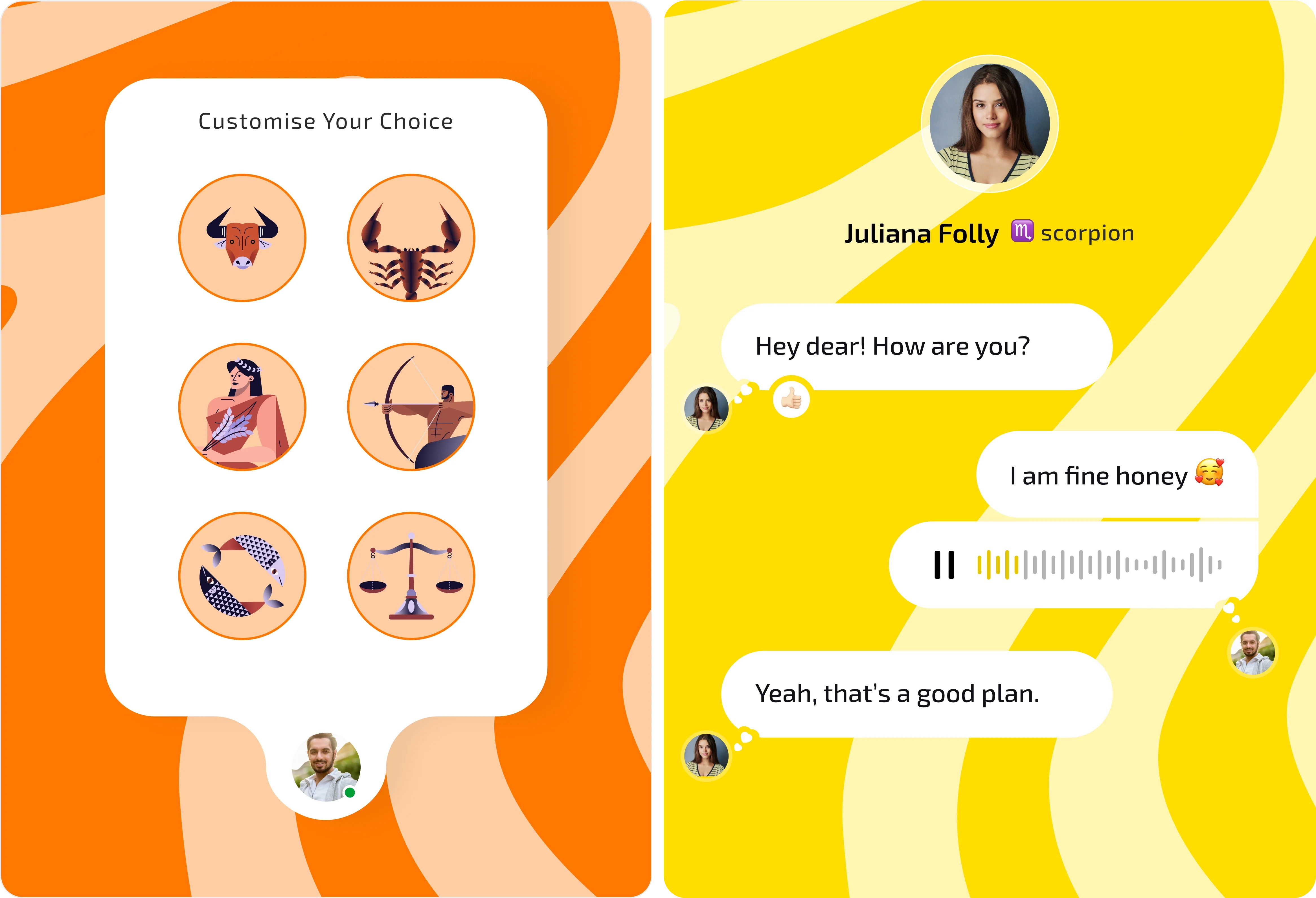
Iconography
We wanted users to connect with real-life examples, so we picked up an icon library that resonates with real-world emotions. This approach enhances the user experience and ensures that future designs can adapt while maintaining a cohesive visual theme.
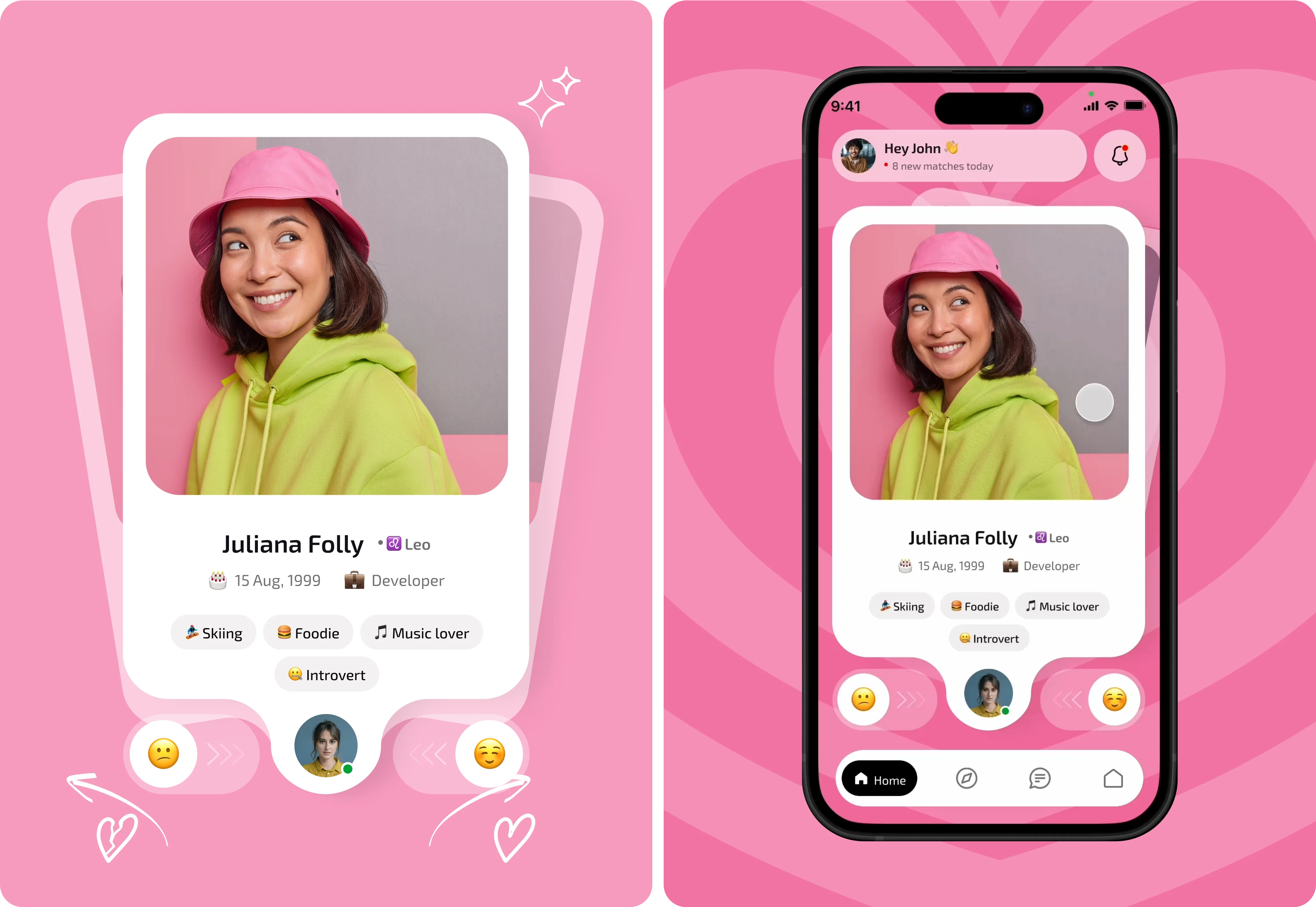
Micro Animations
Incorporating micro animations into the interface enhances user engagement and provides visual feedback during interactions.
7
Outcome
Social Space For Extroverts
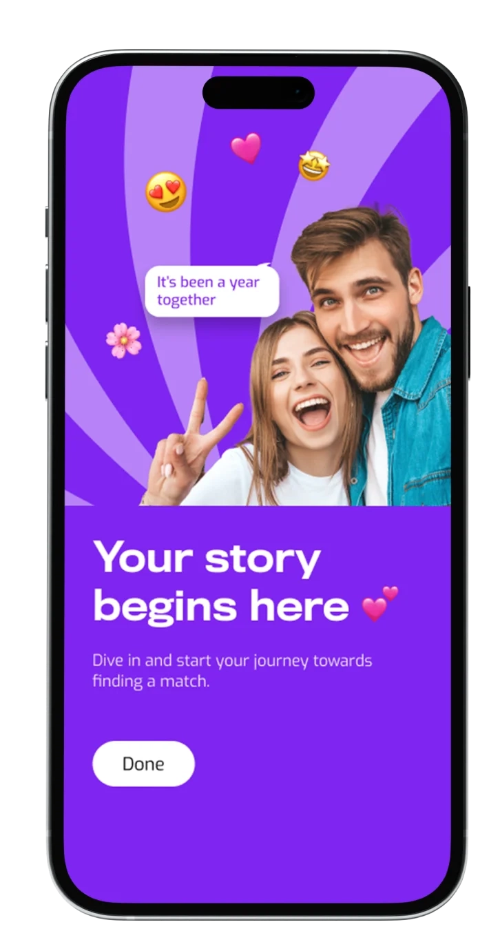
The outcome of this application is a vibrant dating app that resonates deeply with our user base. It features bold visuals and engaging interactions. By prioritizing user preferences, we created a dynamic mobile app that fosters genuine connections and encourages self-expression.
Conclusion
- This bold identity dating app allows users to find their match through features designed for extroverted interactions efficiently.
- This approach enhances matchmaking and fosters a community where extroverts can feel at home, encouraging genuine connections and friendships.
- The app employs a unique algorithm that prioritizes compatibility based on shared interests and social preferences, enabling users to connect with like-minded individuals.
- The app offers interactive icebreakers and conversation starters to facilitate engaging and meaningful conversations between users.
- Additionally, users can create personalized profiles that showcase their vibrant personalities through curated mood boards, highlighting their hobbies, preferences, and unique styles.

Previous
Next

