InboxPro
An E-mail Management Application
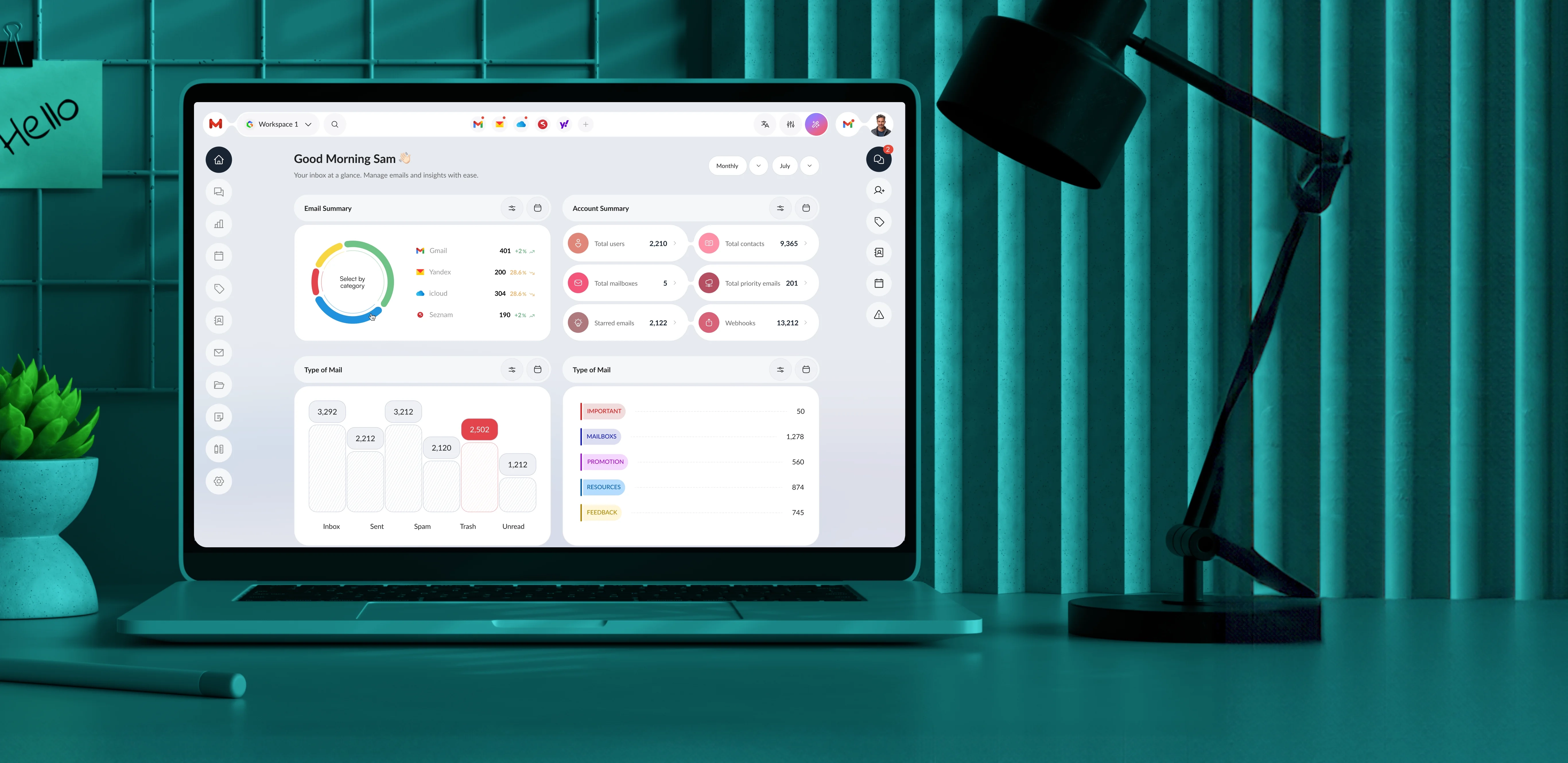
Industry
SaaS
What we did
Product Development
UI UX Designing
UI Development
Platform
Web Application
Problem
As a busy professional, managing emails from multiple sources can be overwhelming. Constant notifications from various email providers can cause essential messages to get lost in the noise, making it challenging to stay organized. Without a unified system, tracking conversations and prioritizing tasks becomes difficult.
Solution
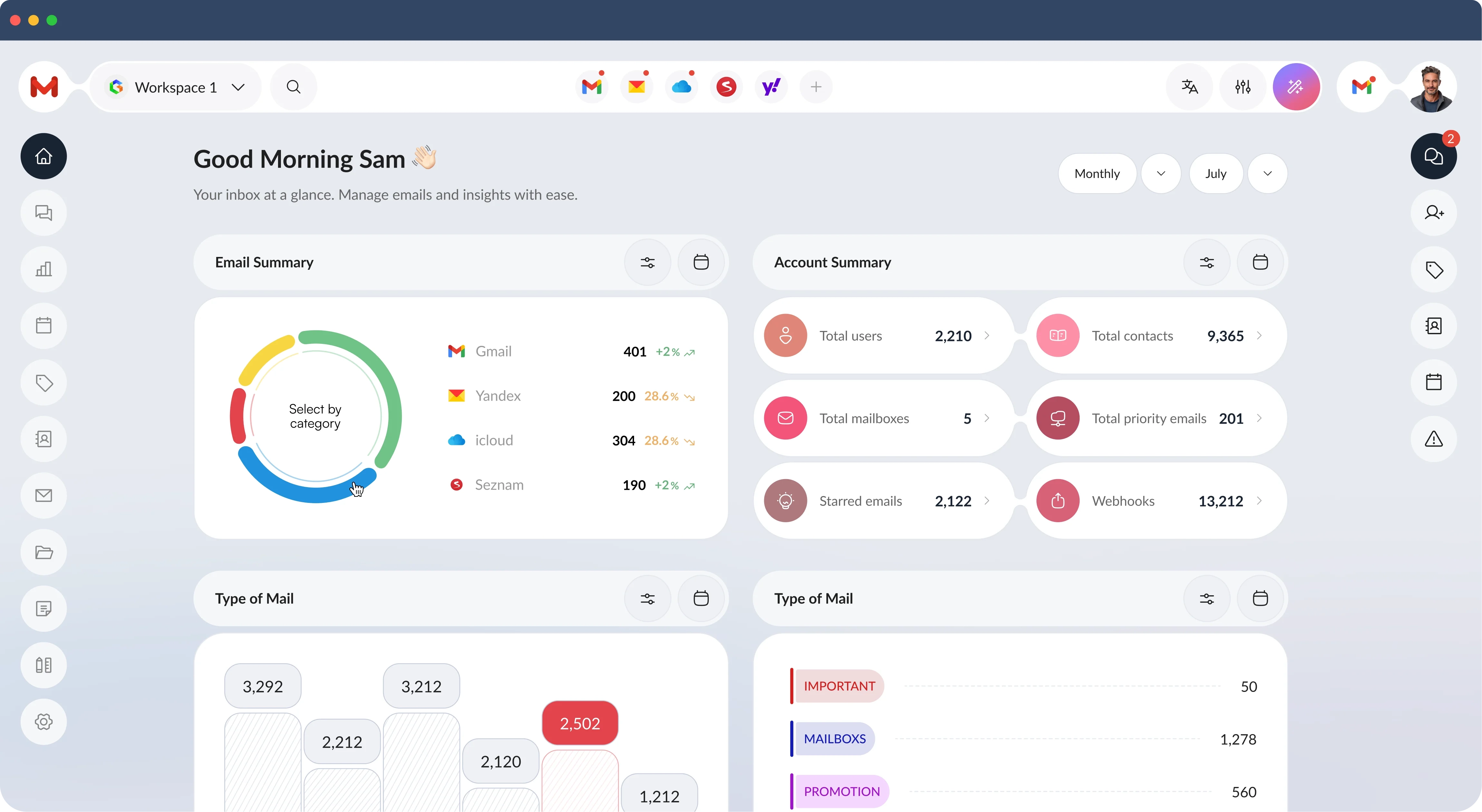
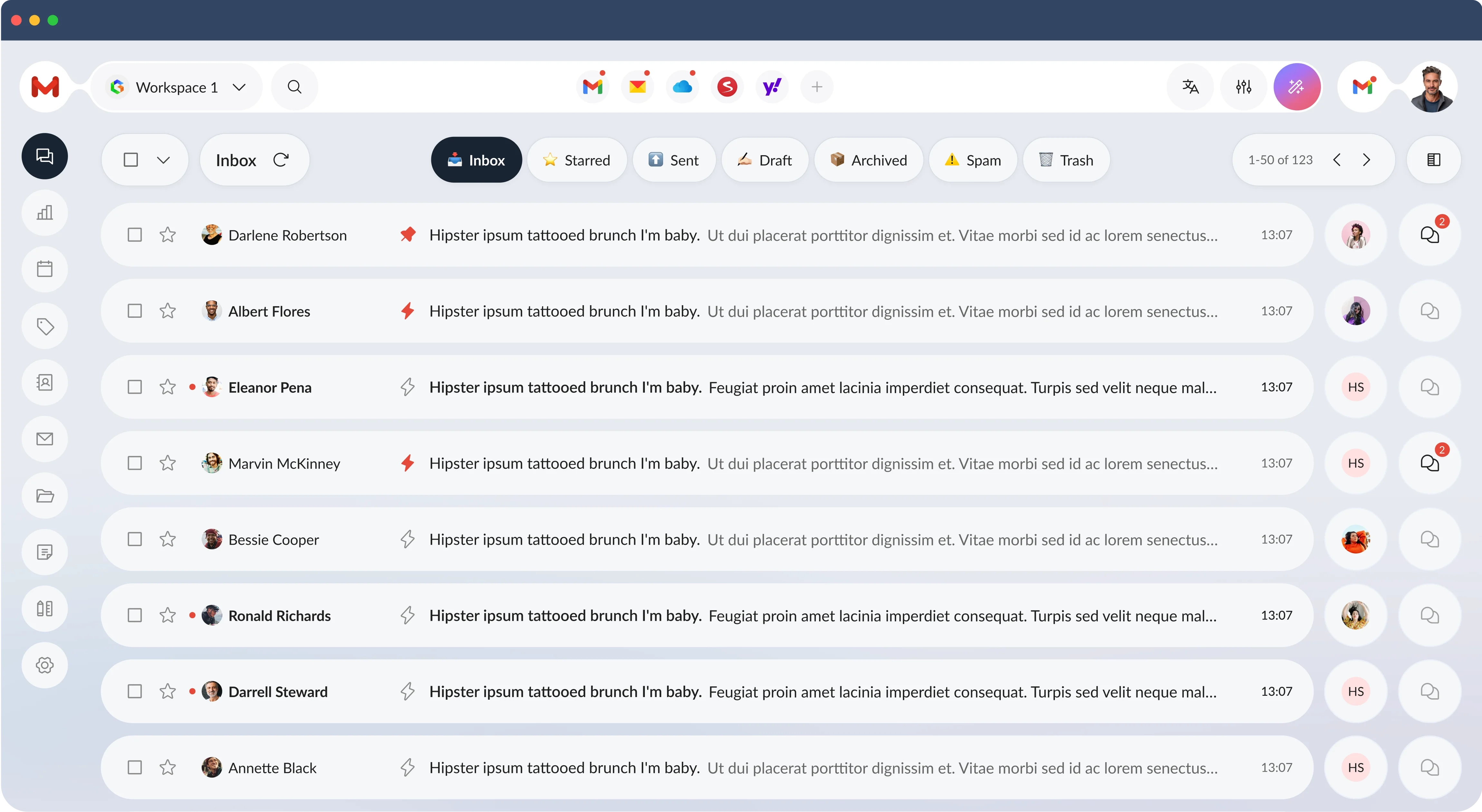
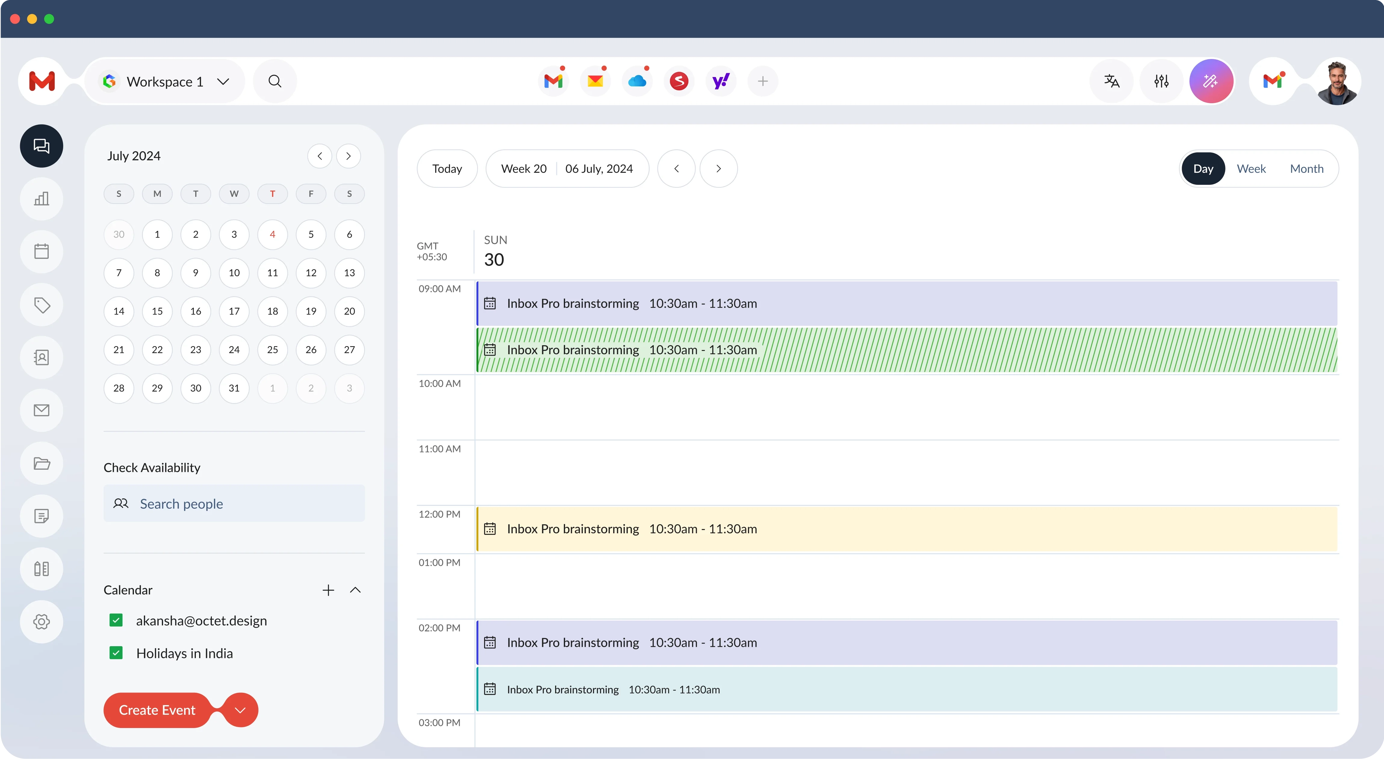
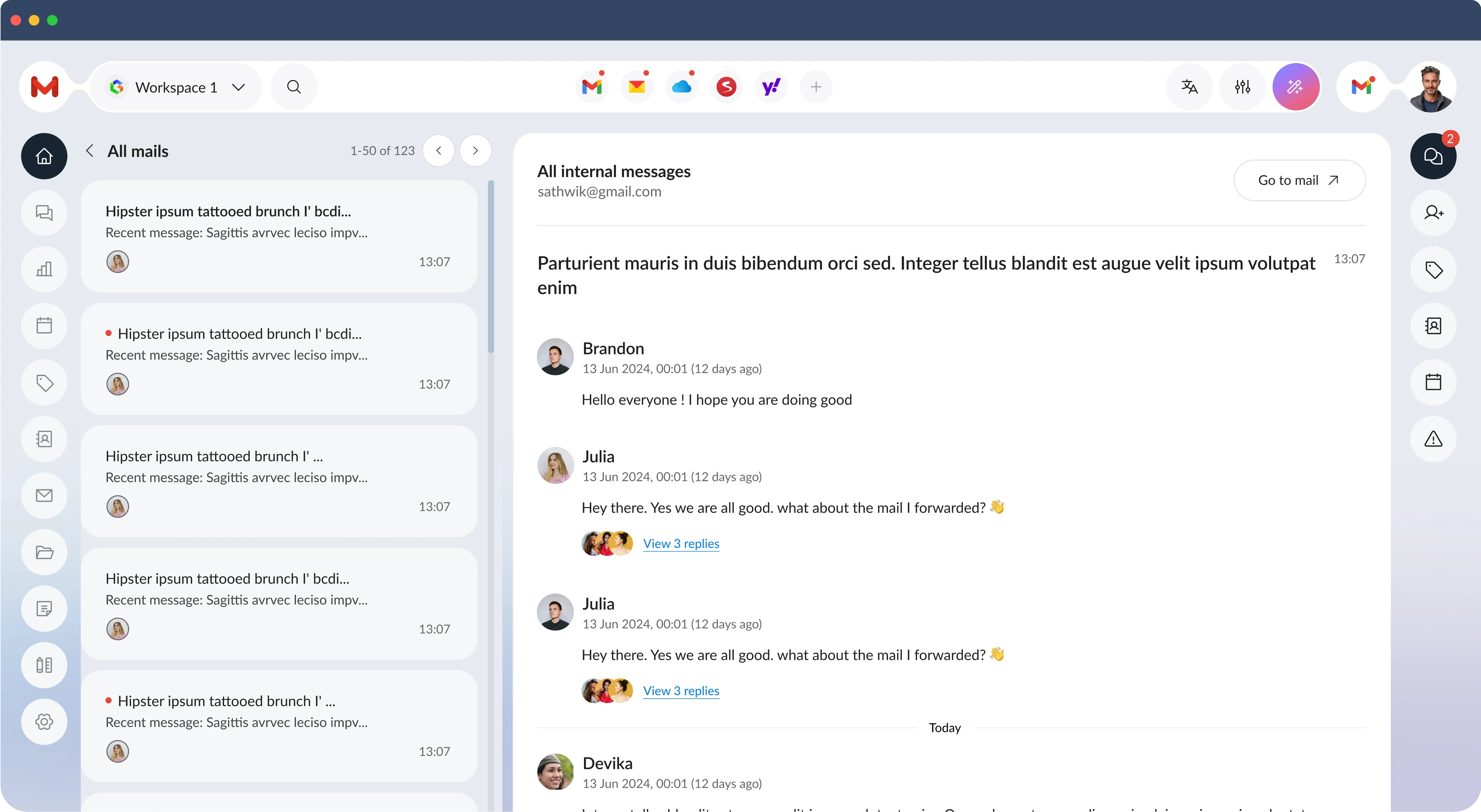
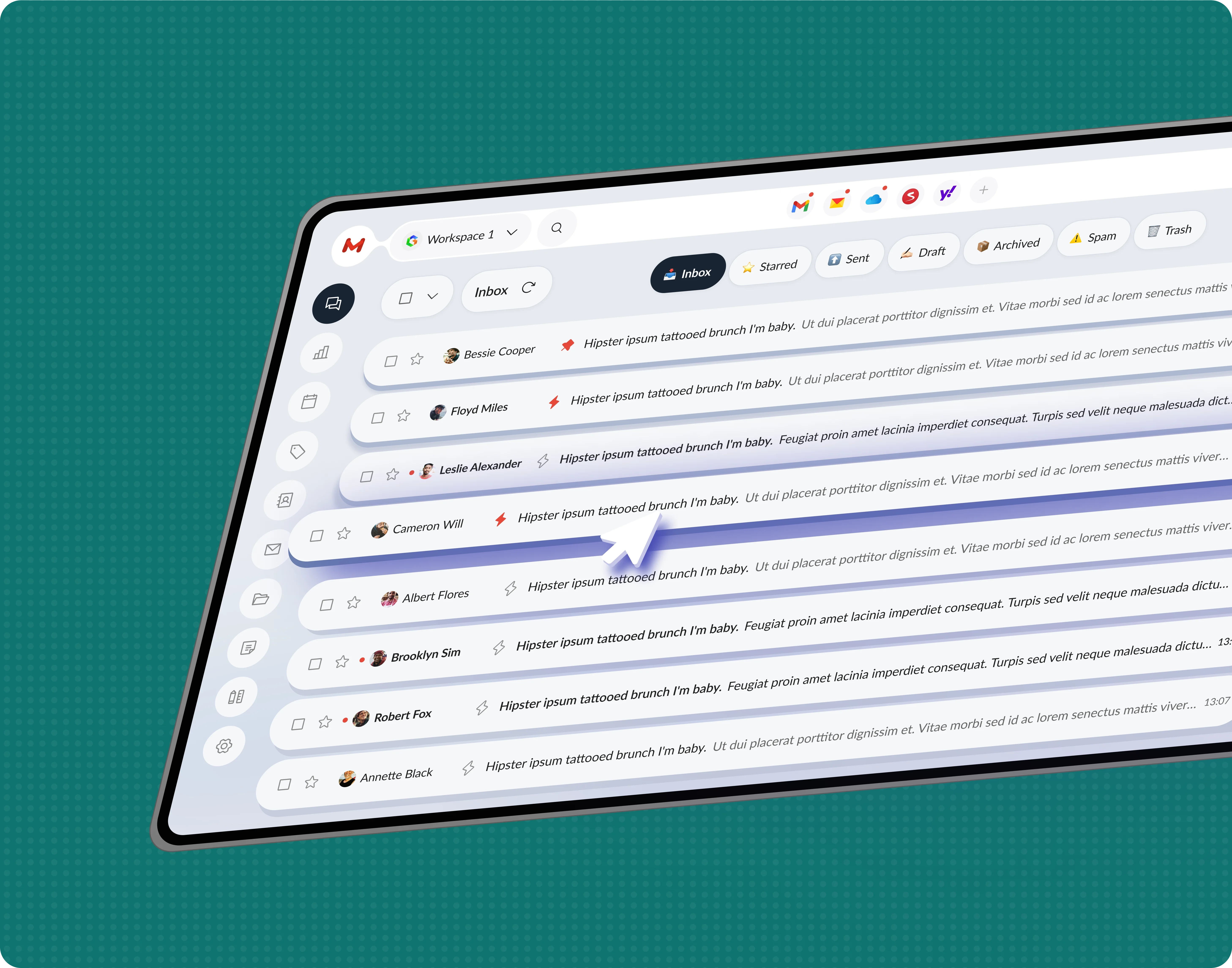
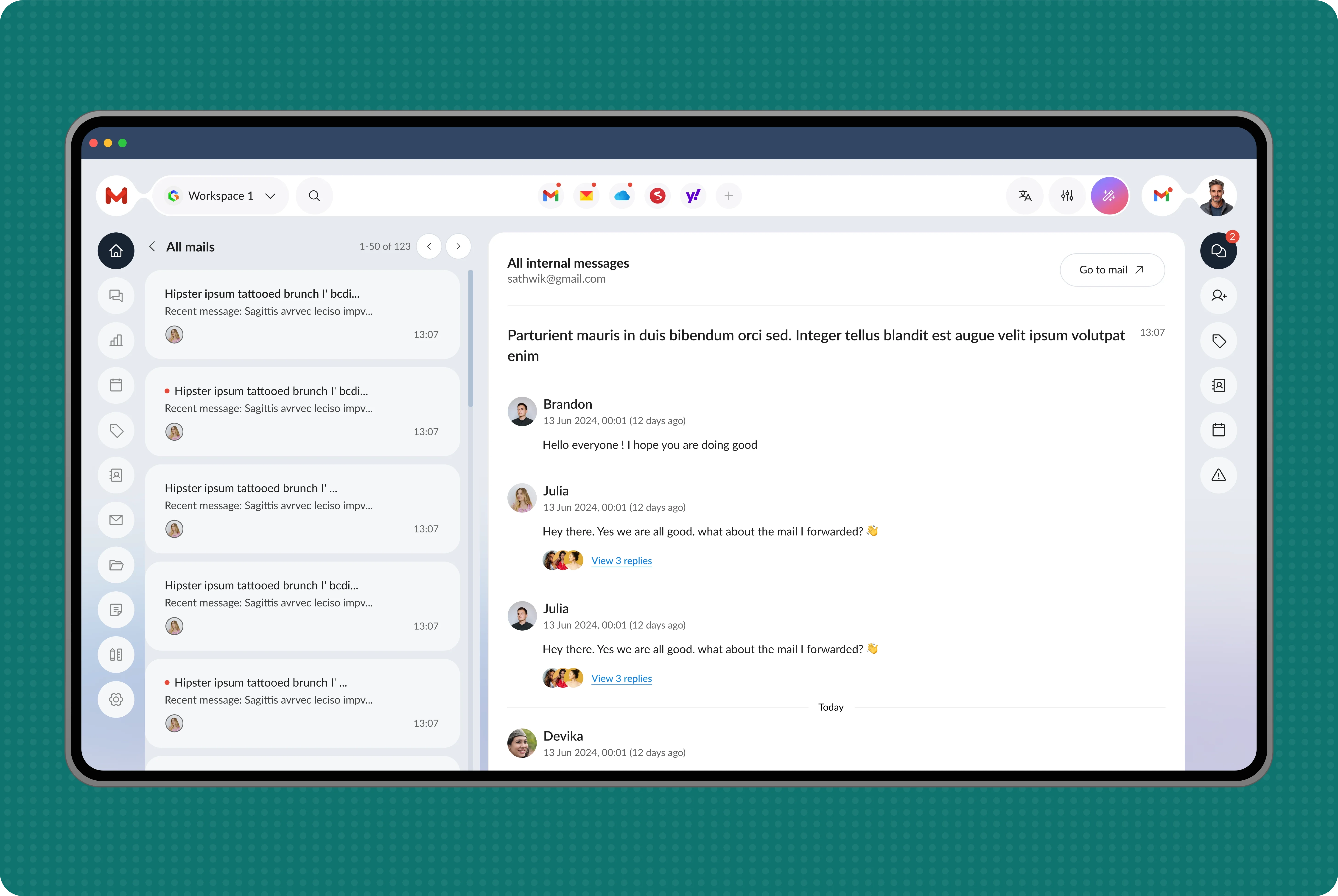
We designed this email management app to allow users to integrate multiple email providers into one centralized platform. This unified solution enables users to access and manage all their emails in one place, eliminating the need to switch accounts.
1
Project Brief
What Is InboxPro?
We have designed an innovative email management app integrating multiple email providers into one centralized platform. This app allows busy professionals to access emails from various accounts in a single interface, simplifying the management process.
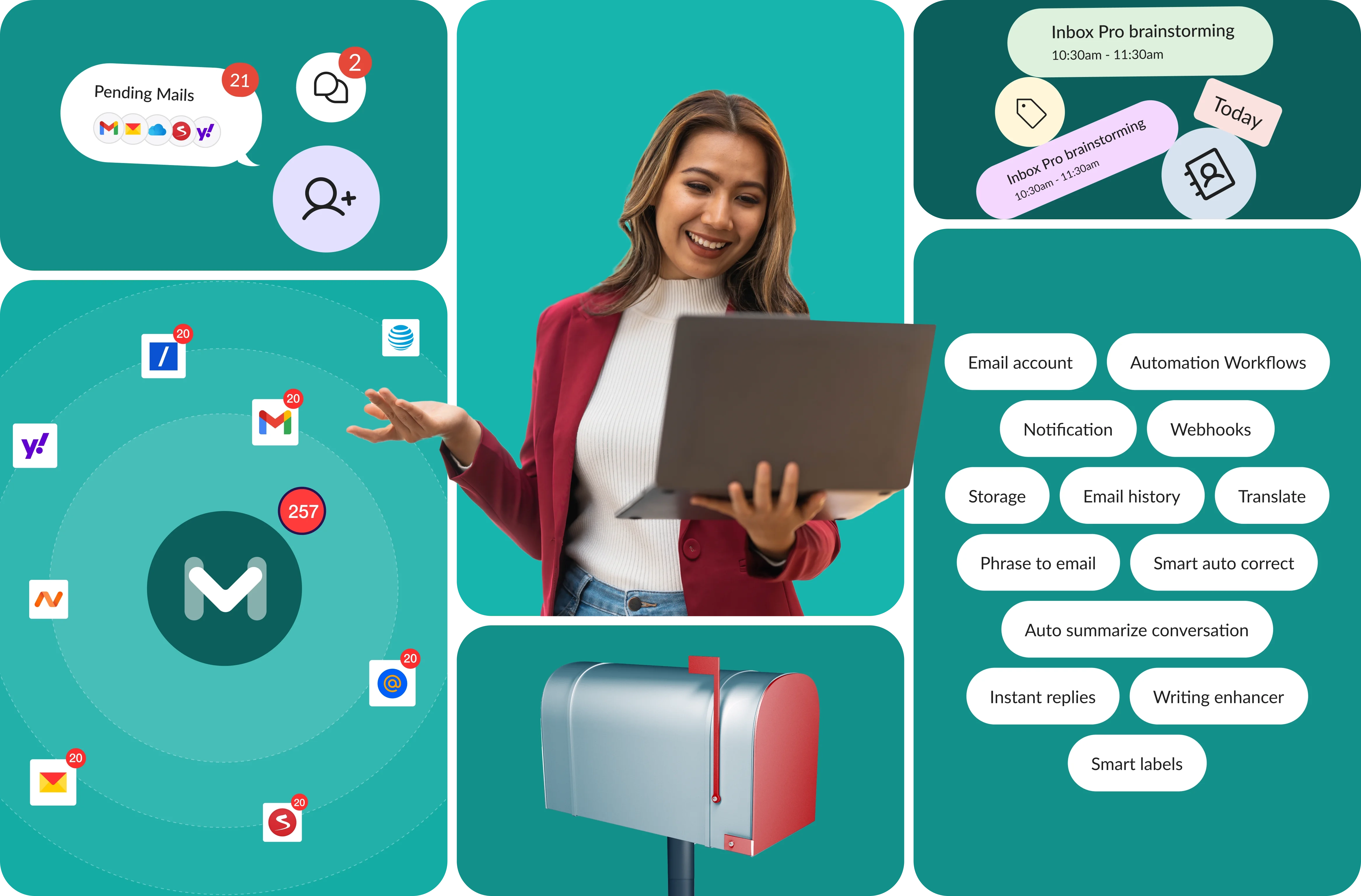
All-in-One Email Management App
Effortlessly integrate and manage emails from multiple providers in a single platform, designed for busy professionals to stay organized and productive.
2
Research
Survey
User interviews are essential for gathering valuable insights into user needs and preferences. This process allows us to identify specific requirements, ensuring the final product resonates with the target audience.
Kick-off Questions
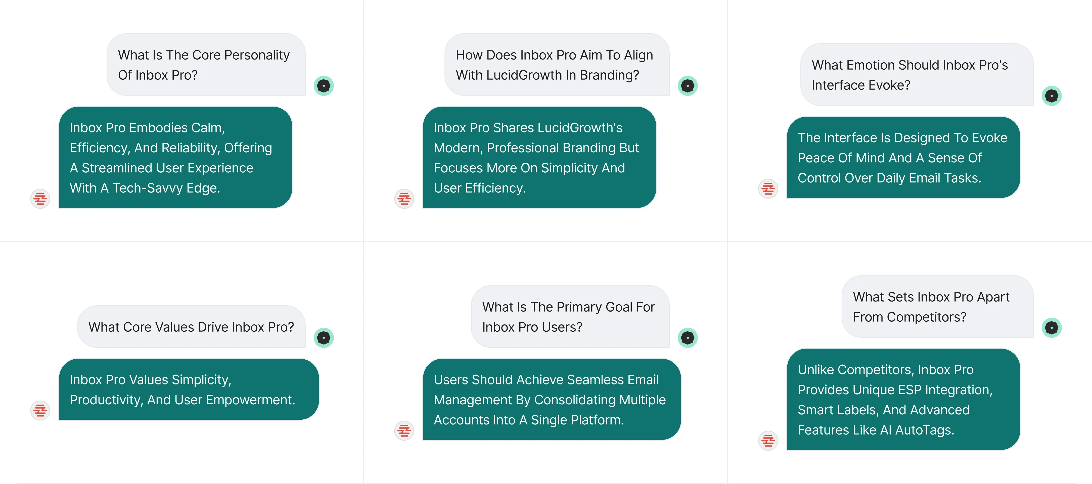
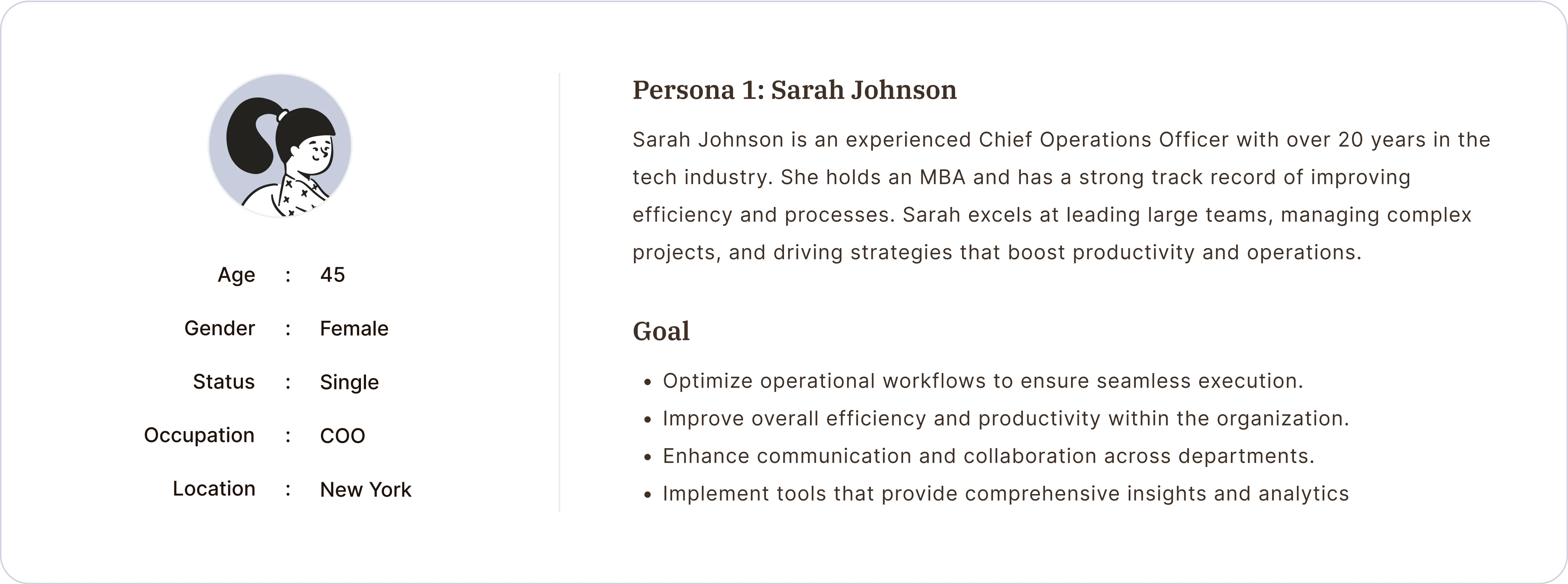
User Personas
3
Observation
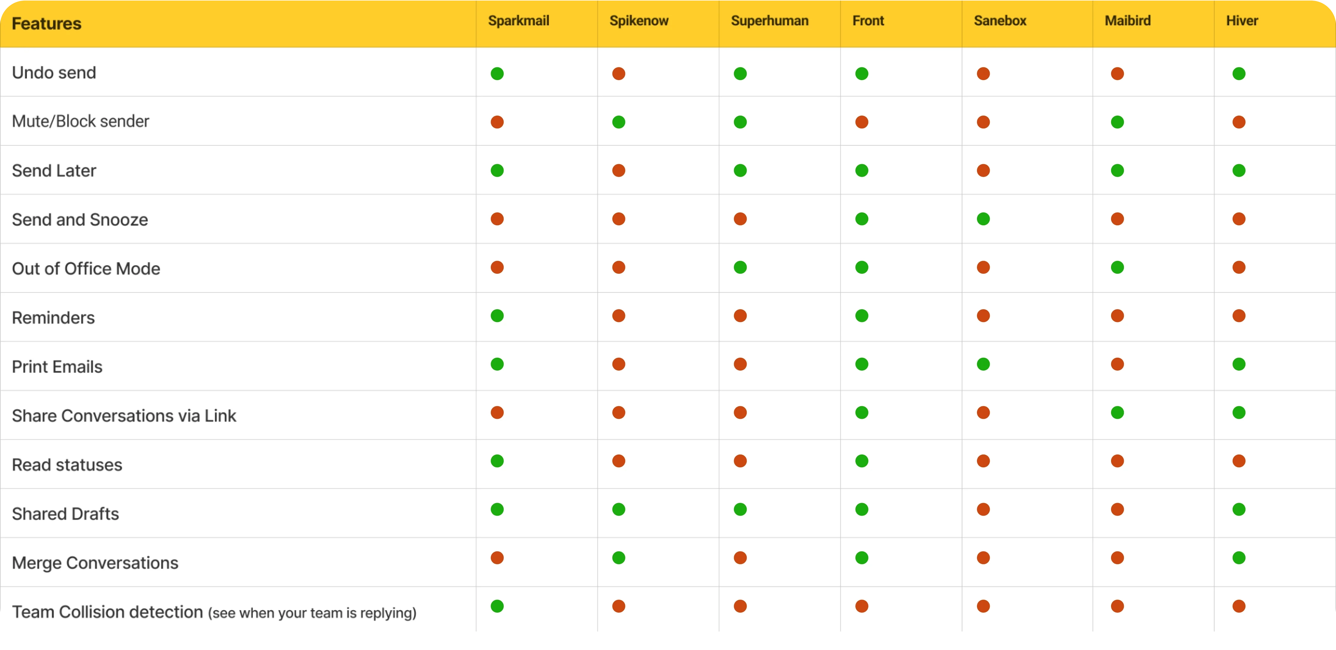
Competitor Research & Feature Listing
Competitor research is essential for identifying existing email management features and pinpointing gaps our app can fill. By analyzing competitors, we can understand user preferences and recognize areas where the solutions lack integration or user experience.
Competitor Research
Features Listing
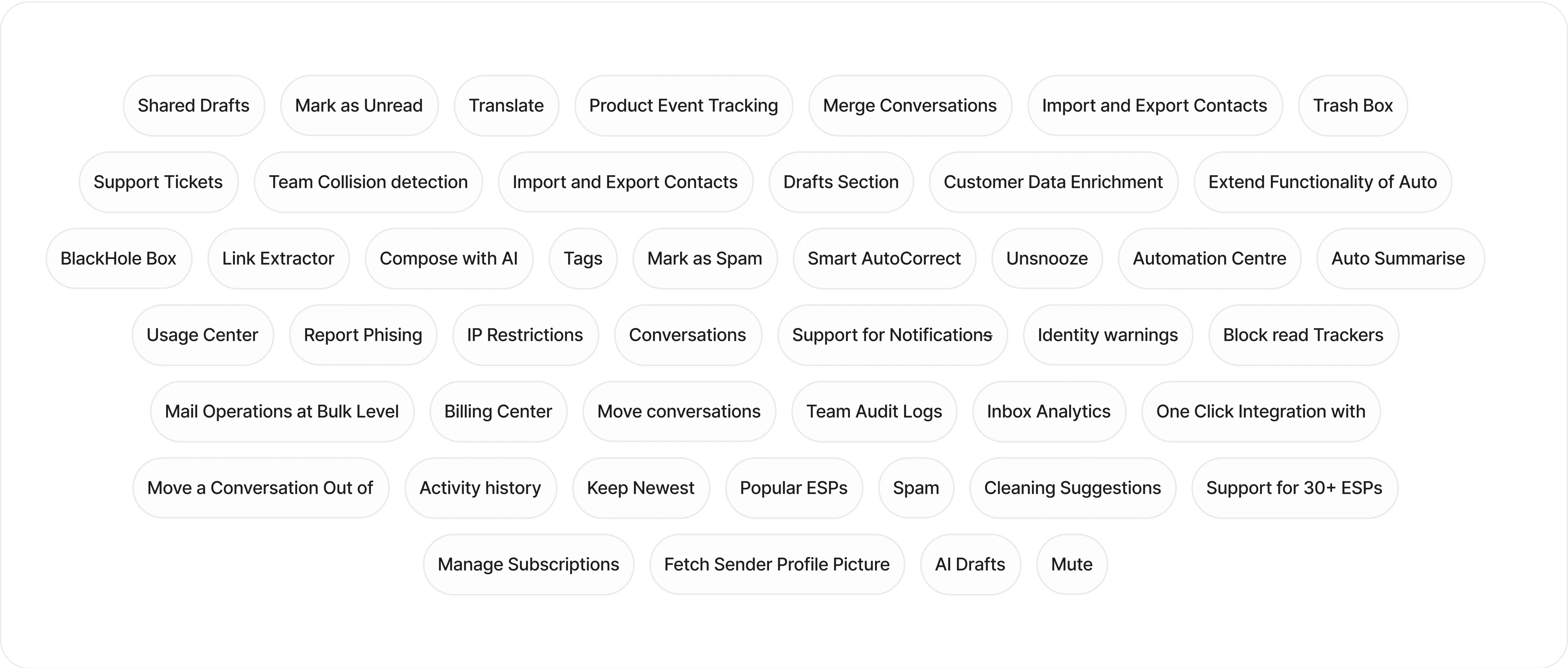
Features Sorting

4
Planning
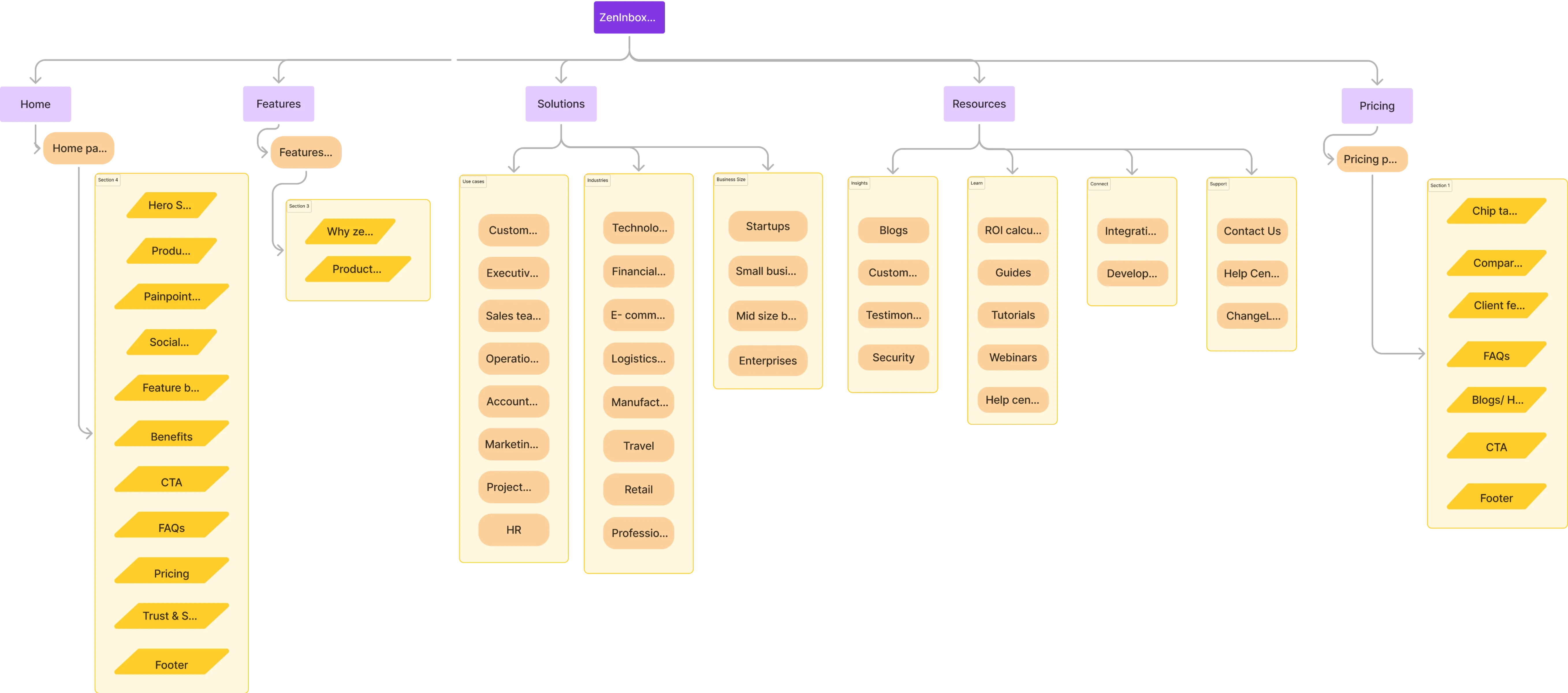
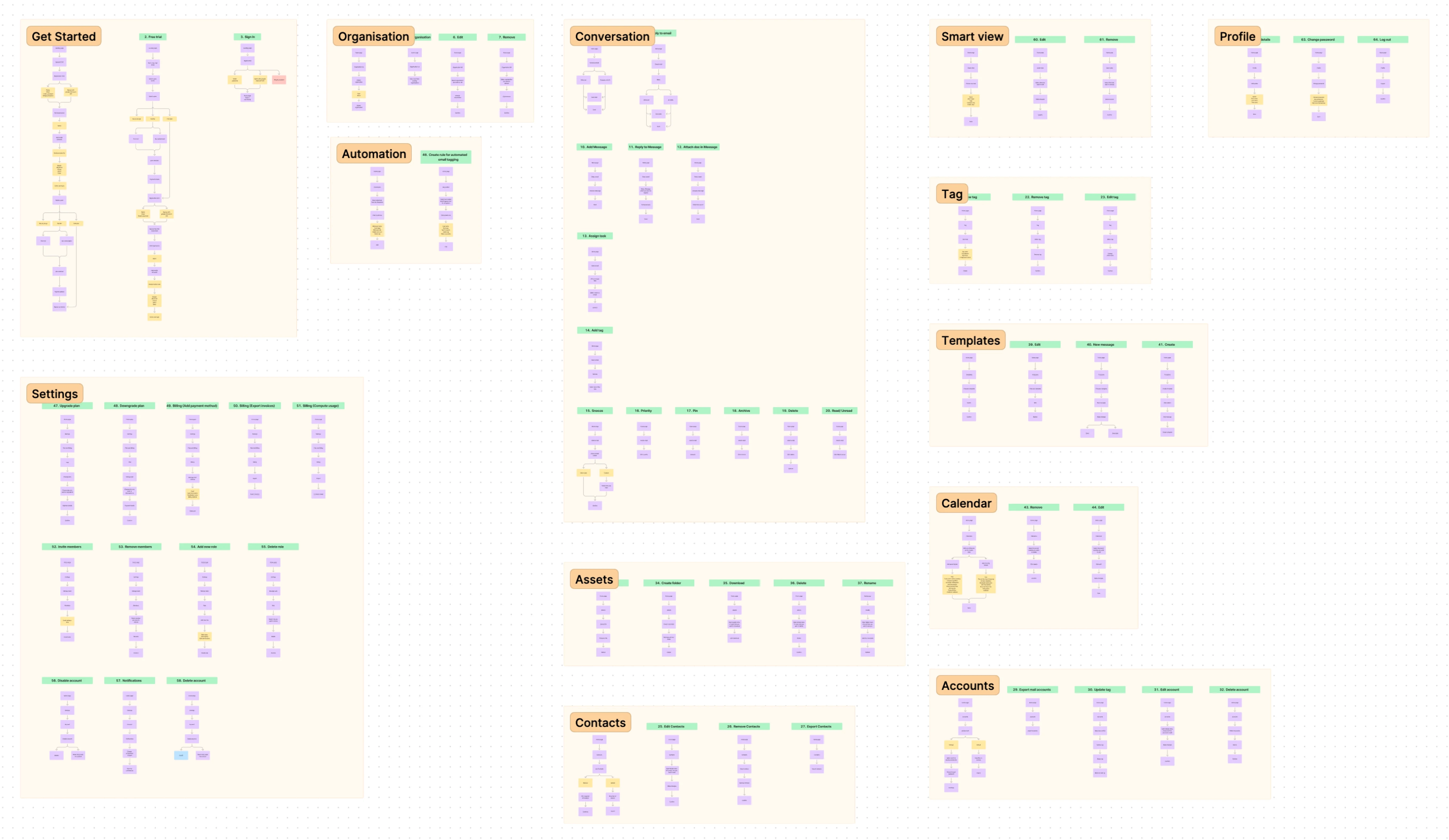
Sitemap & User Flows
Creating a sitemap and user flows ensures a seamless user experience. The sitemap outlines the app's structure, while user flows detail how users navigate tasks. This phase helps identify bottlenecks, ensure intuitive navigation, and align the design with user needs.
Sitemap
User flows
5
Experiments
Wireframes & Prototyping
Wireframes provide a visual blueprint, allowing us to map out key elements and ensure functionality aligns with user needs.
Prototyping enables interactive testing, helping to identify usability issues early on and gather feedback for improvements.
Prototyping & Testing
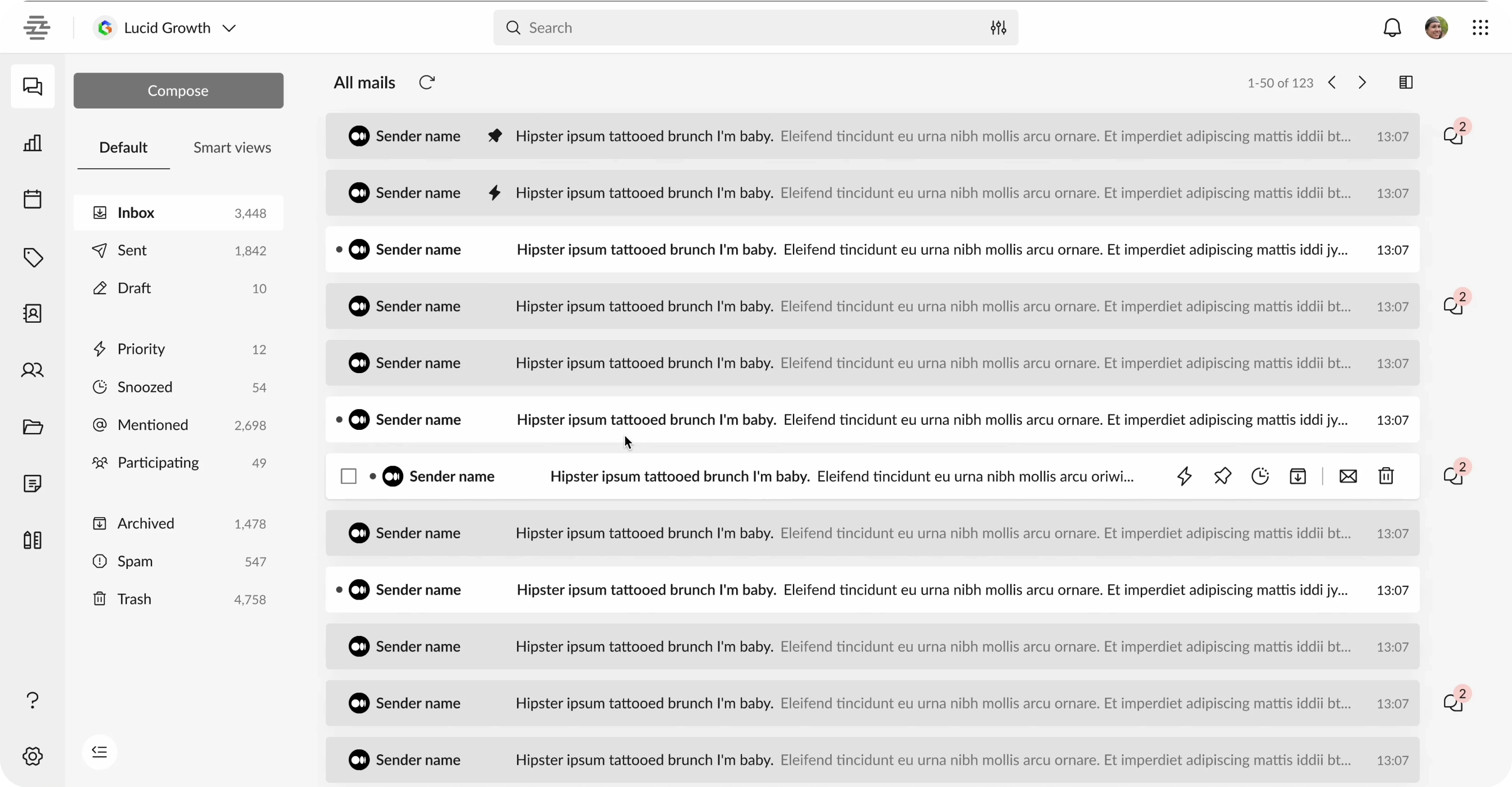
Wifreframings
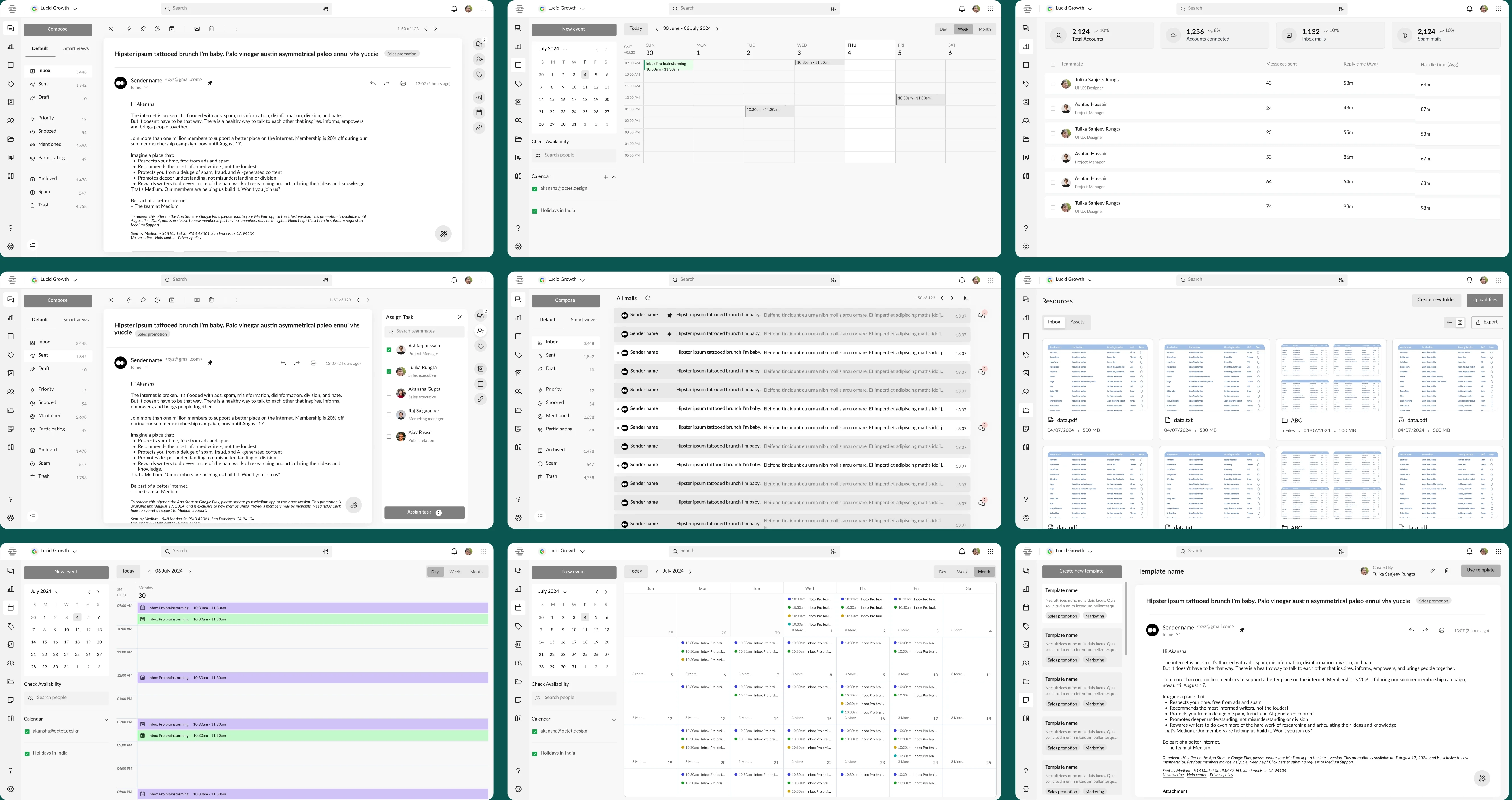
6
Interface
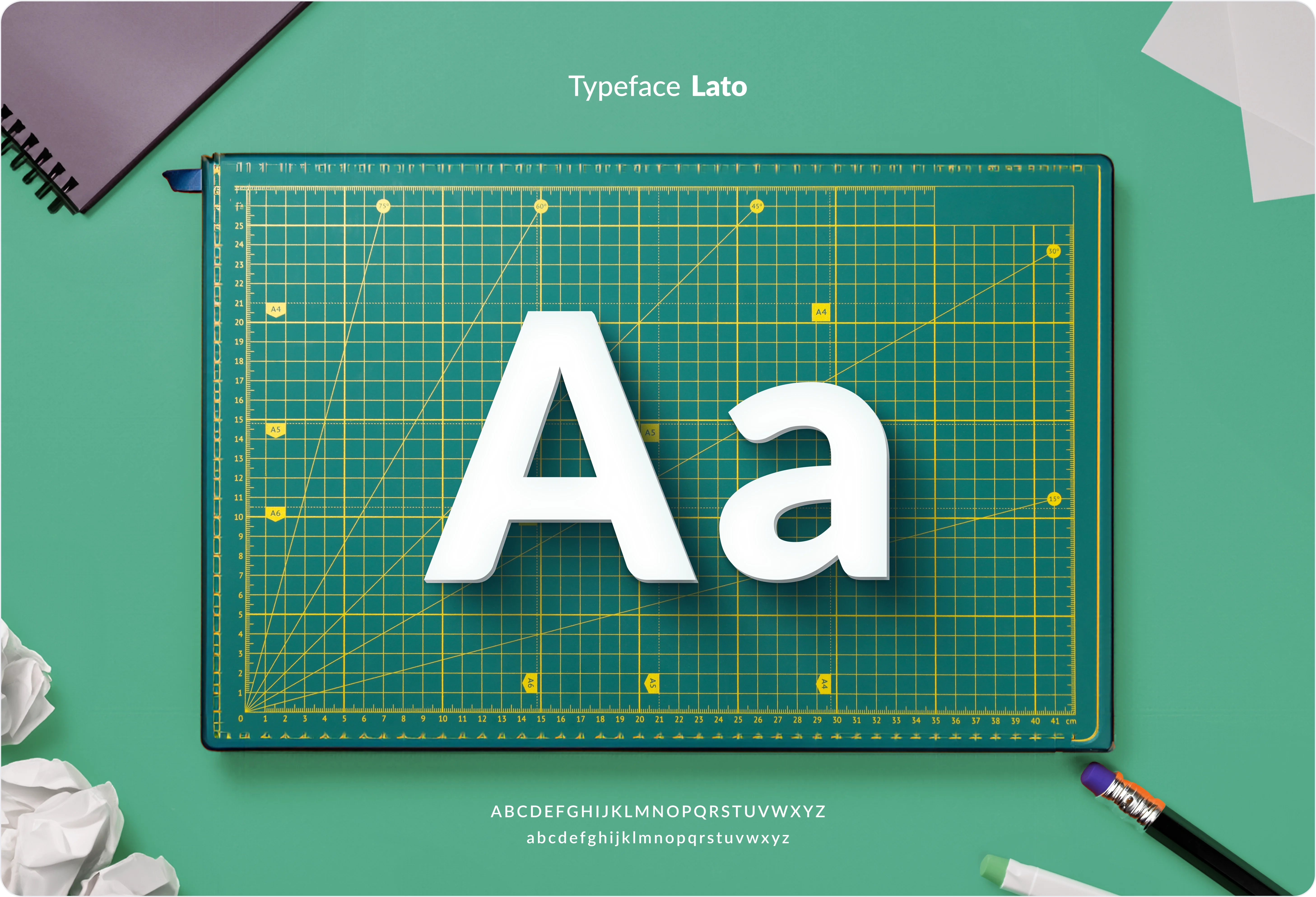
Typography
We selected Lato, a sans-serif font, for its clean and modern design. Its excellent readability and balanced letterforms make it ideal for headings and body text, enhancing the app’s professional and approachable look.
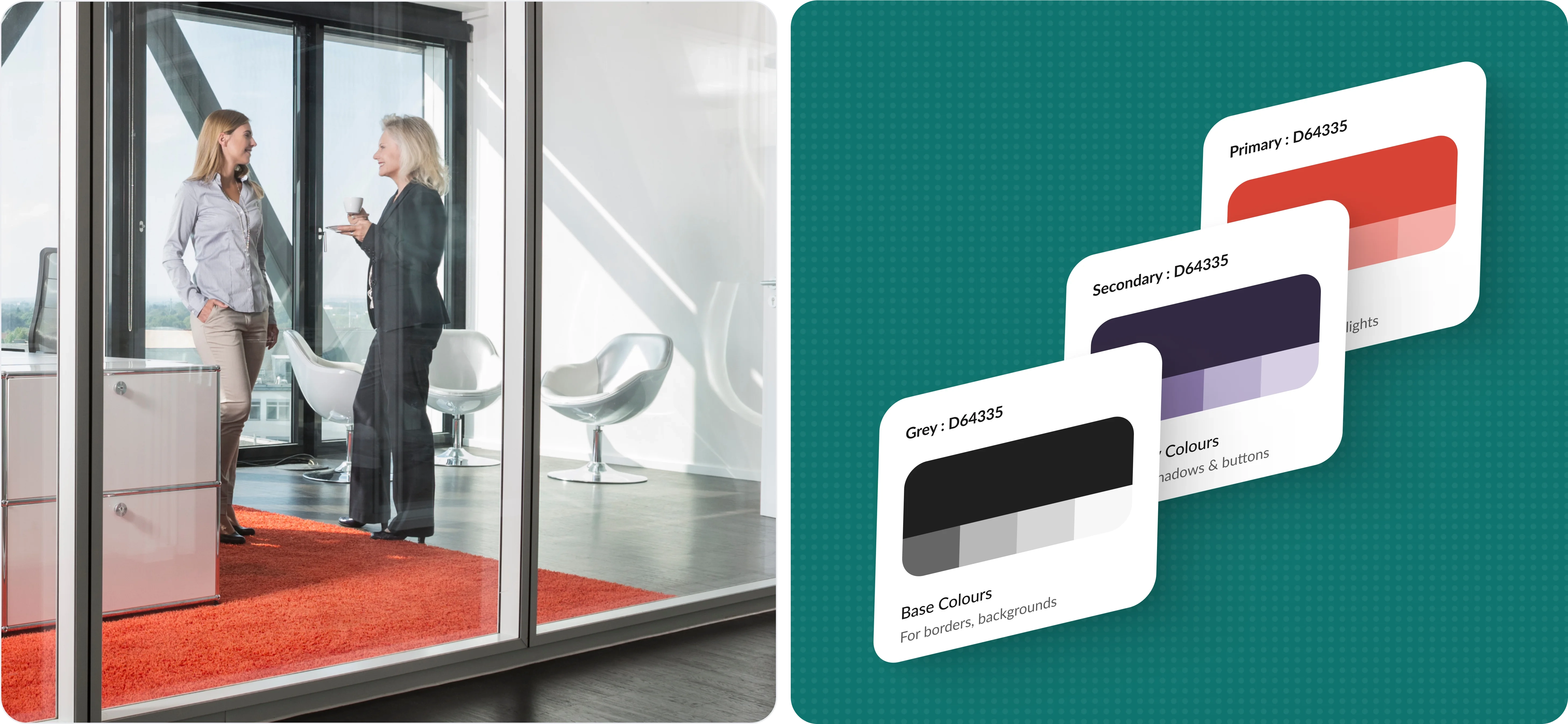
Colors
The palette combines bold reds, blacks, and purples to create a striking yet professional aesthetic. Black provides a strong, clean foundation, red highlights necessary actions and alerts and purple adds a touch of creativity and sophistication.
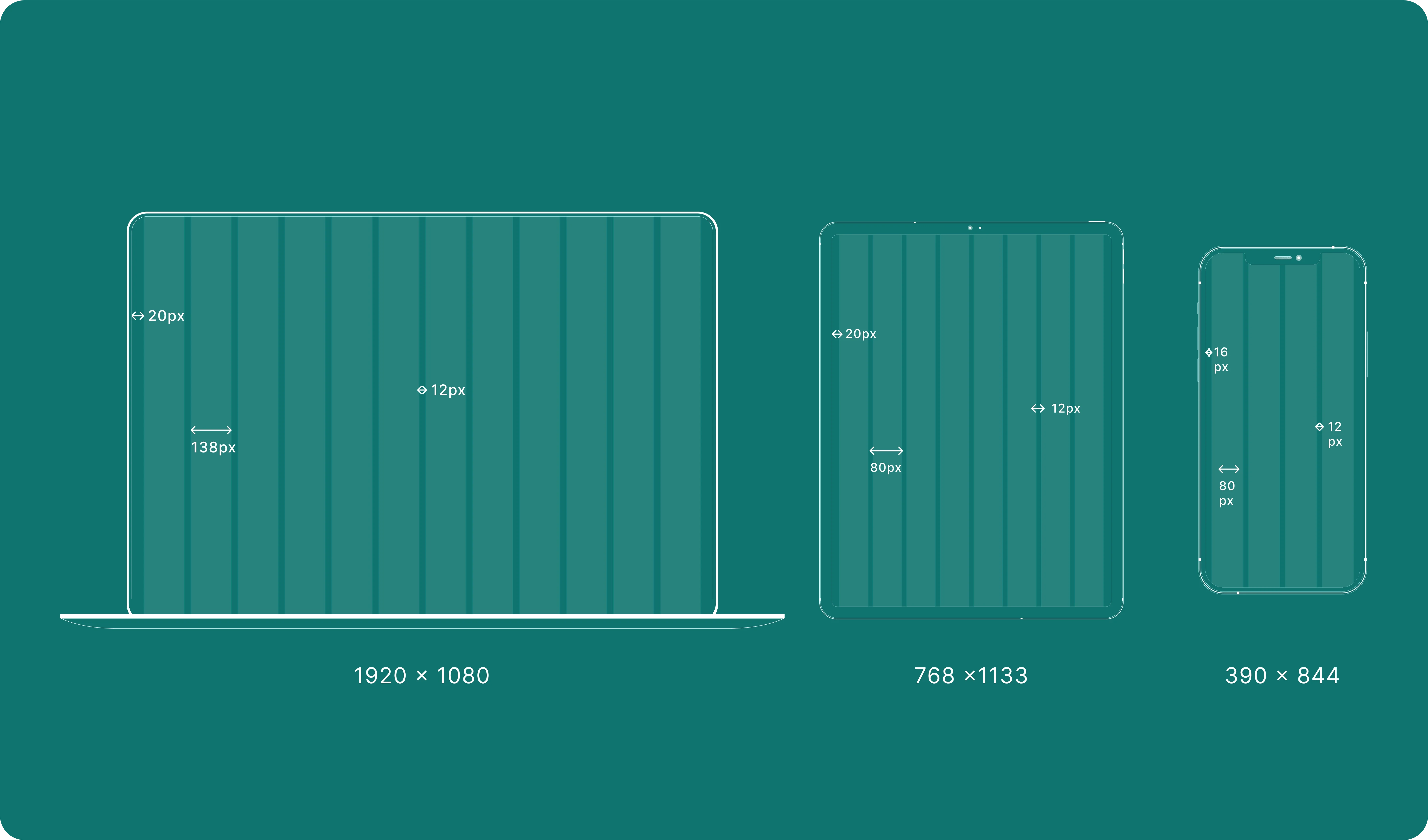
Grids & Proximity
Consistent spacing and margins are crucial to creating a balanced layout that enhances usability and visual appeal. This thoughtful use of grids and proximity ensures that elements are organized, allowing users to feel consistency across the application.
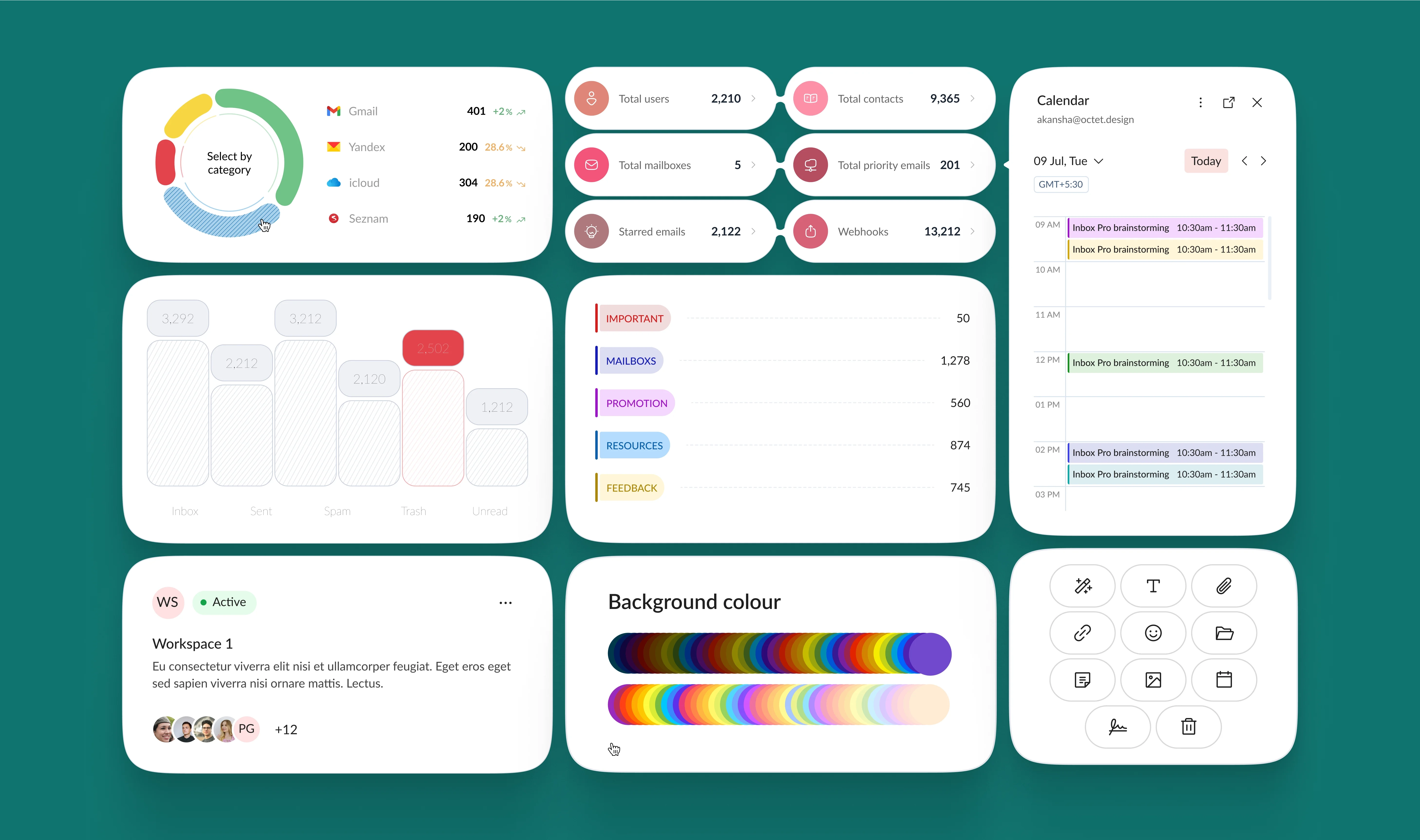
Components
The app’s components are intuitive and responsive, ensuring a smooth user experience. Consistent styling of buttons, navigation bars, and icons creates a cohesive and easy-to-navigate interface.
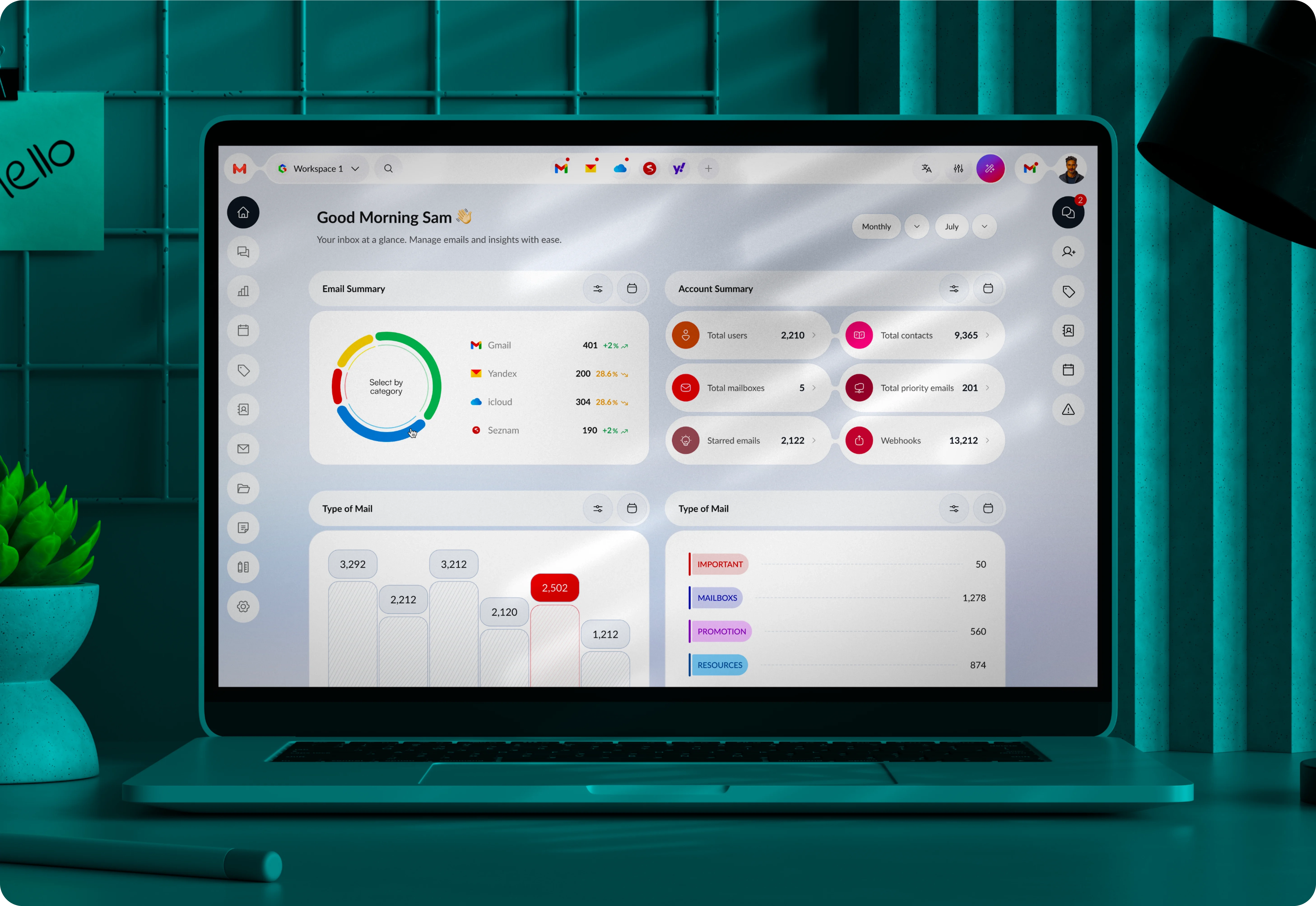
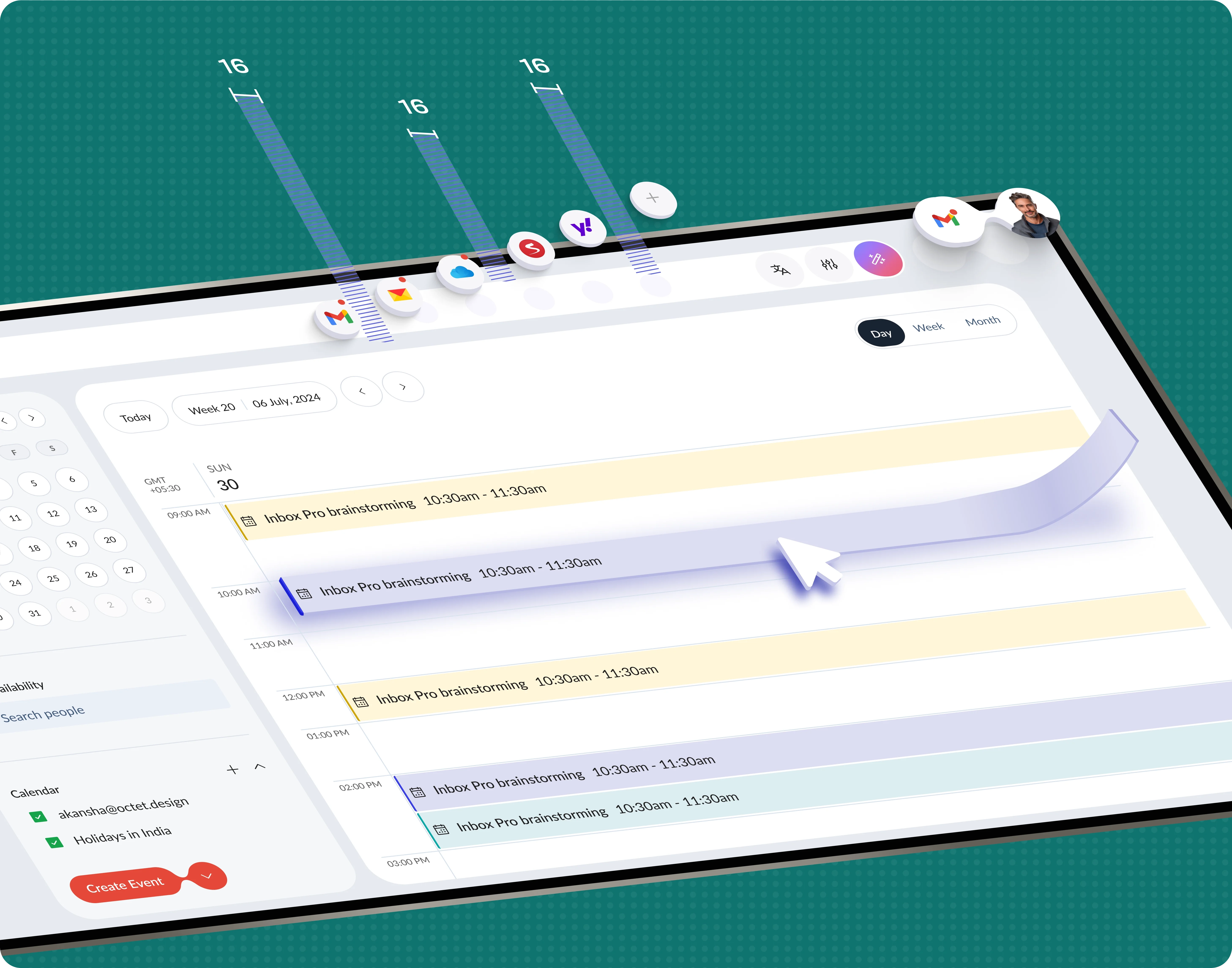
Outcome
The app successfully streamlines email management by integrating multiple providers into an intuitive platform. This enhances user productivity and provides a seamless, organized communication experience.
Conclusion
- The app solves the problem of managing multiple email accounts in one unified platform.
- Intelligent categorization and insights improve email organization and prioritization.
- Competitor research identified gaps, allowing us to build a more tailored solution.
- Planning with sitemaps and user flows ensured seamless navigation and functionality.
- Wireframes and prototypes helped refine the design and address usability issues early.
- Intuitive components provide a cohesive and responsive user experience.
- The Lato font and bold color palette were chosen to enhance readability and aesthetics.
- The result is an app that boosts productivity and simplifies professional email management.


Previous
Next


