Quizzer
A QnA App based on personalized tests
Industry
EdTech
What we did
UI Designing
Platform
Mobile App Design
Problem
While doing our research, we found that many users needed guidance about career paths, understanding their strengths, and making good decisions due to conflicting advice and numerous options. The main challenge was providing users with reliable career guidance.
Solution
We proposed designing a user-friendly mobile app for career guidance. The app would offer aptitude tests and suggest career options based on performance. By focusing on these solutions, we aimed to empower users to better understand their abilities and make informed decisions about their future careers.
1
Project Brief
What Is Quizzer?
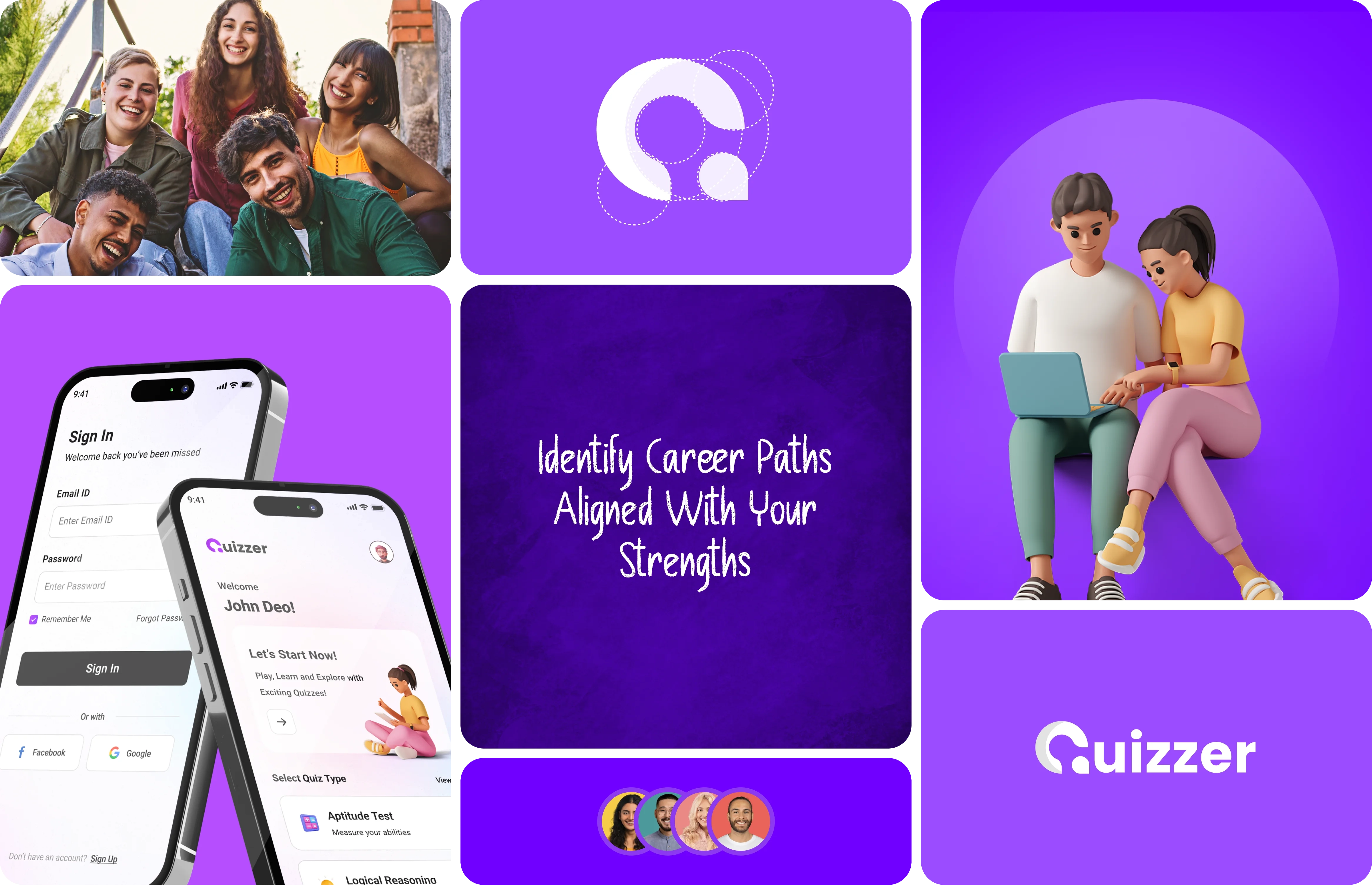
Quizzer is a mobile app designed to help users find the right career path by providing personalized guidance in a user-friendly way. The app has a clean and modern design that makes it easy for users to take a strengths assessment test and explore various career options.
App Screens Overview
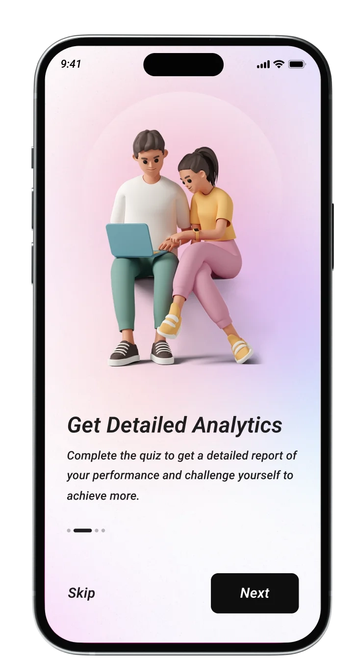
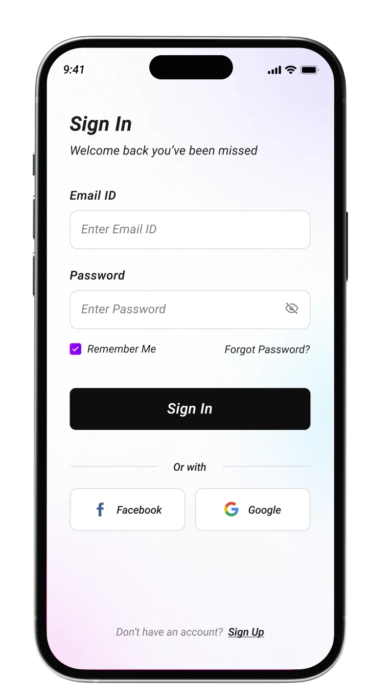
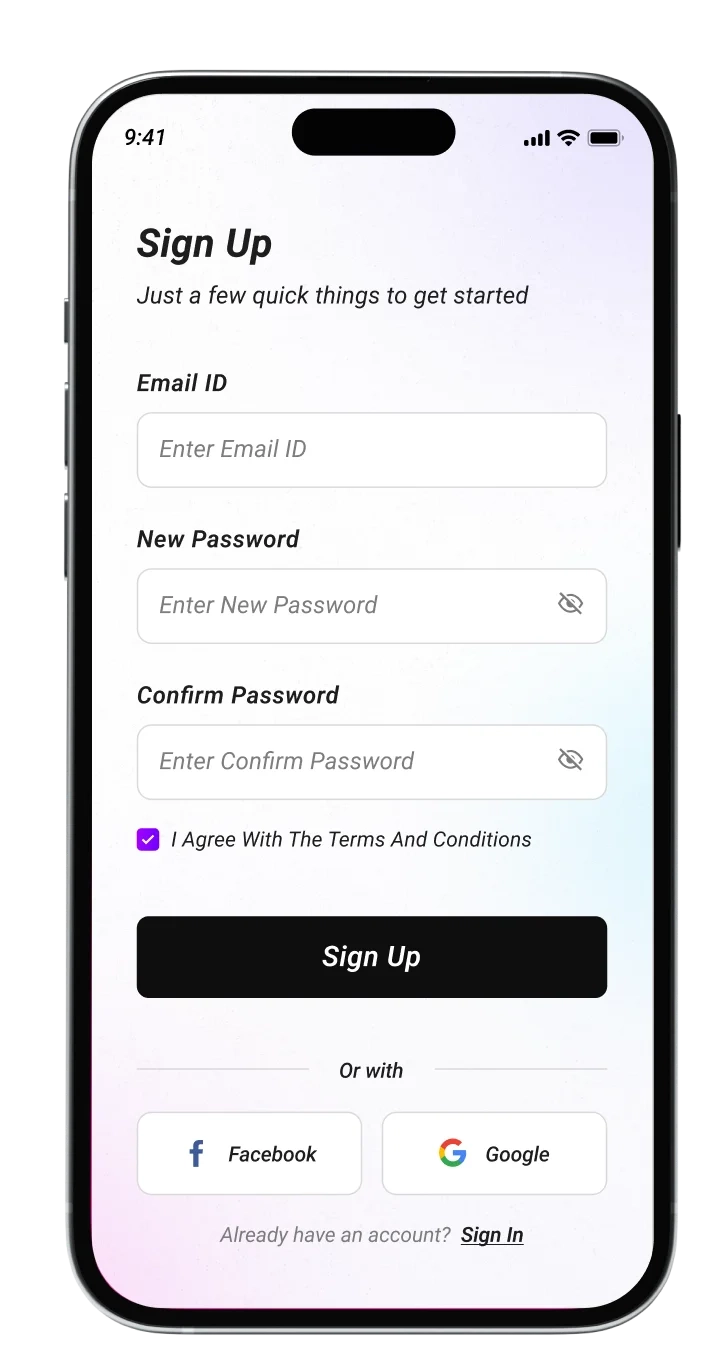
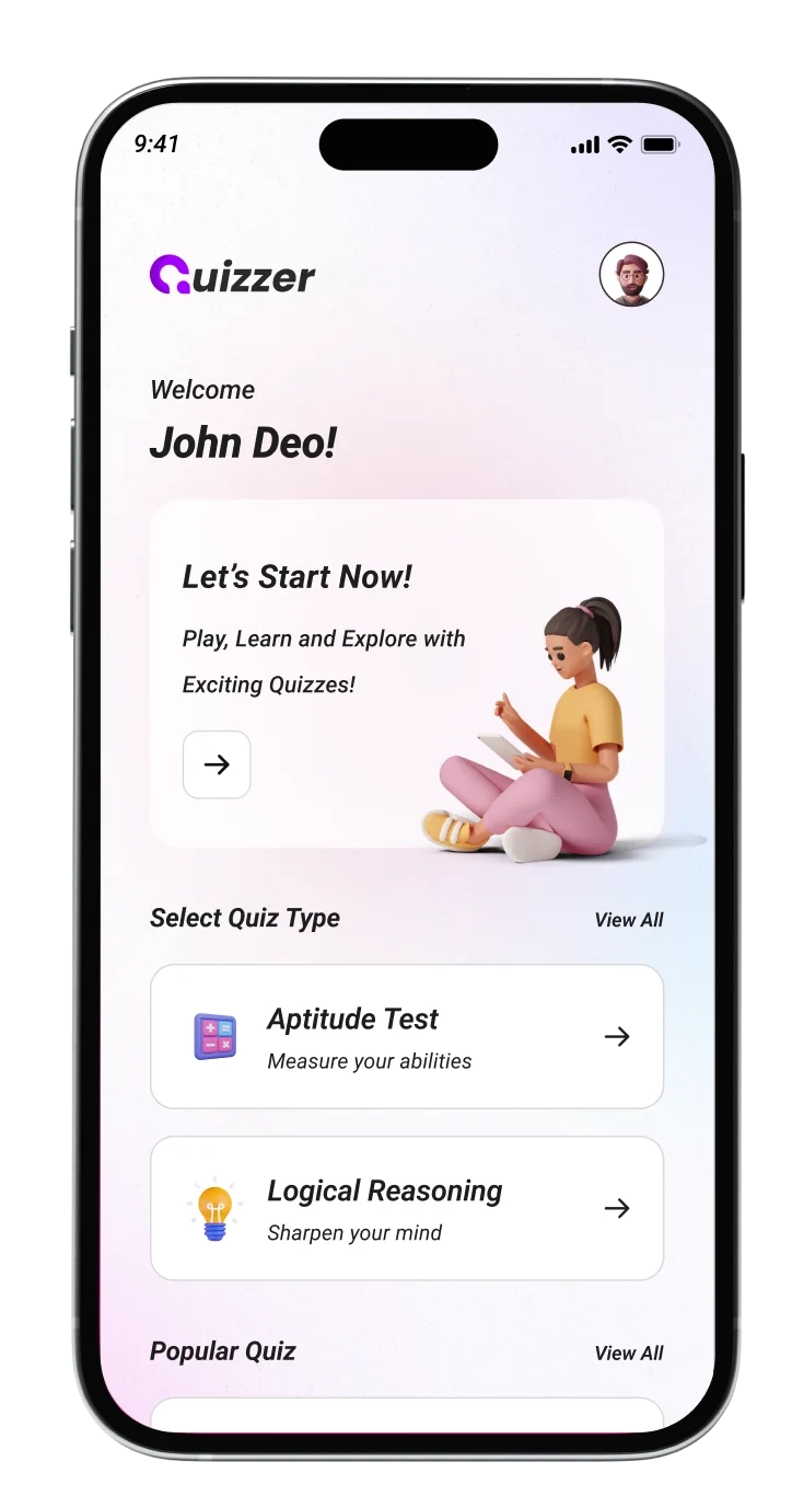
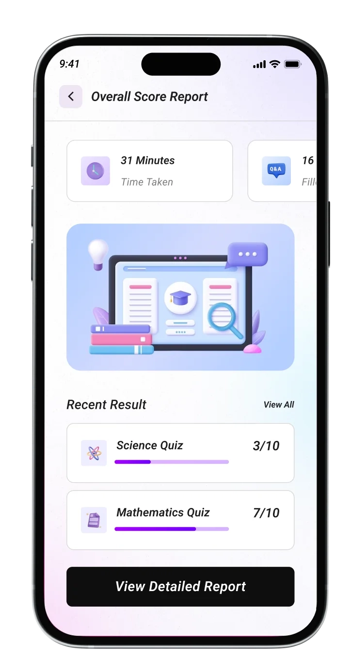
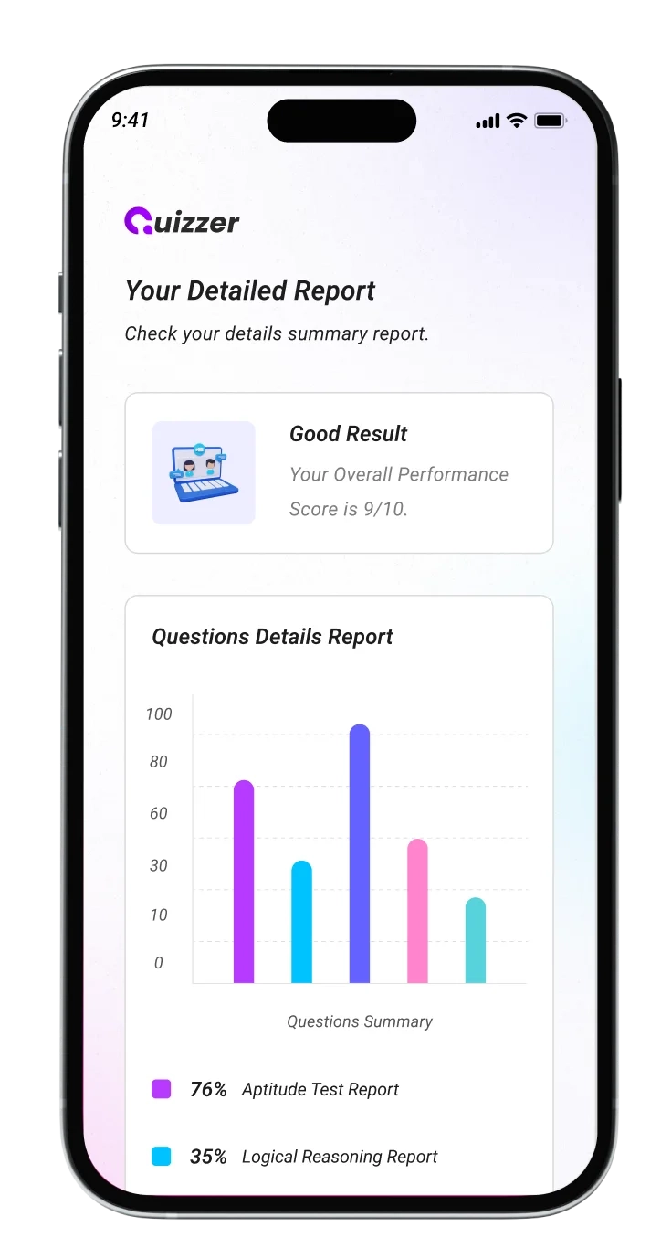
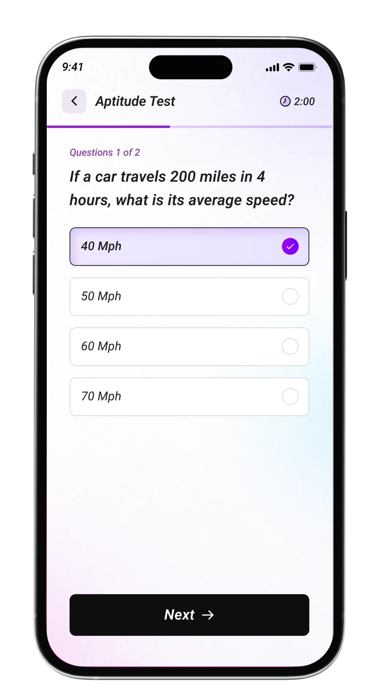
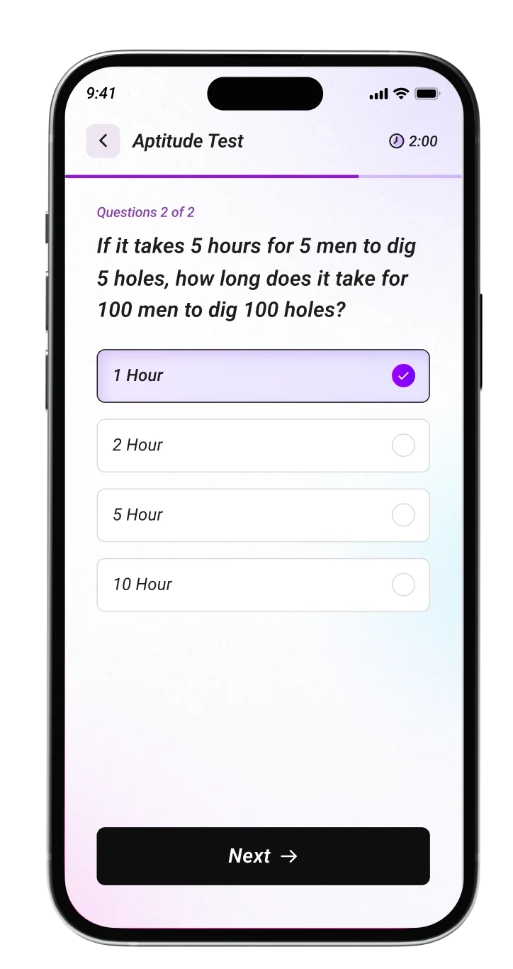
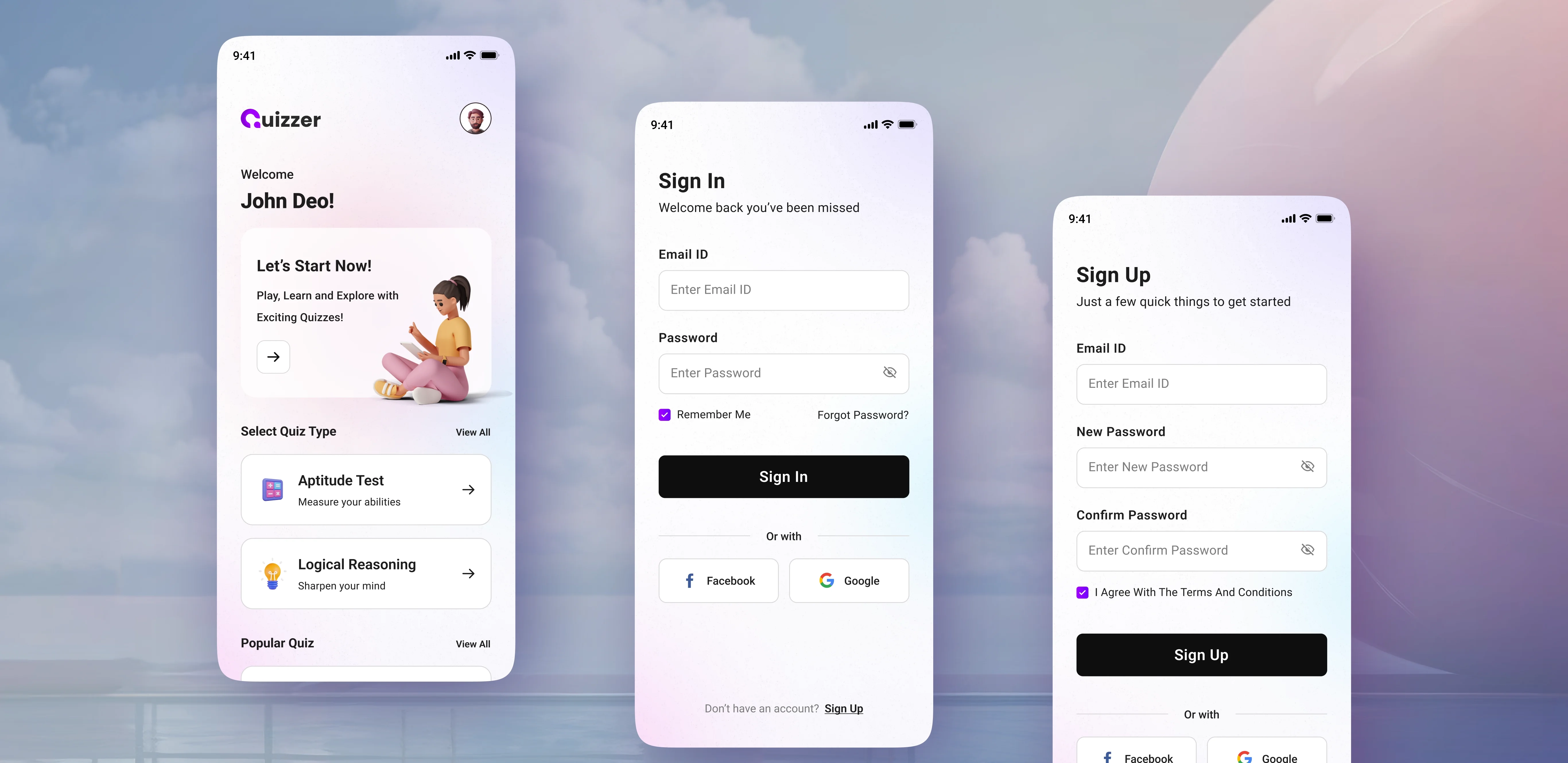
We created an easy-to-use interface with smooth navigation and attractive visuals.The clean layouts and vibrant colors enhance usability, making navigation effortless. Every screen conveys a visually appealing and intuitive user experience.
2
Research
Survey
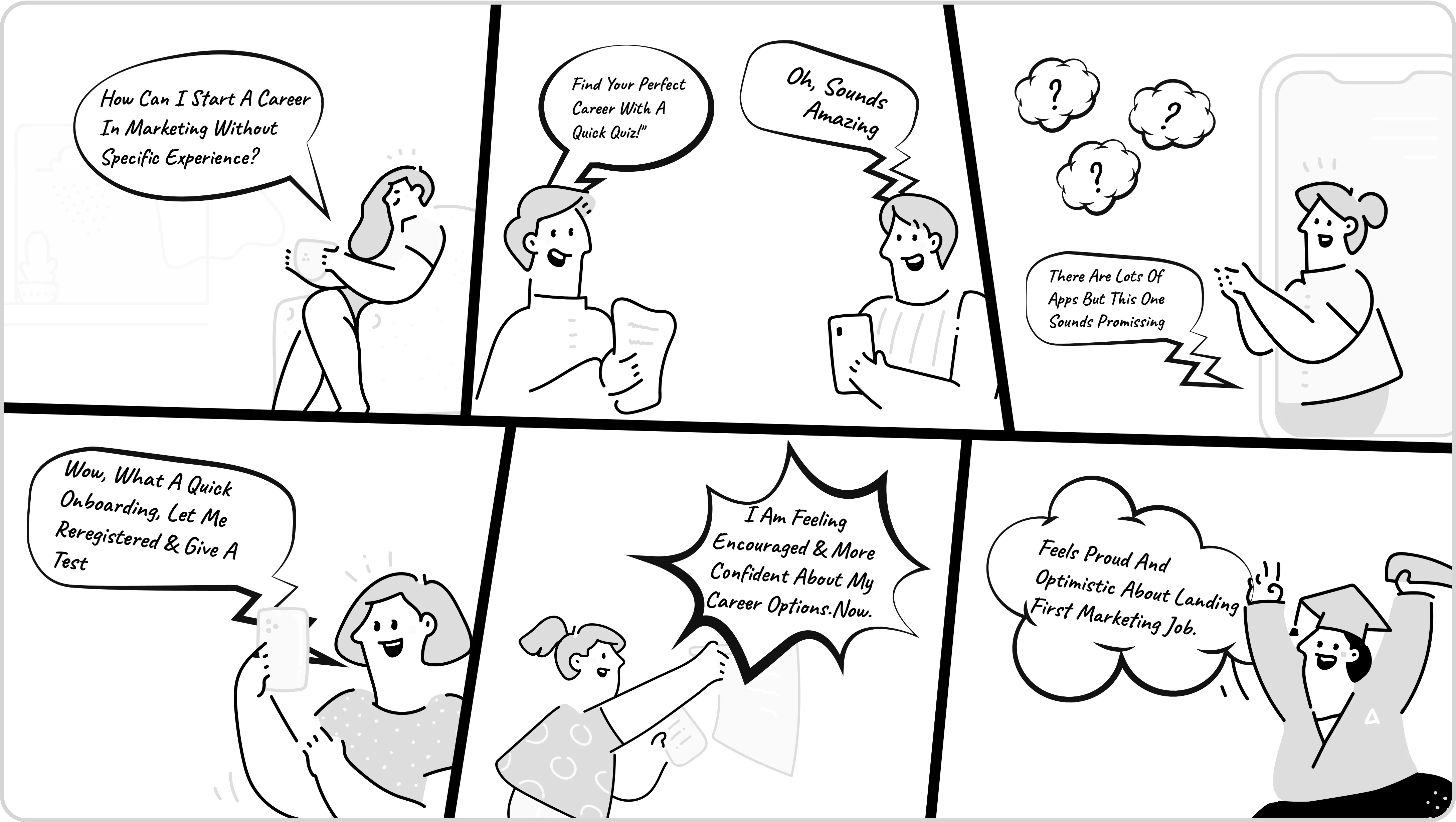
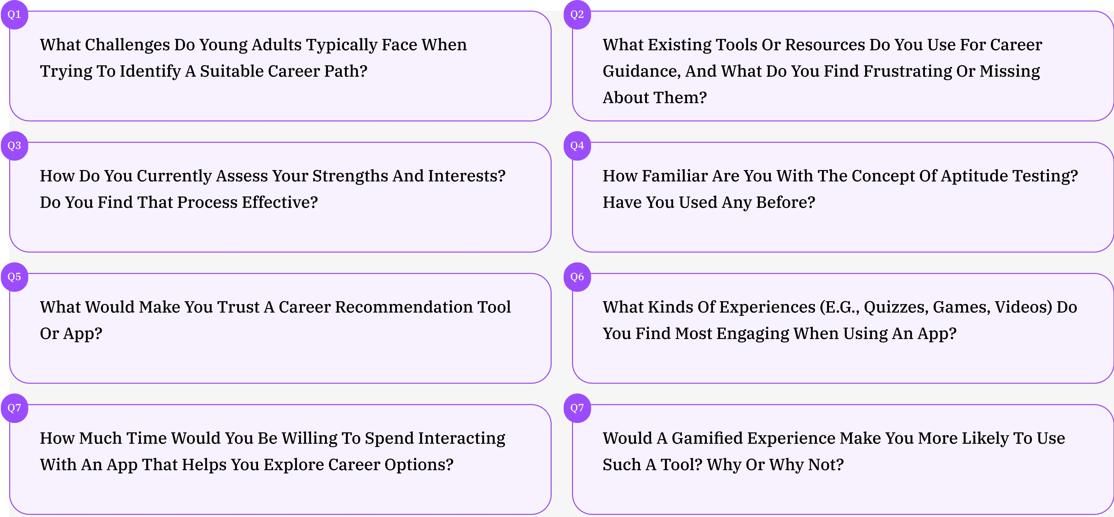
During the research phase of our project, we created user storyboards to visualize the experiences and needs of our target audience. We also conducted user research to gather insights about the challenges users face when choosing a career path.
Story Board
User interviews
3
Observations
Analysis
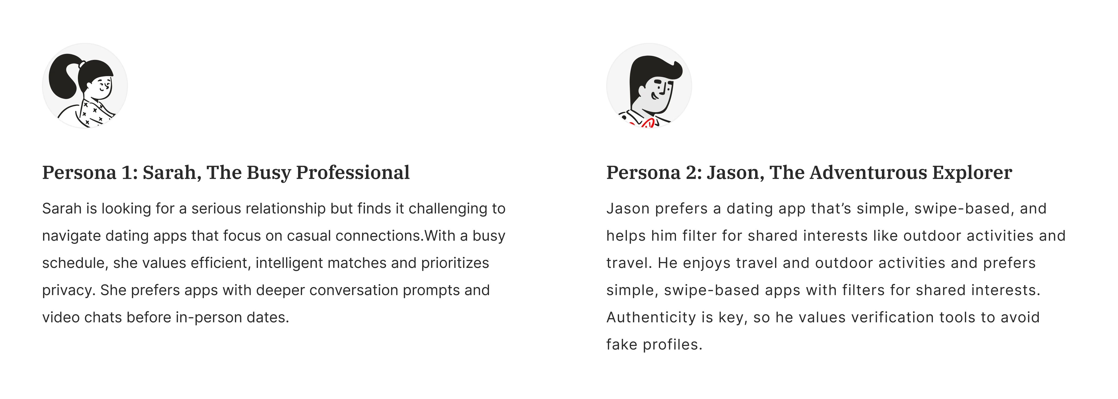
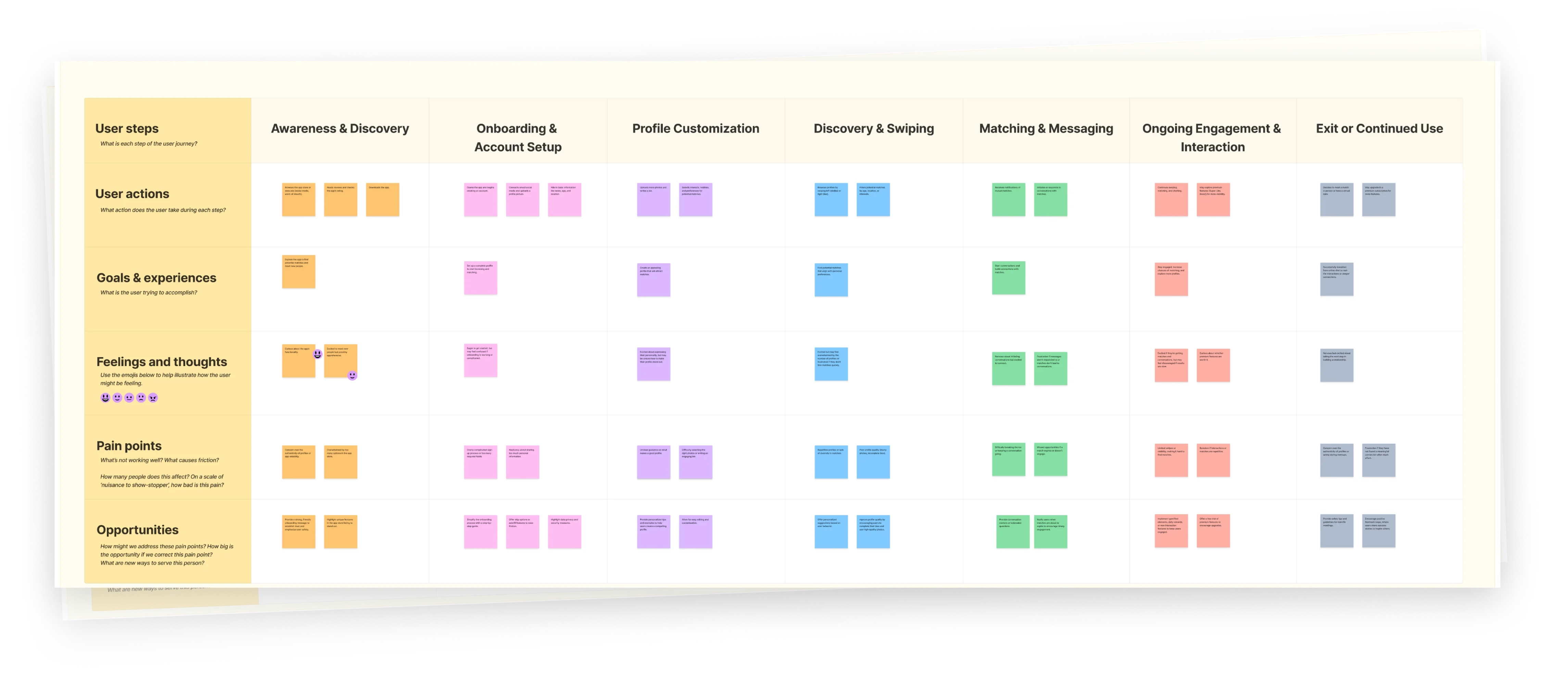
We developed user personas to represent our target audience and their unique characteristics. We created user journey maps to visualize the steps users take, helping us identify pain points & opportunities for improvement.
User Personas
User Journey Mapping
Jobs-to-be-Done
4
Wireframes
Sketching & Wireframing
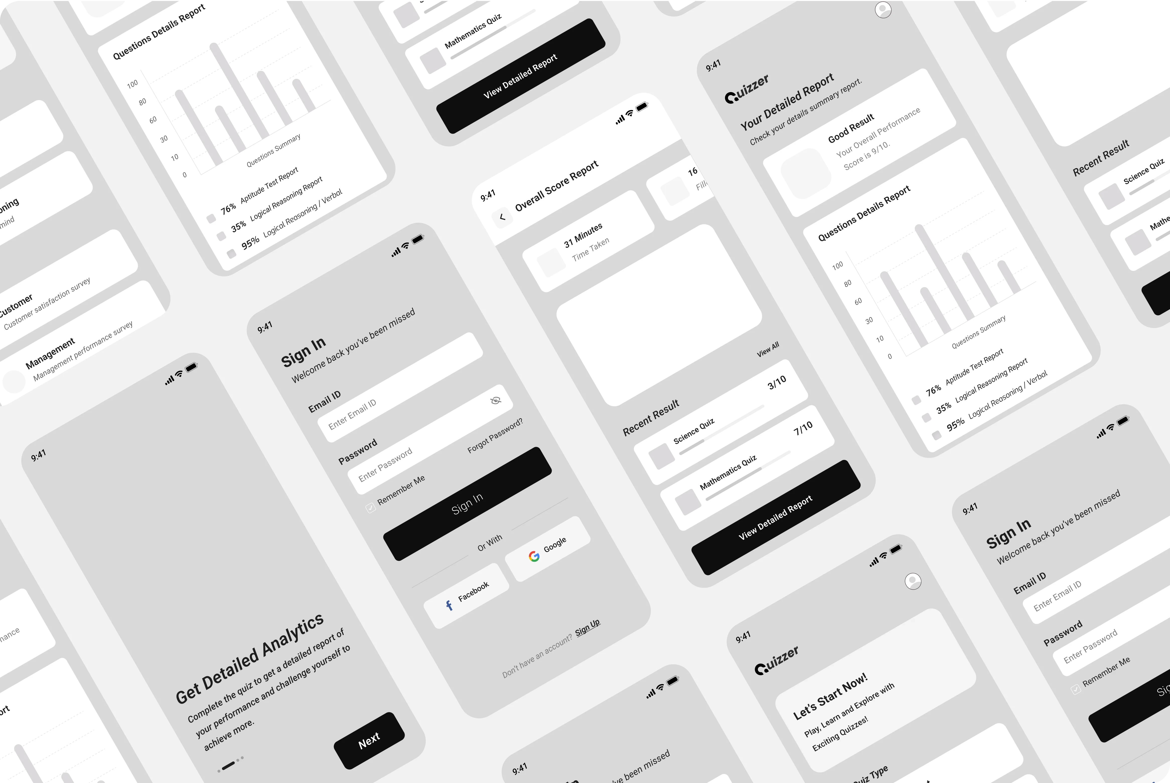
The sketching ideas for the app's layout and features, allowed us to explore different design concepts. We created wireframes to establish the app’s flow, ensuring a smooth experience before the final design.
5
Moodboard
Moodboard
We made a mood board to set the visual style for the app, focusing on colors, fonts, and images that give a sense of professionalism and trust.

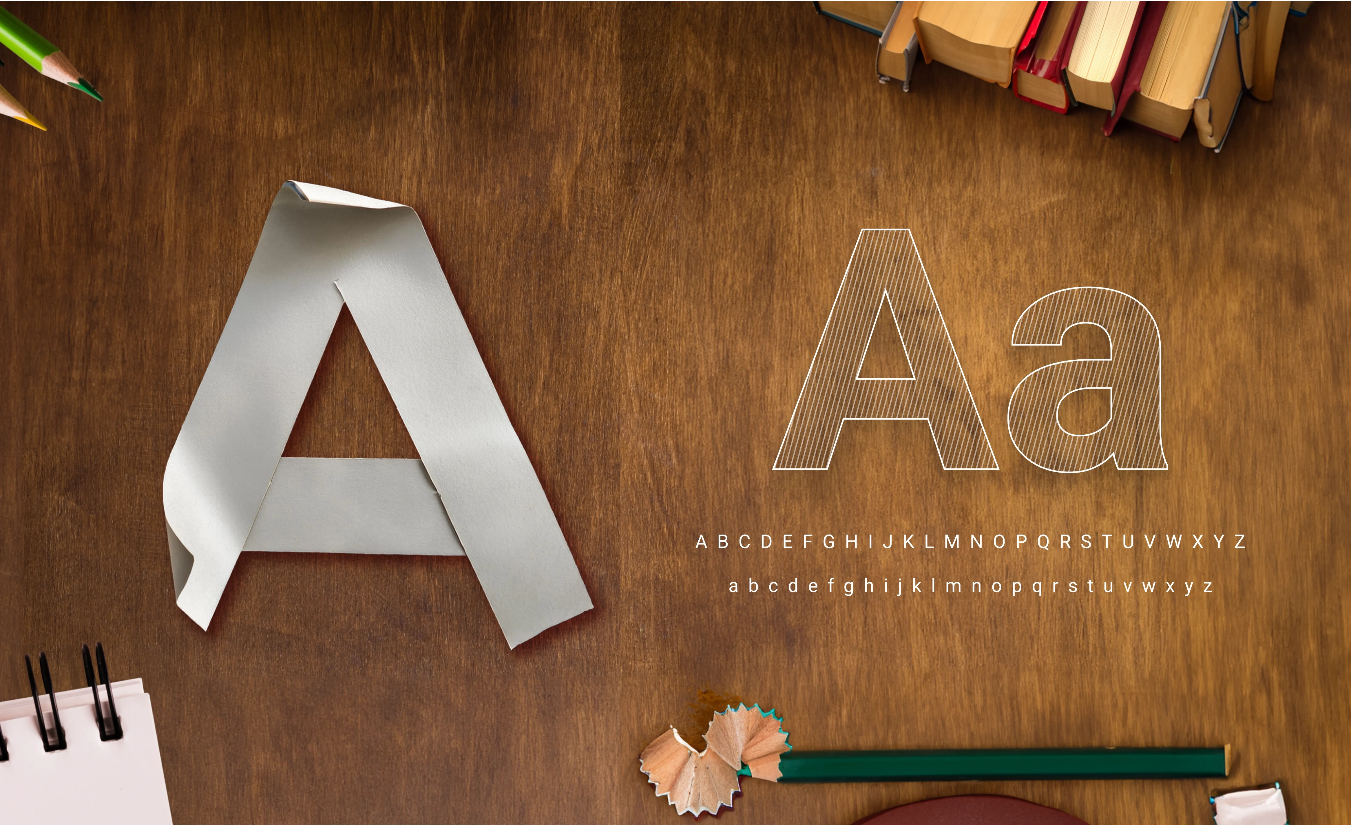
Typography
We chose the Roboto font for as its modern and clean look, which enhances readability. This choice create a professional feel, making it easier for users to engage with the app.
Color Pallate
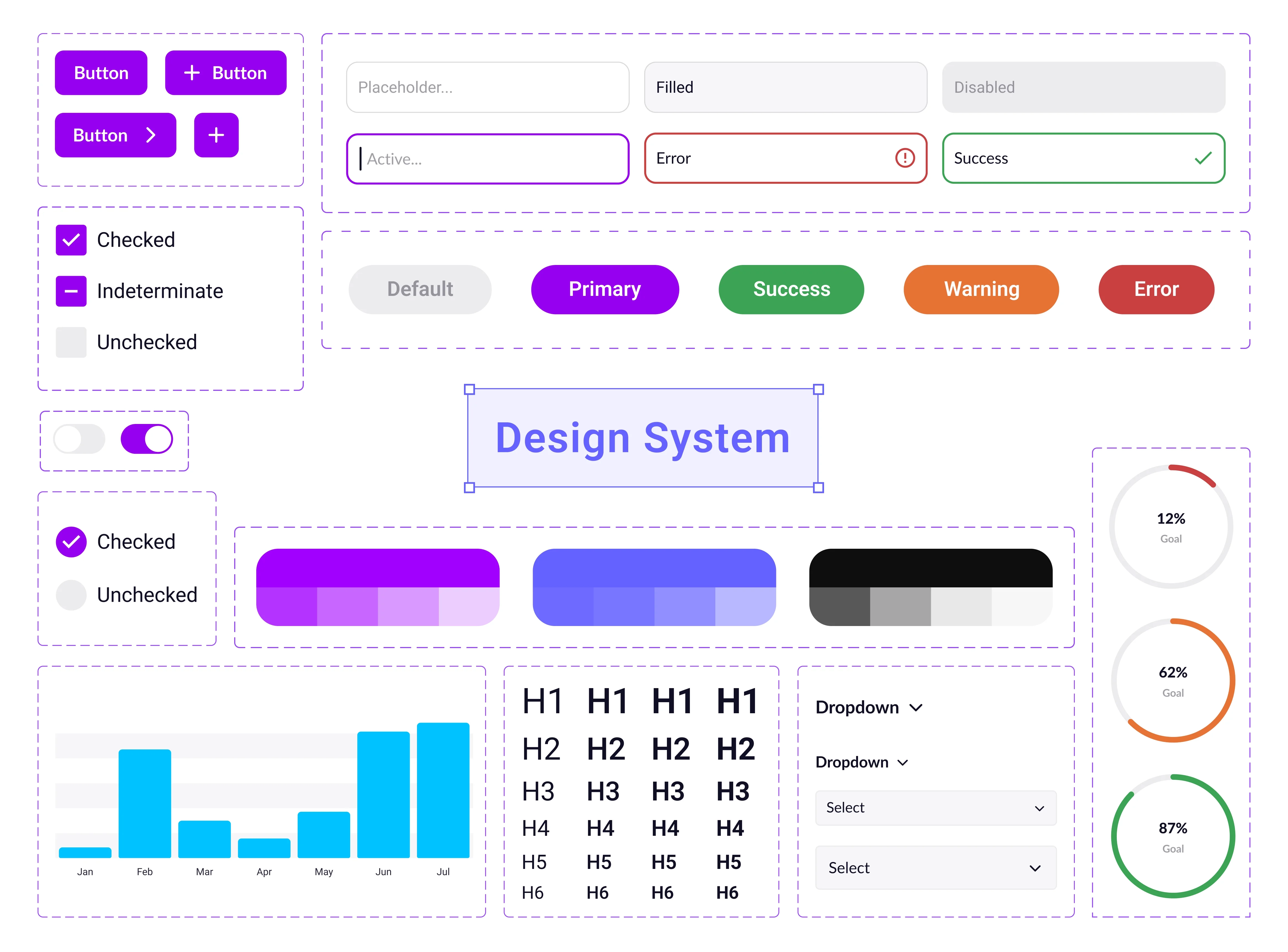
We picked vibrant colors to create an energetic and inviting feel. This bright color helps grab users' attention and makes the app feel friendly as they explore their career choices.

Design System
Our design system ensures that all elements, such as buttons and icons, look consistent. This helps provide a smooth user experience as users navigate through assessments.
6
Interface
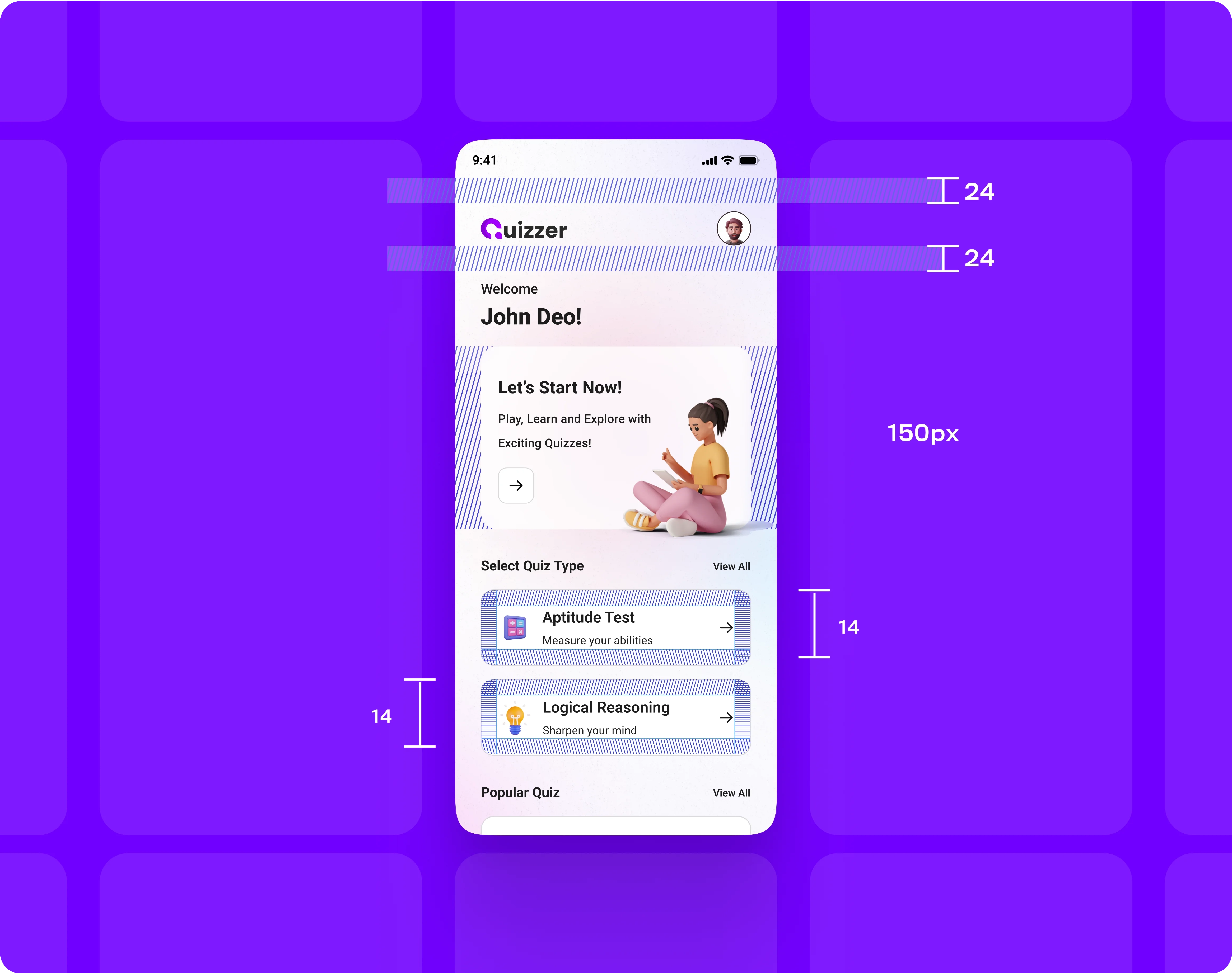
Grids & Proximity
We used grids to organize the app's layout, ensuring it was clean and easy to navigate. Grouping related items together helps users find information quickly.
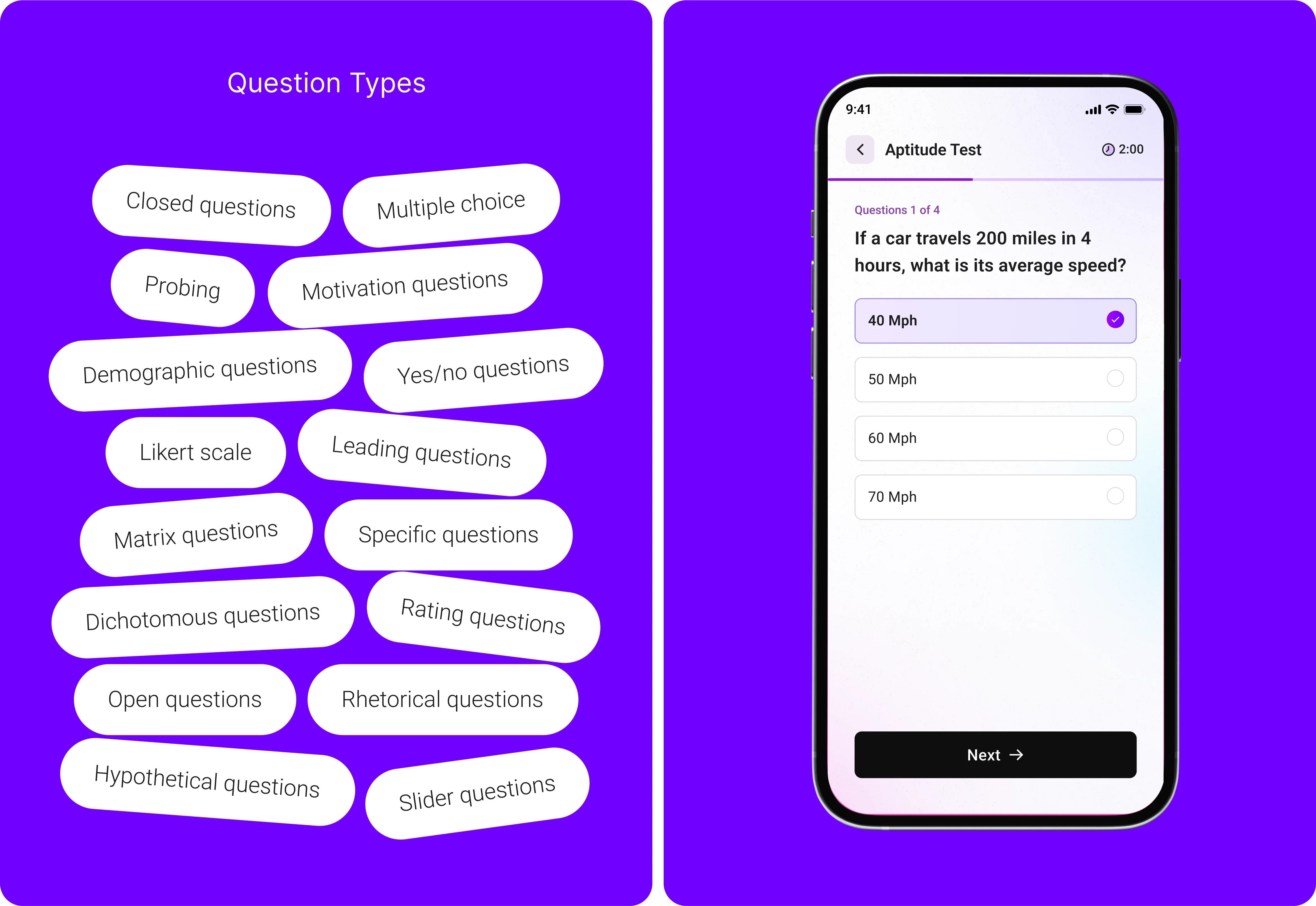
Q&A
In the app, we included different types of questions, like open-ended and closed questions. This variety allows users to express themselves freely while providing specific answers that help guide their career advice.
7
Outcome
Final Design
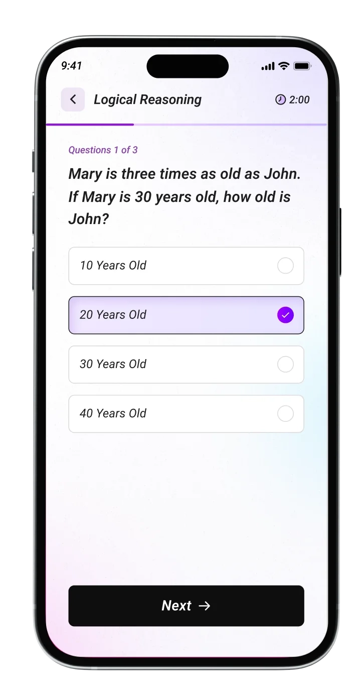
These are the final screens that highlight its simple and user-friendly design. Each screen is made to help users easily navigate their career tests and get personalized advice.
Conclusion
- The app effectively addresses the confusion users face when choosing a career path.
- The combination of vibrant colors and clear layouts reflects the app’s goal of creating a positive and engaging user experience.
- By offering personalized career advice based on test results, the app empowers users to make informed decisions.
- This project demonstrates our commitment to developing solutions that meet users’ needs and guide them toward successful career choices.
- Our user-friendly design and thoughtful features enhance the overall experience, ensuring users feel supported throughout their journey.


Previous
Next

