
Hoby
Ecommerce Website Design
Industry
SaaS
What we did
User Research
UI UX Designing
Design Audit
Platform
Web Application
Mobile Application
Problem
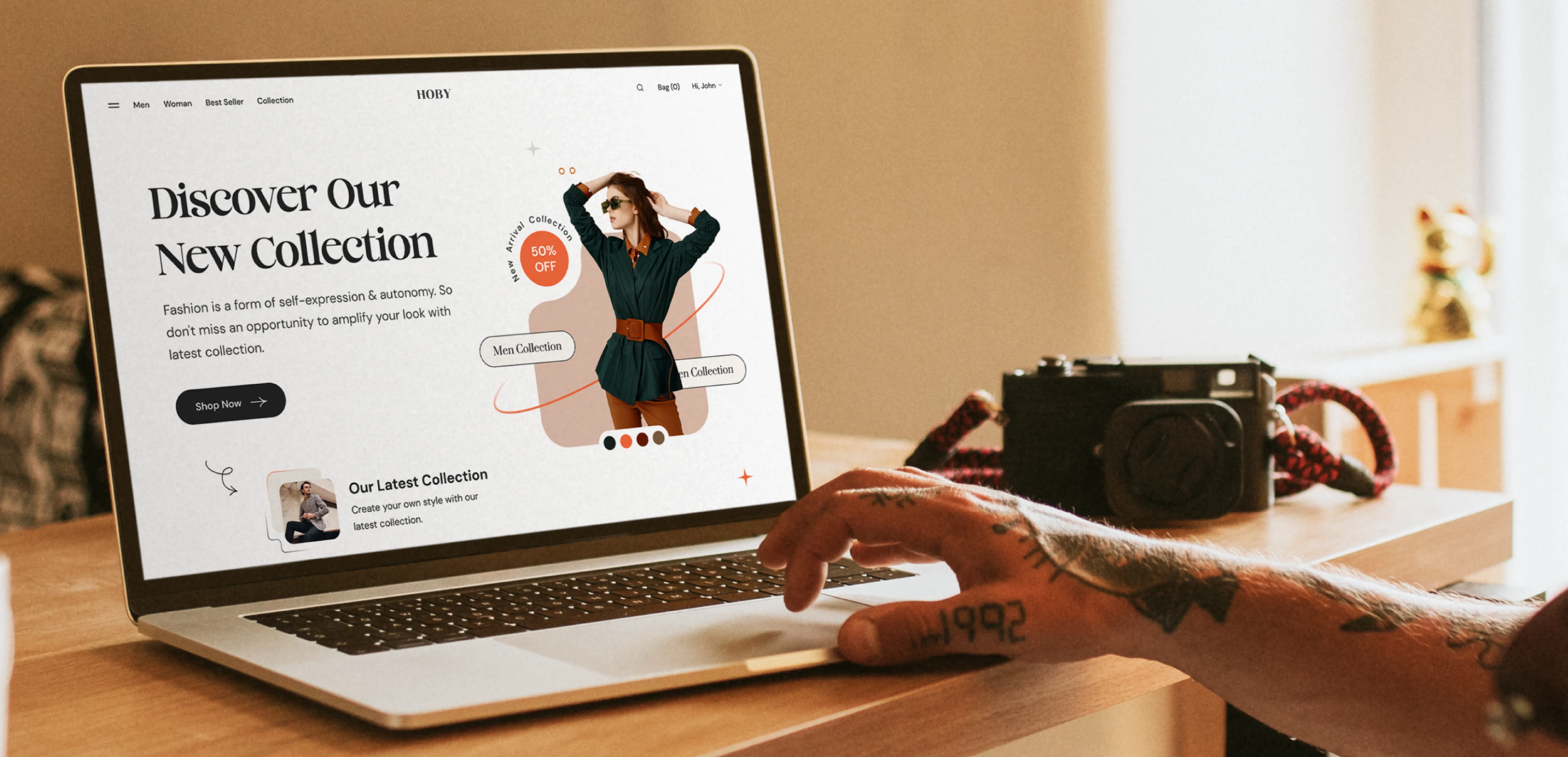
Many fashion websites fail to leave a lasting impression, often following predictable designs that blend in rather than stand out. Users tend to forget these sites because they lack character, and in an industry where personality matters, this is a significant drawback.
Solution
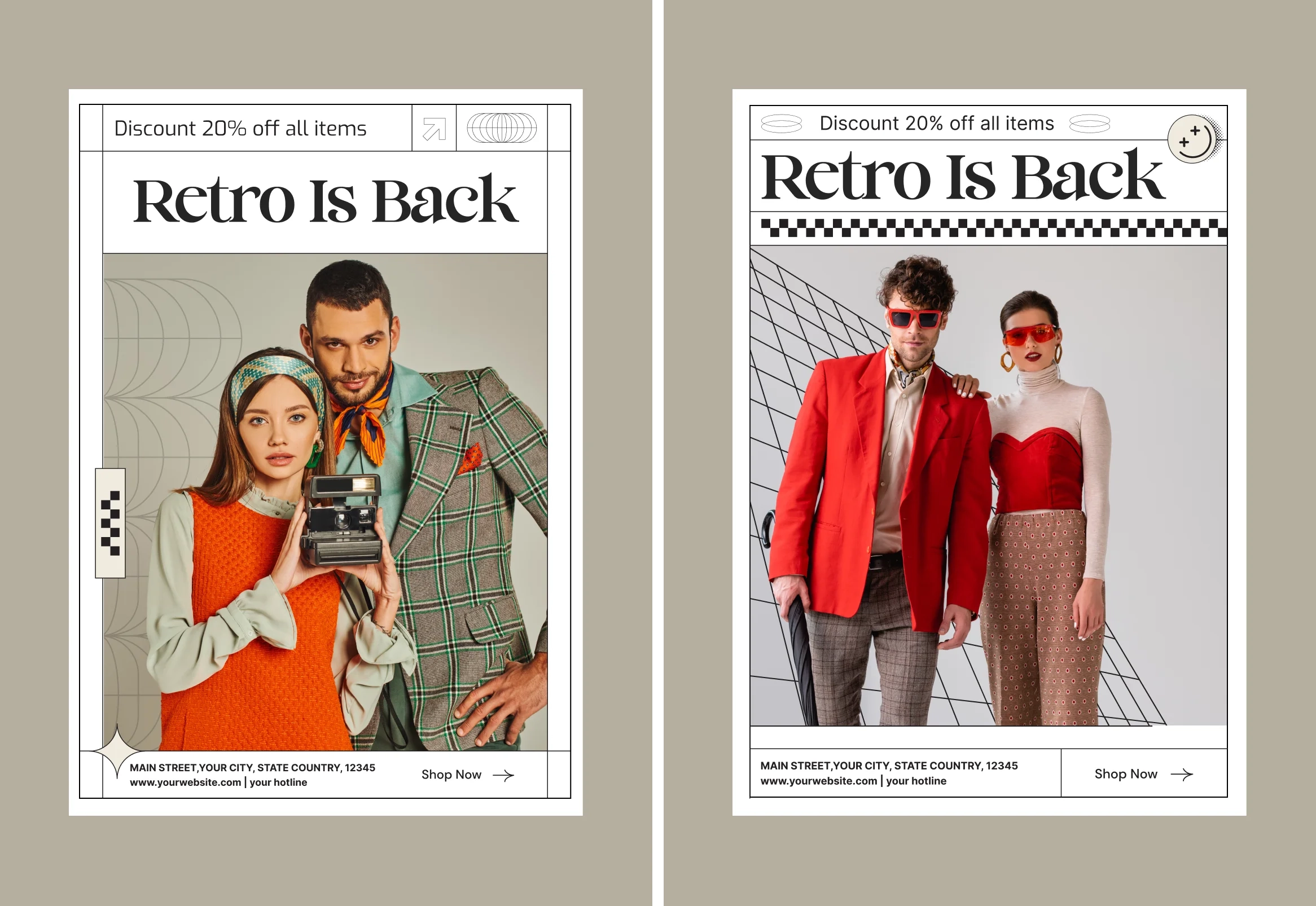
We flipped the script by embracing retro shapes, playful typefaces, and a 90s-inspired look and feel. The site features bold design choices like unique geometric elements and nostalgic graphics, while the "Cinema Sunday" typeface adds a modern edge. These design choices create a distinctive, immersive experience that feels like a trip back in time while still being functional and engaging.
Reviving 90s fashion for today’s digital world
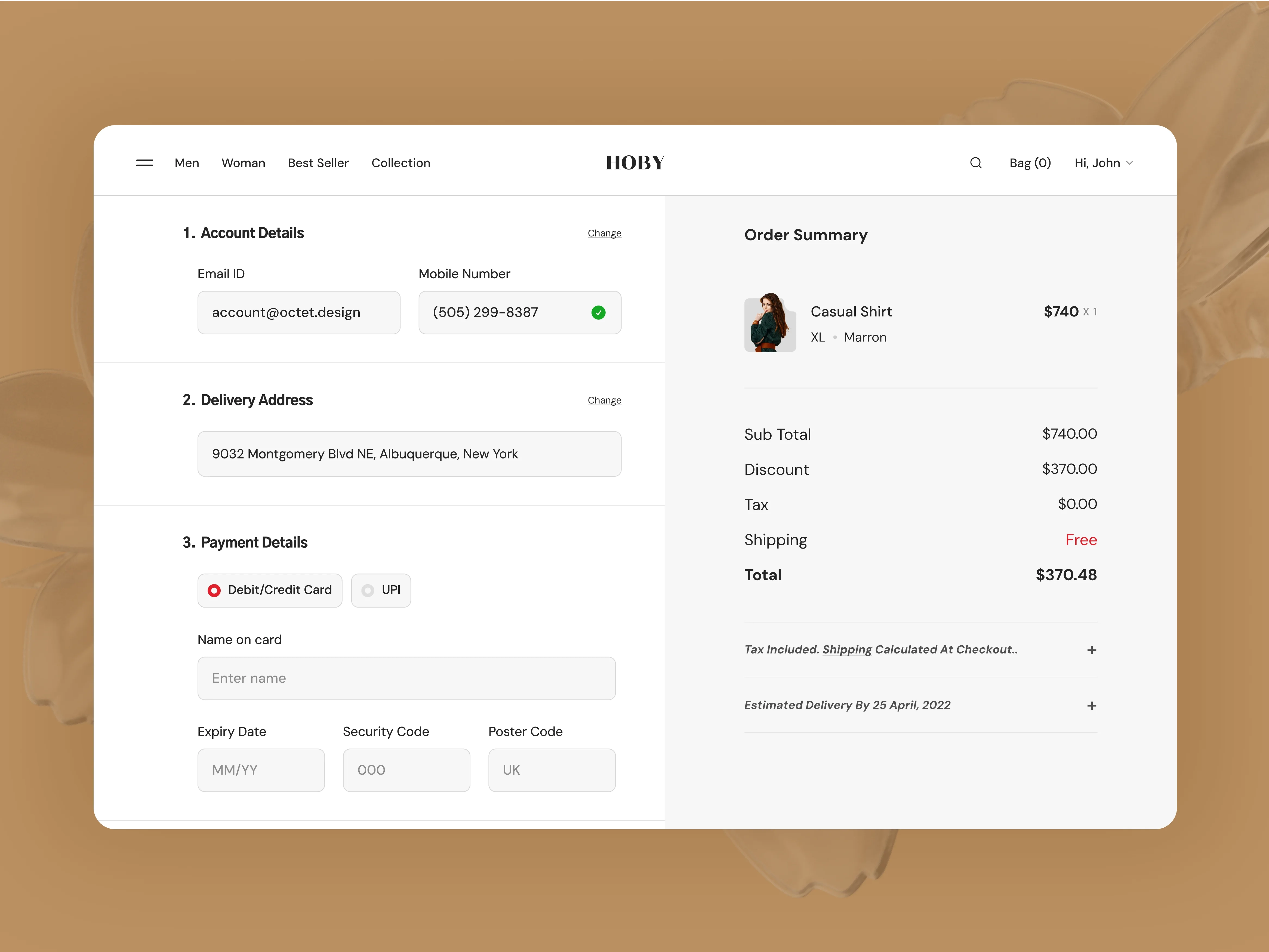
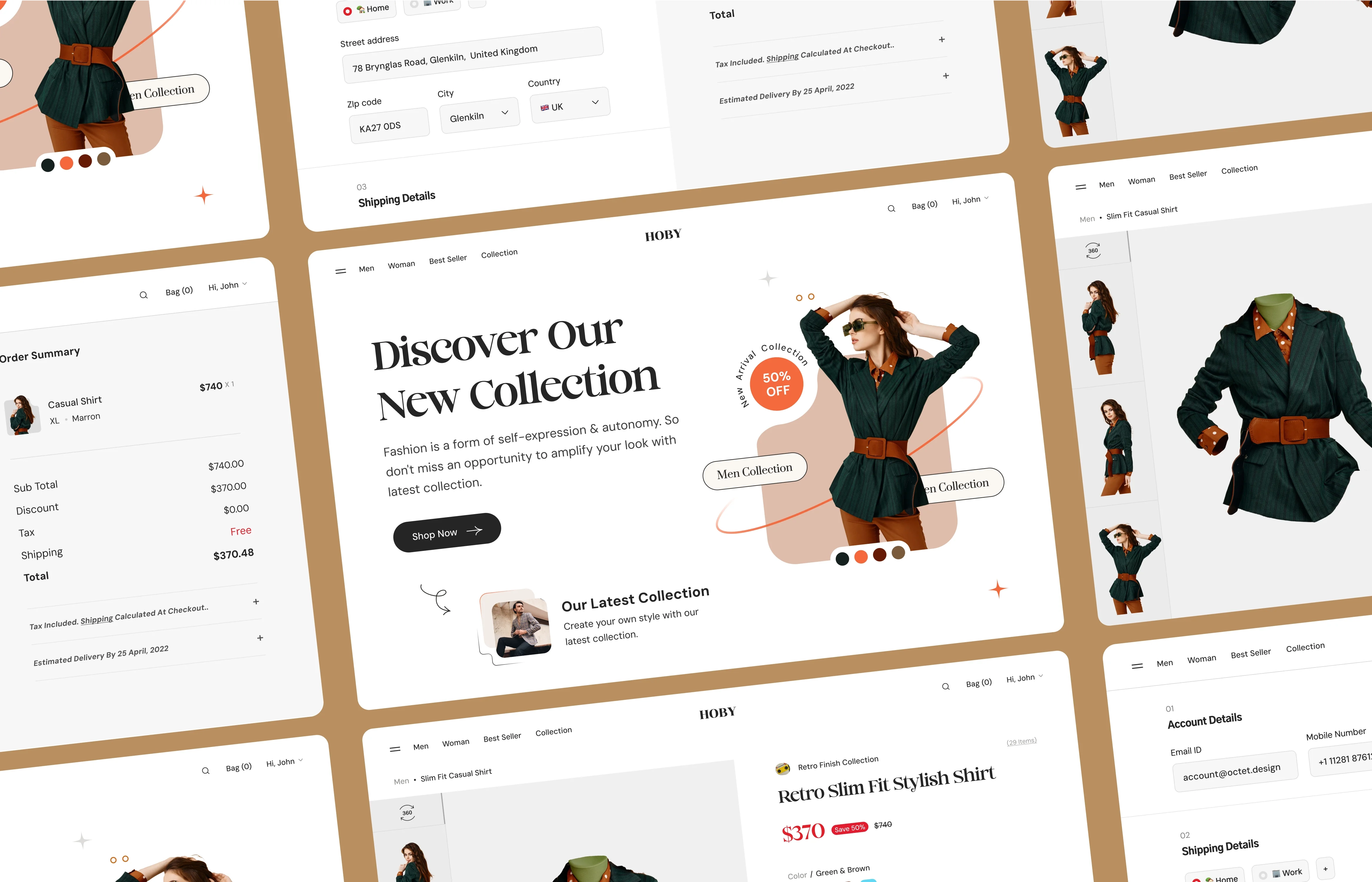
Hoby is a fashion website concept that imagines a comeback of the 90s and early 2000s styles. The website design embraces a retro aesthetic with bold geometric shapes and earthy tones, capturing the essence of 90s fashion.
Typeface
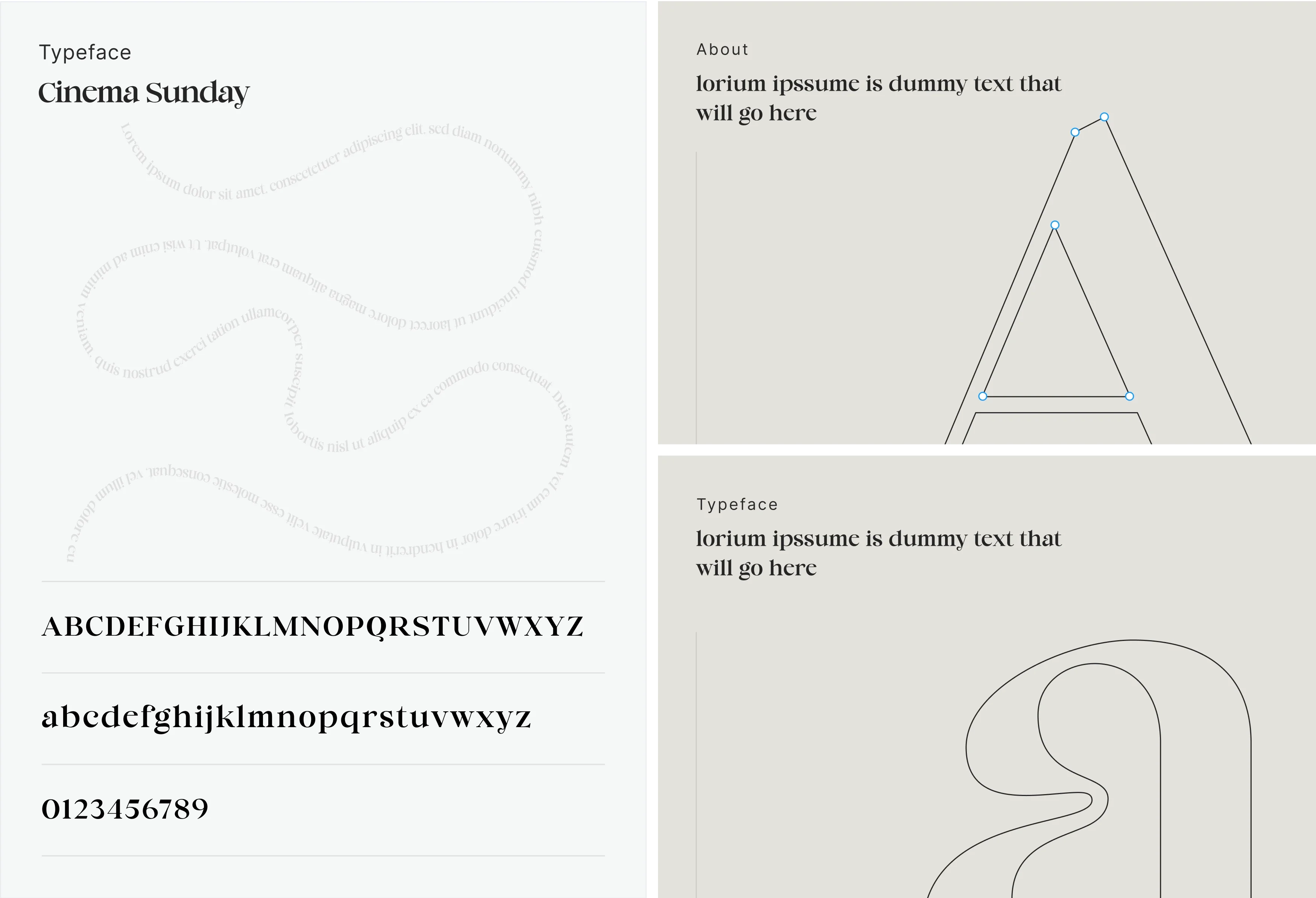
Cinema Sunday was chosen for its balance of retro charm and modern simplicity. It’s fresh and bold, perfectly capturing the essence of the past with a contemporary twist.
Responsiveness
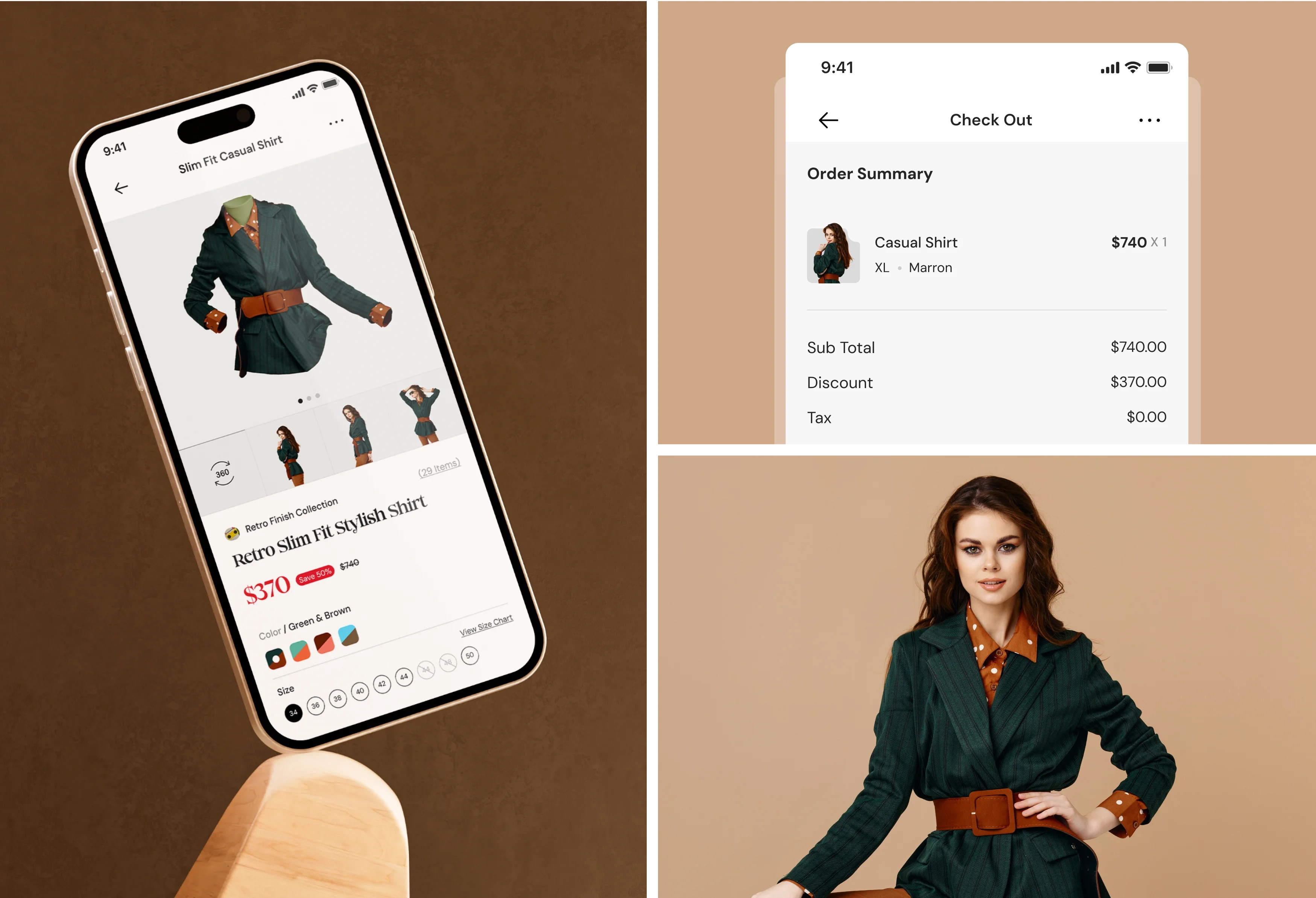
The site has been designed to be fully responsive, ensuring it works smoothly on any device. Whether browsing on a phone or a desktop, the retro feel and unique design elements remain intact, offering a seamless experience.
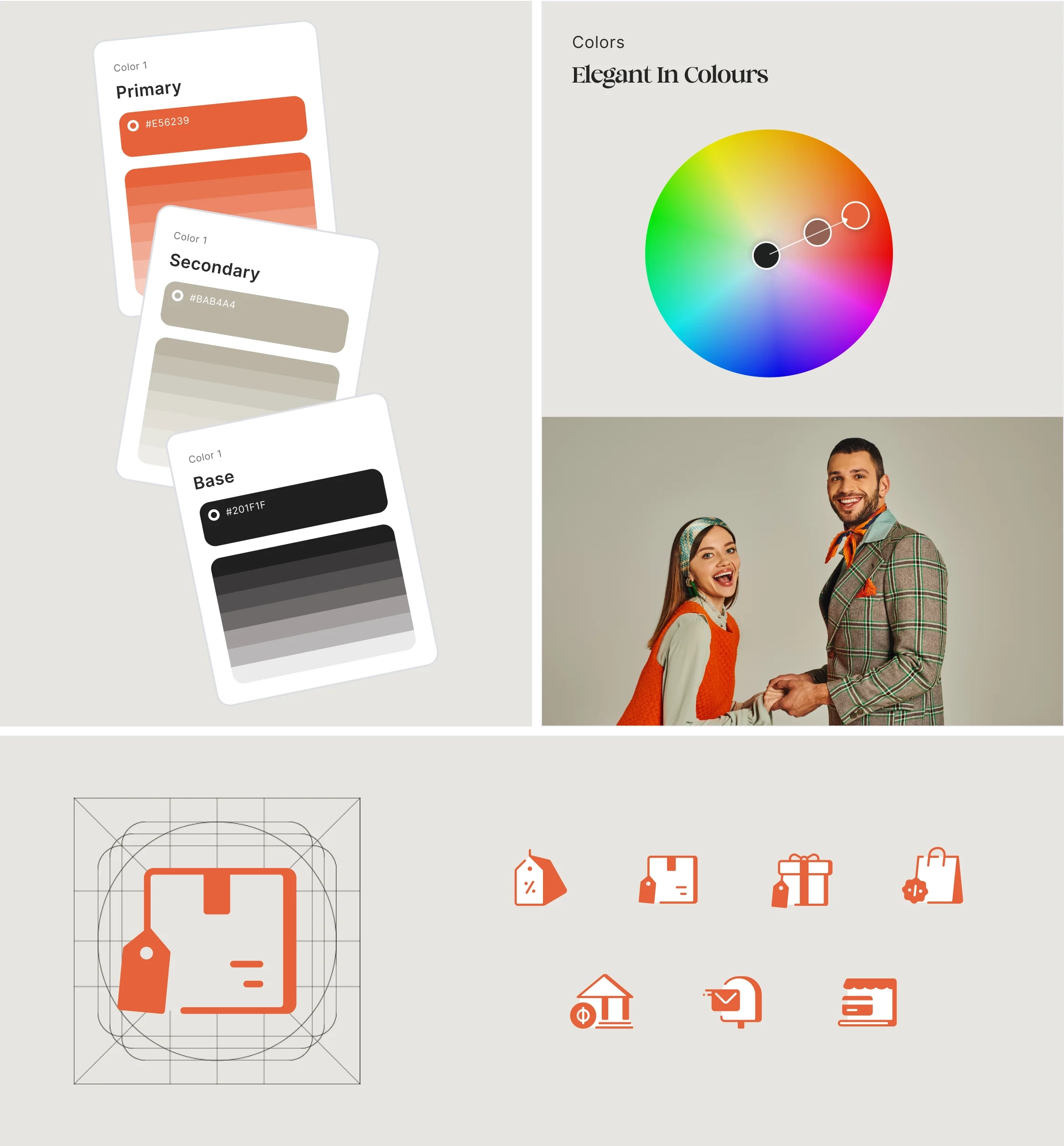
Colors & Iconography
We used tones like beige and brown, paired with accents of green and magenta, to bring out the authentic 90s vibe. The icons are simple yet playful without overwhelming the overall aesthetic.
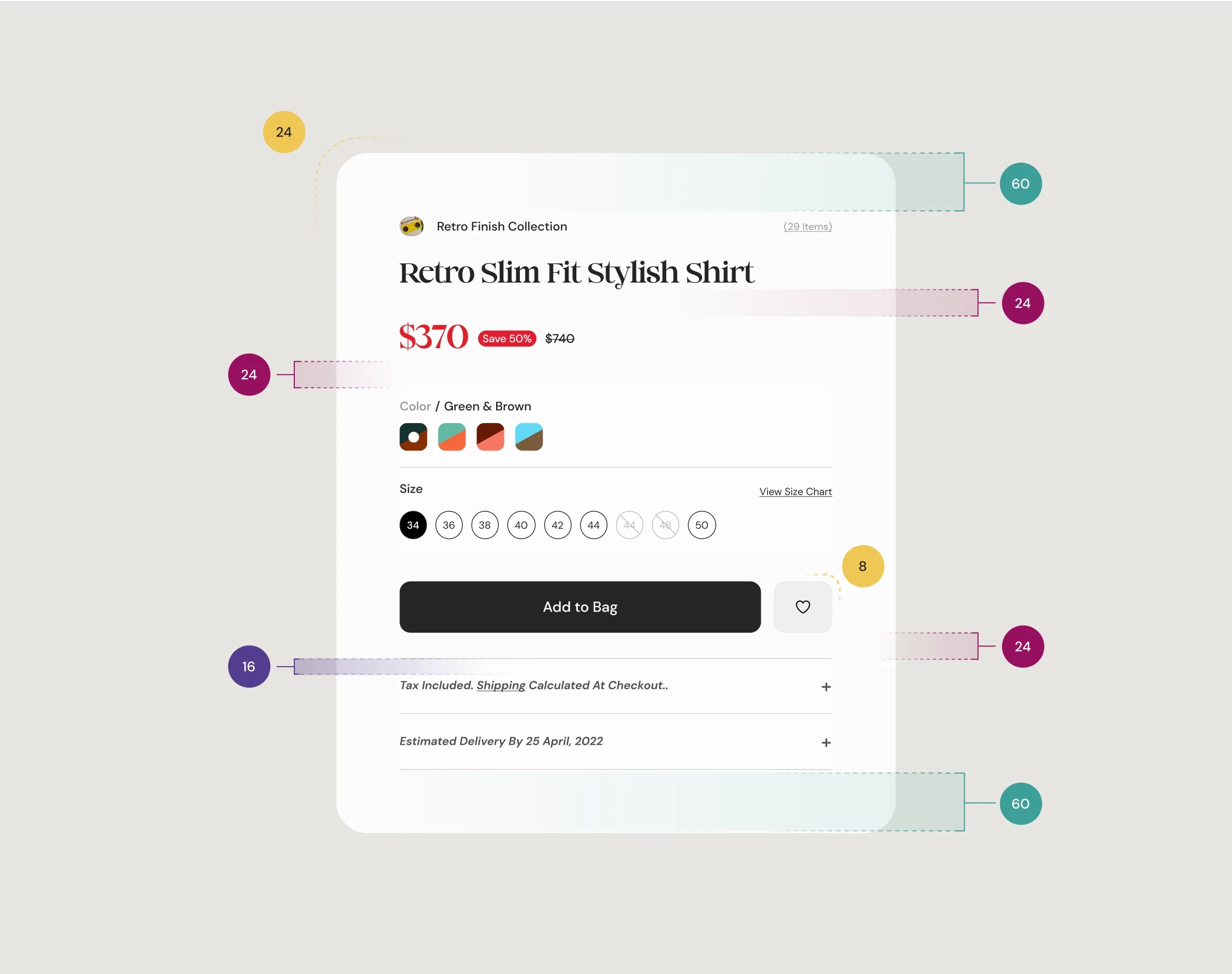
Spacing & Margins
Well-thought-out spacing and margins were vital in making the design clean and easy to navigate. By giving each element room to breathe, we ensured users could focus on the content without feeling crowded by too much visual noise.
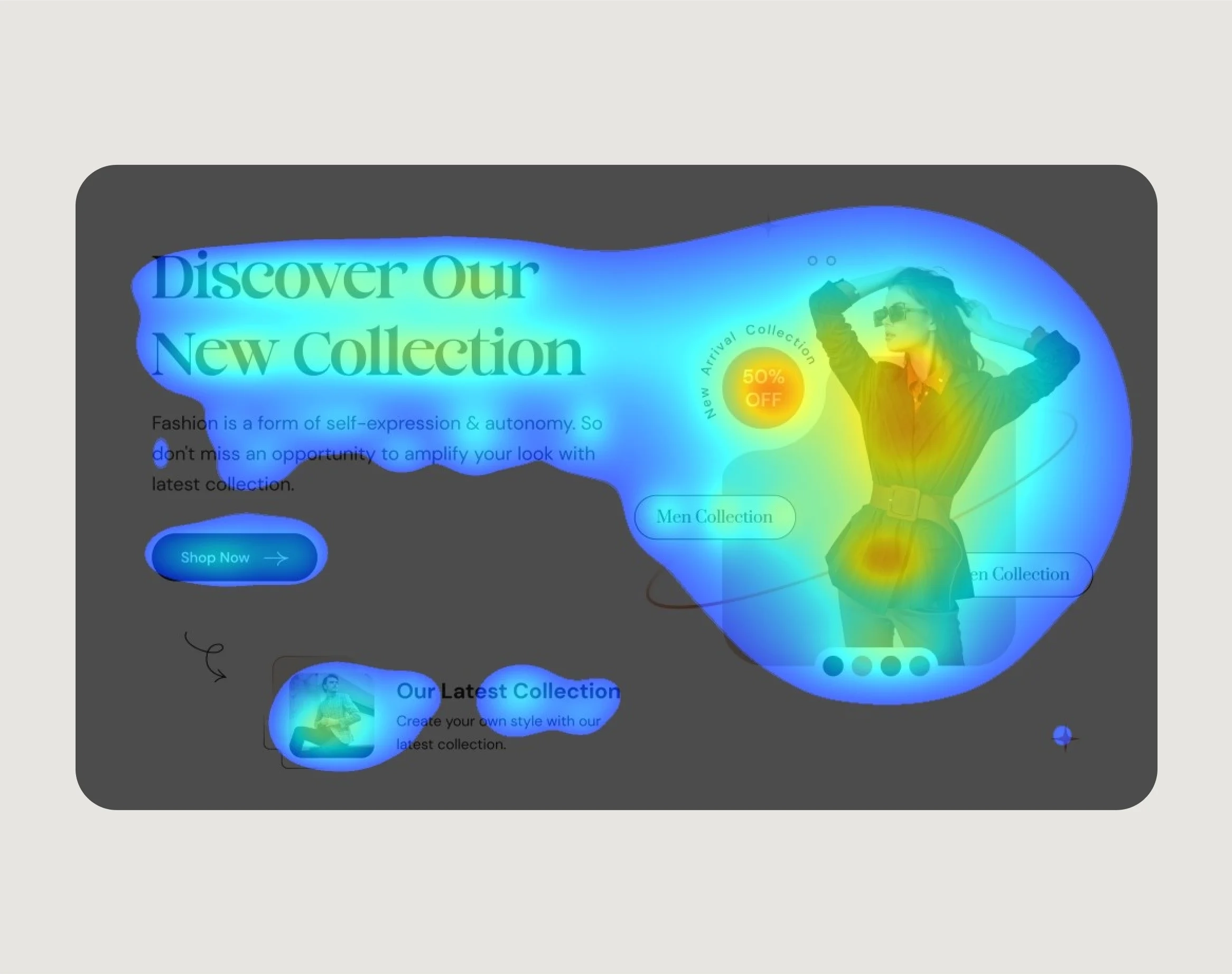
Heatmap
Using heatmaps allowed us to track how users interacted with the site and helped us optimize the layout. It gave us insight into where people were most engaged so we could position the most important elements where they would have the most significant impact.
Outcome
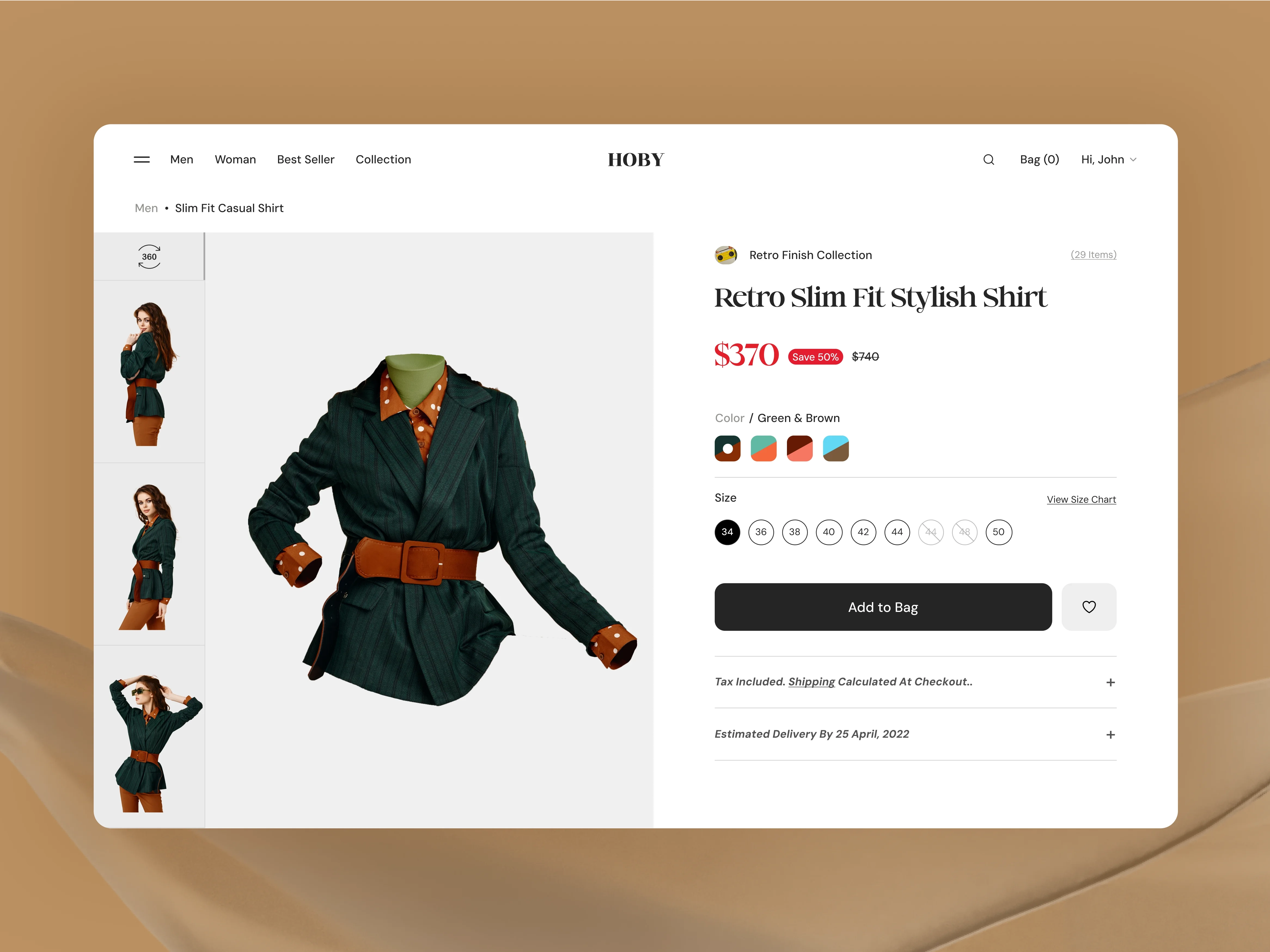
The website created a unique, memorable experience, standing out in fashion. The layout blends retro vibes with modern design, featuring minimalist icons for enhanced usability. With thoughtful spacing and margins, the site offers seamless navigation, inviting users to explore the nostalgic world of retro fashion.

Conclusion
- The website design captures a nostalgic 90s aesthetic with bold geometric shapes.
- The layout strikes a balance between nostalgia and contemporary functionality.
- Unique color choices and playful typography create a memorable visual identity.
- Minimalist icons complement the retro design while ensuring usability.
- Earthy tones like beige, brown, and green evoke a classic retro vibe.
- Thoughtful spacing and margins improve navigation and readability.
- Pops of magenta add a modern touch, enhancing the overall appeal.
- Overall, the site effectively engages users, making the retro fashion experience both fun and accessible.
Looking for App Designers?
We can be your perfect partner


Previous
Next

